How to Create a Pack of Android Launcher Icons in Adobe Illustrator

Final product image
What You’ll Be Creating

In today’s tutorial we’re going to make some little changes to our regular program, and tackle a subject that I’ve wanted to do for a long time. If you haven’t figured it out from the title, well, we’re going to create five simple icons that you could turn into Android launcher icons for any future apps that you might create or be involved in creating.

As for the
process, we’ll be using your basic selection of geometric shapes combined with
the Align panel and some other tools that you probably already work with every
day.

That being said, grab a fresh batch of coffee and let’s get started.

Oh, and don’t forget you can always expand the
project by heading over to GraphicRiver, where you’ll find tons of awesome
Android designed icon packs, just waiting to be clicked on.

Would you prefer to learn via video format? Check out the video tutorial over on the Envato Tuts+ YouTube channel:


1. How to Set Up a New Document

Since I’m guessing that you already have
Illustrator up and running in the background, bring it up and let’s set up a New Document (File > New or Control-N)
using the following settings:

  • Number
    of Artboards:
    1
  • Width:
    800
    px
  • Height:
    600
    px
  • Units:
    Pixels

And from the Advanced tab:

  • Color
    Mode:
    RGB
  • Raster
    Effects:
    Screen (72ppi)
  • Preview Mode: Default
setting up a new document

Quick tip: some of you might
have noticed that the Align New Objects
to Pixel Grid
option is missing, which is because I’m running the new CC
2017 version of the software, where great changes have been made to the way Illustrator handles the way shapes snap
to the underlying Pixel Grid.

2. How to Set Up a Custom Grid

Since we’re going to be creating the icons
using a pixel-perfect workflow, we’ll want to set up a nice little Grid so that we can have full control
over our shapes—that is if we’re running the older version of the software.

Step 1

Go to the Edit > Preferences > Guides & Grid submenu, and adjust
the following settings:

  • Gridline
    every:
    1 px
  • Subdivisions: 1
setting up a custom grid

Quick tip: you can learn more
about grids by reading this in-depth piece on how Illustrator’s Grid System
works
.

Step 2

Once we’ve set up our custom grid, all we
need to do in order to make sure our shapes look crisp is enable the Snap to Grid option found under the View menu, which will transform into Snap to Pixel each time you enter Pixel Preview mode.

Now, if you’re new to
the whole “pixel-perfect workflow”, I strongly recommend you go through my how
to create pixel-perfect artwork
tutorial, which will help you widen your
technical skills in no time.

3. How to Set Up the Layers

With the New Document created, it would be
a good idea to structure our project using a couple of layers, since this way
we can maintain a steady workflow by focusing on one icon at a time.

That being said, bring up the Layers panel, and create a total of six
layers, which we will rename as follows:

  • layer 1: reference grids
  • layer 2: battery
  • layer 3: settings
  • layer 4: messaging
  • layer 5: alarm
  • layer 6: photos
setting up the layers

4. How to Create the Reference Grids

The
Reference Grids
(or Base Grids)
are a set of precisely delimited reference surfaces, which allow us to build
our icons by focusing on size and consistency.

Usually, the size of the grids determines
the size of the actual icons, and they should always be the first decision you
make on you start a new project, since you’ll always want to start from the
smallest possible size and build on that.

Now, since we’re going to be creating the
icons with the intent of having them used within the actual Android OS, we’ll
have to follow their recommended Size and Format guideline, and set up a
custom grid of 96 x 96 px with an
all-around 4 px padding.

Step 1

Start by locking all
but the reference grid layer, and then grab the Rectangle Tool (M) and create a 96 x 96 px orange (#F15A24) square, which will help define the
overall size of our icons.

creating the main shape for the reference grid

Step 2

Add another smaller 88 x 88 px one (#FFFFFF) which will act
as our active drawing area, thus giving us that all-around 4 px padding.

creating the main shape for the active drawing area

Step 3

Group the two squares composing the
reference grid using the Control-G keyboard
shortcut, and then create three copies at a distance of 24 px from one another, making sure to align them to the center of
the Artboard.

Once you’re done,
lock the current layer and move on to the next one where we’ll start working on
our first icon.

creating and positioning all the reference grids

5. How to Create
the Battery Icon

We’re going to
kick off the project by creating the battery icon, which could be used for a
power saving app, or even a status indicator one since it’s pretty basic.

That being said,
make sure you’re on the right layer (that would be the second one) and then
zoom in on the first reference grid so that we can get started.

Step 1

Start by creating the icon’s background using an 88 x 88 px circle, which we will color using #00C853, center
aligning it to the underlying active drawing area afterwards.

creating and positioning the main shape for the battery icons background

Quick tip: since Google was nice enough to put out a
Material Design guideline for colors, I’ve ended up mixing and matching a
couple of the values, which I’ve used for the backgrounds.

Step 2

Create the battery’s main body using a 24 x 40 px rectangle, which we will color using white (#FFFFFF) and
then center align to the larger circle, at a distance of 20 px from its bottom edge.

creating and positioning the main shape for the battery icons body

Step 3

Turn the shape that we’ve just created into an outline, by flipping its Fill with its Stroke (Shift-X), and
then setting its Weight to 4 px and its Corner to Round Join,
all from within the Stroke panel.

turning the battery icons body into an outline using the stroke panel

Step 4

Create the first state indicator bar, using either a 12 x 4 px rectangle (#FFFFFF) or a 12 px wide stroke (#FFFFFF) with a 4 px Weight, which we will center align
to the battery’s body, leaving a 4 px gap
around it.

creating and positioning the battery icons first state indicator bar

Step 5

Add two more indicator bars, which we will vertically stack at a
distance of 4 px from one another,
grouping them together (Control-G)
afterwards.

adding the remaining state indicator bar to the battery icon

Step 6

Finish off the
icon by adding the top cap, which we will create using a smaller 8 x 4 px rectangle (#FFFFFF) that we
will center align to the battery’s body, at a distance of 6 px (4 px for the
padding + 2 px for the top half of
the stroke).

Once you’re done, don’t forget to select and group (Control-G) all the battery’s composing shapes, doing the same thing
for all of the icon’s composing sections as well.

finishing off the battery icon

6. How to Create
the Settings Icon

Assuming you’ve
managed to finish the first icon, lock its layer and then move on up to the
next one (that would be the third one) and let’s start working on the settings
one.

Step 1

As we did with the previous icon, start by creating its background using
an 88 x 88 px circle, which we will
color using #2196F3, center aligning it to the underlying active drawing area
afterwards.

creating and positioning the main shape for the settings icons background

Step 2

Start working on the center slider by creating a 4 x 32 px rectangle or a 32
px
tall stroke with a 4 px thick
Weight, which we will color using
white (#FFFFFF) and then center align to the larger circle, at a distance of 18 px from its top edge.

creating and positionign the main shape for the settings icons center slider

Step 3

Create the slider’s state indicator using a 12 x 4 px rectangle (#FFFFFF) which we will center align to the
previously created shape, at a distance of 4
px
from its bottom edge.

creating and positioning the main shape for the center sliders state indicator

Step 4

Add the lower section of the slider using 4 x 12 px rectangle (#FFFFFF) which we will position just under the
state indicator bar, selecting and grouping (Control-G) all three shapes together afterwards.

creating and positioning the main shape for the center sliders lower section

Step 5

Create the top section for the left slider using a smaller 4 x 12 px rectangle (#FFFFFF), which we
will align to the top edge of the center slider, positioning it at a distance
of 12 px from it.

creating and positioning the main shape for the left sliders upper section

Step 6

Add the slider’s state indicator by creating a 12 x 4 px rectangle (#FFFFFF) which we will vertically stack to the
previously created shape, at a distance of 4
px
from its bottom edge.

creating and positioning the main shape for the left sliders state indicator

Step 7

Finish off the
left slider by adding the bottom section which we will create using a 4 x 32 px rectangle (#FFFFFF) that we
will position underneath the indicator.

Once you’re done, select all three shapes and group them together (Control-G) as we did with the center
slider.

finishing off the settings icons left slider

Step 8

Finish off the
icon by creating a copy (Control-C >
Control-F
) of its left slider, which we will position onto the right side
of the circle, at a distance of 4 px from
the center slider.

Once you’re done, don’t forget to select and group (Control-G) all its composing sections so that they won’t get
separated by accident.

finishing off the settings icon

7. How to Create
the Messaging Icon

Assuming you’ve
already moved on up to the next layer (that would be the fourth one), zoom in
on the third reference grid and let’s get started.

Step 1 

Create the icon’s background using an 88 x 88 px circle, which we will color using #7C4DFF and then
center align to the underlying active drawing area.

creating and positioning the main shape for the messaging icons background

Step 2

Create the main shape for the left messaging box using a 32 x 24 px rectangle, which we will
color using white (#FFFFFF) and then position at a distance of 20 px from the active drawing area’s
both left and top edge.

creating and positioning the main shape for the messaging icons left text box

Step 3

Start adjusting
the shape that we’ve just created, by first turning on the Pixel Preview mode (Alt-Control-Y)
and then adding a new anchor point to
its bottom edge, at a distance of 10 px from
its left one by left clicking with the help of the Add Anchor Point Tool.

Once you’re done, don’t forget to exit Pixel Preview mode by using the Alt-Control-Y keyboard shortcut.

adding a new anchor point to the bottom edge of the messaging icons left text box

Step 4

Continue adjusting the rectangle by selecting its bottom-left anchor point with the Direct Selection Tool (A), and then
pushing it to the bottom by 8 px with
the help of the Move tool (right
click > Transform > Move > Vertical > 8 px
).

adjusting the shape of the messaging icons left text box

Step 5

Turn the resulting shape into an outline, by flipping its Fill with its Stroke (Shift-X) and
then setting its Weight to 4 px and its Corner to Round Join.

turning the messaging icons left text box into an outline

Step 6

Add the smaller text line by creating a 10 x 4 px rectangle, which we will color using white (#FFFFFF) and
then position inside of the little message box, aligning it towards its
top-left corner, making sure to leave a 4
px
gap around it.

creating and positioning the first text line onto the messaging icons left text box

Step 7

Add the wider text line using a 20 x
4 px
rectangle (#FFFFFF) which we will left-align to the previously created
one, at a distance of 4 px from its
bottom edge.

Once you’re done, don’t forget to select and
group all of the text box’s shapes together using the Control-G keyboard shortcut.

creating and positioning the second text line onto the messaging icons left text box

Step 8

Create a copy (Control-C >
Control-F
) of the little text box’s outline, and then reflect (right click > Transform > Reflect
> Vertical
) and position it onto the right side of the circle, at a
distance of 18 px from the active
drawing area’s both right and bottom edge.

creating and positioning the messaging icons second text box

Step 9

Finish off the
icon, by removing the text box’s overlapping section (highlighted with red) so
that you end up having a 4 px gap
between it and the left one’s outline. To do this, simply add a new anchor point to its top and left edge,
and then remove all the other ones.

Once you’re done, select all of the icon’s composing sections and group
them together using the Control-G keyboard
shortcut.

finishing off the messaging icon

8. How to Create
the Alarm Icon

Since by now you
probably already know the drill, lock the layer and move on up the next layer
(that would be the fifth one) and let’s start working on our alarm icon.

Step 1

Create an 88 x 88 px circle,
which we will then color using #FFC107, center aligning it to the underlying
active drawing area.

creating and positioning the main shape for the alarm icons background

Step 2

Create the alarm clock’s main body using a 40 x 40 px circle, which we will color using white (#FFFFFF) and
then center align to the active drawing area, at a distance of 20 px from its bottom edge.

creating and positioning the main shape for the alarm icons body

Step 3

Turn the shape that we’ve just created into an outline, by flipping its Fill with its Stroke, and then setting its Weight
to 4 px from within the Stroke panel.

turning the alarm icons main body into an outline

Step 4

Select the Pen Tool (P) and
draw in the clock’s hands using a 4 px thick
Stroke with the color set to white
(#FFFFFF) and the Corner to Round Join, making sure to leave a 4 px gap between the ending anchor points and the larger circle.

drawing in the little hands inside the alarm clocks main body

Step 5

Move a few pixels towards the top, and create an 8 x 6 px rectangle (#FFFFFF) which we will center align to the
upper section of the larger circle, positioning it so that it ends up
overlapping the Stroke’s top half.

creating and positioning the main shape for the alarm clocks upper section

Step 6

Add a 16 x 4 px rectangle
(#FFFFFF) on top of the one that we’ve just created, selecting and grouping (Control-G) them together afterwards.

finishing off the alarm clocks top section

Step 7

Finish off the icon by drawing in the two little diagonal line segments
using a 4 px Stroke with the color
set to white (#FFFFFF). Once you’re done select and group (Control-G) all of the alarm clock’s composing shapes together,
doing the same for the entire icon afterwards.

finishing off the alarm clock icon

9. How to Create
the Photos Icon

Make your way to
the sixth and last layer, and let’s finish the project by creating the photos
icon.

Step 1

Using an 88 x 88 px circle (#FF6F00)
create the icon’s background which we will center align to the underlying
active drawing area.

creating and positioning the main shape for the photos icons background

Step 2

Create the photo’s main body using a 36 x 36 px rectangle, which we will color using white (#FFFFFF) and
then center align to the underlying active drawing area, at a distance of 20 px from its top edge.

creating and positioning the main shape for the photos icons body

Step 3

Turn the shape that we’ve just created into an outline, by flipping its Fill with its Stroke (Shift-X), and
then setting its Weight to 4 px and its Corner to Round Join from
within the Stroke panel.

turning the photos icons main body into an outline

Step 4

Using the Pen Tool (P) draw
in the horizontal divider line using a 4
px
thick Stroke (#FFFFFF) which
we will position inside of the previously created shape, at a distance of 4 px from its bottom edge.

adding the horizontal divider line to the lower body of the photos icon

Step 5

Using the same 4 px thick Stroke (#FFFFFF) with a Round Join, start drawing the first mountain by positioning your first anchor point onto the left edge of the
photo, at a distance of 10 px from
the horizontal divider line that we’ve just created. 

Add the second anchor at a distance of 10 px both horizontal and vertical from
the first one. Finish off the mountain by adding the third and last anchor onto the horizontal divider line,
while holding down the Shift key to
draw in a perfect diagonal line.

drawing the photos icons first mountain

Step 6

Draw in the second smaller mountain, using the
same 4 px thick Stroke (#FFFFFF), and then once you’re done, select and
group all of the photo’s composing shapes together using the Control-G keyboard shortcut.

drawing the photos icons second mountain

Step 7

Create the icon’s bottom section using a 28 x 6 px rectangle, which we will color using white (#FFFFFF) and
then center align to the lower section of the photo’s outline, at a distance of
4 px.

creating and positioning the main shape for the lower section of the photos icon

Step 8

Finish off the
icon, by turning the shape that we’ve just created into a 4 px thick outline (#FFFFFF) with a Round Join, and then adjusting it by adding a new anchor point to the center of its top
edge, which we will then remove in order to open the path (highlighted with
red).

Select the resulting shape and the rest of the photo’s composing
elements and group them (Control-G)
doing the same for the icon’s composing sections afterwards.

finishing off the photos icon

It’s a Wrap!

I hope that you’ve managed to keep up with each and every step, and most
importantly learned something new and useful during the process. That being
said, I’ll see you in the next one!


Final Design

How to Create a Thanksgiving Background With a Pumpkin and Leaves in Adobe Illustrator

Final product image
What You’ll Be Creating

In this tutorial, you will learn how to use the Mesh Tool in Adobe Illustrator to create a vector Thanksgiving background!

If you want to skip the tutorial and just use this background with some other awesome elements, purchase the Happy Thanksgiving Background from GraphicRiver!

Happy Thanksgiving Background

1. How to Draw the Pumpkin

Step 1

Let’s start by drawing the pumpkin with Gradient Mesh.

Create an orange object in the shape of a pumpkin —the color is #E3860F. Next, grab the Mesh Tool (U). Click to create nodes, which in turn create a Mesh Grid

Once your Mesh Grid resembles the one shown below, select
the right cluster of nodes (they are already colored differently in the
screenshot) and color them with #CC5A18.

Next, select nodes that are lighter (they’re selected below) and proceed to change their color to #EBA427. Add some darker orange tones in the fourth step with #BE361B, and then darken it more with #C3431A and #CB7F31

Always make sure to select the nodes that are selected in each screenshot below and apply the corresponding color to them!

draw pumpkin with mesh

Step 2

Continue coloring the pumpkin with the help of the screenshot below. You will need to use these colors:

  1. #EAA30B
  2. #D96716
  3. #B04312
  4. #F0C174
  5. #D77310
  6. #DF8517
gradient mesh tutorial

Step 3

Finish the mesh using these colors:

  1. #FAE1CB
  2. #E69A2F
  3. #CF6512
  4. #EEB963
  5. #D86611
  6. #EEB457
thanksgiving vector

Step 4

Draw another element.

  1. #E4A15B
  2. #B7471E
  3. #CCBBA8
  4. #F2E1D6
  5. #C3551D
adobe illustrator mesh pumpkin

Step 5

Begin drawing the stem.

  1. #2C3018
  2. #9D592C
  3. #82785D
  4. #4F4D34
  5. #0B1304
  6. #C6B293
gradient mesh pumpkin tutorial

Step 6

Finish the stem.

  1. #6E664D
  2. #1B210E
  3. #F5F5F5
thanksgiving background vector

Step 7

Assemble the pumpkin!

mesh pumpkin vector adobe illustrator photo-realistic

2. How to Draw the Leaves

Step 1

Draw a leaf with mesh. Use these colors:

  1. #CB1400
  2. Create the Mesh Grid
  3. #AC1400
mesh red leaf

Step 2

Use a #BA600F Stroke with a specific Stroke Profile for the details.

Expand the line, and then set it to Multiply with 20% Opacity.

stroke

Step 3

Place the line in the middle of the leaf, and then add a Clipping Mask as shown below.

clipping mask

Step 4

Create a narrower copy of the leaf we just made.

mesh leaf

Step 5

Create one more modified version of the original with Effect > Warp > Arc. Use a 14% Bend, and Expand Appearance of the result.

arc

Step 6

Add one more version with Effect > Warp > Arch. Use -31% Bend, -22% Horizontal, and 13% Vertical Distortion.

warp effect

Step 7

Add a final version with Effect > Warp > Bulge and these settings:

  • Bend: 12%
  • Horizontal Distortion: -9%
  • Vertical Distortion: 1%
warp effects tutorial adobe illustrator

Step 8

Draw a narrow branch, colored with #CB1100. Use Stroke, just like in Step 2.

vector branch

Step 9

Place the corresponding leaves on the branch.

branch with mesh leaves

Step 10

Recolor the original red leaf with Edit > Edit Colors > Adjust Colors. Use:

  • Red: -7%
  • Green: 19%
  • Blue: -21%
edit colors

Step 11

Add a version using Effect > Warp > Bulge. Use these settings:

  • Bend: 22%
  • Horizontal Distortion: -25%
  • Vertical Distortion: 0%
bulge warp effect

Step 12

Add one more brown leaf with Effect > Warp > Arc. Use these parameters:

  • Bend: -21%
  • Horizontal Distortion: -11%
  • Vertical Distortion: 1%

Don’t forget to Expand Appearance.

arc warp effect

Step 13

Add a brown, #AA4500 branch.

stroke profile

Step 14

Place the new leaves on the branch.

brown mesh leaves

Step 15

To add more leaves, consult some of my other tutorials!

mesh arrangement thanksgiving

3. How to Add the Background

Step 1

Draw a #EDDCAF card, adding a #E0C9A0 border to it.

greeting card

Step 2

Draw a Blend shadow! Use shapes filled with #684730 and #F8F6F5.

Place the smaller shape inside the bigger shape, and then make the bigger one completely transparent. Proceed to Object > Blend > Blend Options, choosing Specified Steps with a value of 30

Finally, select both shapes and use Object > Blend > Make to create a transparent shadow.

blend shadow

Step 3

Place the shadow behind the card.

blend shadow

Step 4

Draw the paper background with mesh. Use #E7D6B8, then #F9F4EB.

paper mesh

Step 5

Place all the elements on the background!

finished thanksgiving background

Awesome Work, You’re Now Done!

What now? You can try any of my other tutorials from my profile, or check out my portfolio on GraphicRiver, as well as the original vector we recreated in this tutorial.

I hope you enjoyed the tutorial, and I would be super happy to see any results in the comments below!

Happy Thanksgiving Background

Check out some of my other tutorials!

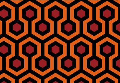
How to Create the Carpet Pattern From “The Shining” in Adobe Illustrator

Final product image
What You’ll Be Creating

In today’s
tutorial we’re going to continue with the Horror Movie Special, and learn how
to create the trippy carpet pattern from Stanley Kubrick’s The Shining.

We’re going to create it in Adobe Illustrator using some “old-school” techniques, which involve the
careful handling of the Rectangle Tool combined with the power of the Pixel
Grid.

So, grab a cup of that hot coffee that you love, and let’s get started!

Oh, and don’t forget you can always find new
jaw-dropping patterns over at Envato Market, with tons of themes to choose from.

You can now follow this tutorial in video format over on the Envato Tuts+ YouTube channel.


1. Set Up a New
Project File

Bring up
Illustrator, and set up a New Document (File > New Document or Control-N) and adjust it using the
following settings:

  • Number
    of Artboards:
    1
  • Width:
    602
    px
  • Height:
    600
    px
  • Units:
    Pixels 

And from the Advanced tab:

  • Color
    Mode:
    RGB
  • Raster
    Effects:
    Screen (72ppi)
  • Align New Objects to Pixel Grid: checked
setting up a new document

2. Set Up a Custom
Grid

Since we’re going
to be creating the pattern using a pixel-perfect workflow, we’ll want to set up
a nice little Grid so that we can have full control over our shapes.

 Step 1

Go to the Edit > Preferences > Guides &
Grid
submenu, and adjust the following settings:

  • Gridline
    every:
    1 px
  • Subdivisions: 1
setting up a custom grid

Quick tip: you can learn more
about grids by reading this in-depth piece on how Illustrator’s Grid System
works
.

Step 2

Once we’ve set up our custom grid, all we
need to do in order to make sure our shapes look crisp is enable the Snap to Grid option found under the View menu, which will transform into Snap to Pixel each time you enter Pixel Preview mode.

Now, since we’re
aiming to create the pattern using a pixel-perfect workflow, I strongly
recommend you go through my how to create pixel-perfect artwork tutorial, which
will help you widen your technical skills in no time.

3. Create the Main Repeating Element

The first thing that we’re going to start
working on is the main repeating element, or rather section of the pattern,
that we will use to build our larger composition.

Step 1

Grab the Rectangle Tool (M) and create an 86 x 106 px shape, which we will color
using a bright orange (#DF5F18) and then align to the center of the underlying Artboard.

creating and positioning the main shape for the patterns repeating element

Step 2

Zoom in on the shape that we’ve just created, and use the Add Anchor Point Tool (+) to add two
new anchor points, one to the
center of its top edge, and another one to its bottom one.

adding the top and bottom anchor points to the repeating elements main shape

Step 3

Use the Direct Selection Tool (A)
to select the anchors that we’ve
just created, and then push them
towards the top by right-clicking and
going to Transform > Move and
entering -26 px into the Vertical value field, leaving the Horizontal one at 0 px.

adjusting the repeating elements main shape

Step 4

Now that we have our main shape, let’s give it a top outline, by
selecting it, and then using the Move
Tool
to create a copy at a distance of 14
px
from it (right click >
Transform > Move > Horizontal: 0 px > Vertical: -14px >
Copy
).

creating the repeating elements top outline using the move tool

Step 5

Grab a copy of the original shape (Control-C)
and paste it on top of the one that we’ve just created (Control-F) using Pathfinder’s
Minus Front Shape Mode to remove
part of its lower section, coloring the resulting shape using black (#000000).

adjusting the repeating elements top outline

Step 6

Add the bottom outline, using a copy (Control-C > Control-F) of the one that we’ve just created, which
we will position right under the orange shape, selecting and grouping (Control-G) all three shapes together
afterwards.

creating and positioning the repeating elements bottom outline

Step 7

Using the Rectangle Tool (M) create
a 26 x 14 px shape, which we will
color using #981F24, and then Horizontal
Center Align
to the Artboard, at
a distance of 50 px from the top
outline tip.

creating and positioning the main shape for the repeating elements top hexagon detail

Step 8

Adjust the shape that we’ve just created by adding two new anchor points to its top and bottom
edges, and then individually pushing them towards the outside by 8 px using the Move Tool (right click >
Transform > Move > Vertical > – 8 px
for the top one and + 8 px for the bottom one).

adjusting the repeating elements top hexagon detail

Step 9

Give the little hexagon a nice thick
outline, by selecting it and then going over to Object > Path > Offset Path and entering 12 px into the Offset value
field, leaving all the other options as they are.

adding the outline to the repeating elements top hexagon detail

Step 10

Change the outline’s color to something darker (#000000) in order for it
to stand out from the inner fill shape, and then select and group them both
using the Control-G keyboard
shortcut.

adjusting the color of the repeating elements top hexagon detail

Step 11

Grab a copy (Control-C >
Control-F
) of the hexagon and its outline, and position it onto the left
side of the repeating element, at a distance of 74 px from its tip, making sure that only its right half overlaps
it.

creating and positioning the second hexagon detail onto the repeating element

Step 12

Grab a copy (Control-C >
Control-F
) of the second hexagon detail, and position it towards the right
side of the repeating element, making sure that only its left half overlaps it.

creating and positioning the third hexagon detail onto the repeating detail

Step 13 

Using the Rectangle Tool (M) create
a 12 x 62 px shape, which we will
color using black (#000000) and then center and position over the top hexagon
detail.

creating and positioning the vertical rectangle onto the repeating elements top hexagon detail

Step 14

Add the same 12 x 62 px rectangle (#000000) to the
other two hexagon details, only this time position it towards the top.

Once you’re done, select and group all the shapes that we’ve created so
far using the Control-G keyboard
shortcut.

adding the vertical rectangle to the second and third hexagon details

Step 15

At this point
we’re pretty much done creating the repeating element. All we need to do now is
mask it so that when we start building the larger pattern, the pieces will fit
nicely together.

To do that, simply create an 86 x
160 px
rectangle (highlighted with orange), which we will center to the
shapes that we’ve just grouped, and then use that as a Clipping Mask (right click
> Make Clipping Mask
).

masking the repeating element

Step 16

Once we’ve masked our repeating element, we’ll want to align it to the
left side of our Artboard since
we’re going to create a couple of copies of it in the next stage of our
process.

positioning the masked repeating element onto the left side of the artboard

4. Create the Main
Section of the Pattern

Up until this
point we’ve created the pattern’s main repeating element, which is great, but
we’re going to need to add a couple of instances in order to get it right.

Step 1

Select the repeating element, and then create eight copies of it (Control-C > Control-F) which we will
position 0 px from one another,
making sure to click on the original one to set it as our Key Object.

creating the patterns first row of repeating elements

Step 2

Select and group (Control-G)
all the repeating elements together, centering them to the Artboard with the help of the Align
panel’s Horizontal Align Center option.

aligning the row of repeating elements to the center of the artboard

Step 3

Create five more rows using the one that we have, and stack them on top
of one another, making sure that their top and bottom outlines overlap. You can
make the process a lot easier by lowering the opacity of the copies so that you
can have a better view of the overlapping shapes.

creating the rest of the patterns repeating rows

Step 4

Once you’ve added all the rows, set their Opacity to 100%, and
then group (Control-G) and
vertically align them to the center of the Artboard.

grouping and positioning the patterns repeating rows to the center of the artboard

Step 5

With the repeating rows in place, mask them using a 602 x 600 px rectangle so that the outward facing elements of the
pattern get cut in half.

masking the main section of the pattern

5. Create the
Actual Swatch Pattern

So at this point we’re
all done working on the elements needed to create the pattern, which means that
we can turn it into an actual swatch library element.

Step 1

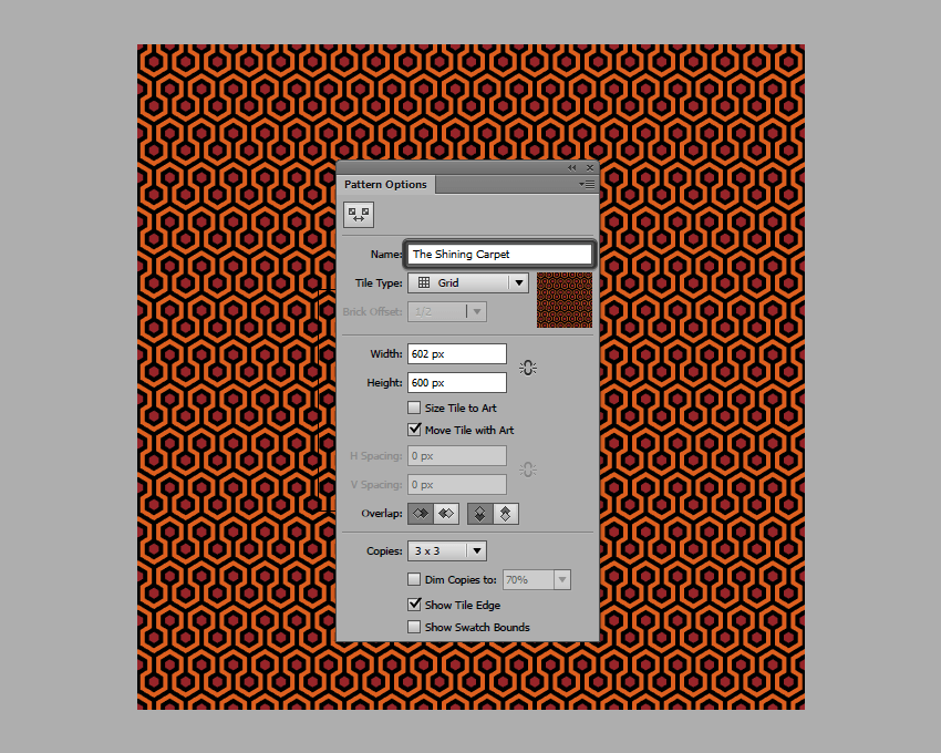
Select the masked pattern, and then go to Object > Pattern and hit Make
which will bring up a new window with a couple of options which we will need to
adjust. But first, let’s give it a proper name to make it easy to recognize.

giving the pattern a custom name

Step 2

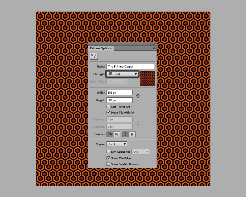
Next, we have Tile Type which
we’re going to want to leave set to Grid,
since our pattern elements are designed to be stacked together instead of being
spread out.

choosing a tile type for the pattern

Step 3

Then, we have the Width and Height which
we are going to set using the actual size of our pattern (602 x 600 px).

choosing a size for our pattern

Step 4

Leave the Overlap
and Copies settings as they are,
since they’ll work just fine, and then finally hit Done to add the pattern to your swatch
library.

setting the overlap and copies settings for our pattern

Step 5

To use the pattern, simply select it from the swatch, and then grab the Rectangle Tool (M) (or any other shape)
and draw a new object, which as you will see will have that same trippy
brain-damaging effect as the real one from the movie had.

example of using the pattern

It’s a Wrap!

There you have it: an easy way to create your very own “Shining” carpet, using some basic
shapes and the power of Illustrators
built-in Pattern options.

I hope that you had as much fun as I did when I first created the
project, and most importantly learned something new along the way.

final preview of the pattern

How to Create an Abstract Icon Set in Adobe Illustrator

Final product image
What You’ll Be Creating

Welcome to how to create an abstract icon set in Adobe Illustrator! The theme we’re working on will be chess. In this tutorial we will learn the step by step process of how to create an abstract set of icons using basic shapes and tools.

For more examples of abstract icon sets, check out GraphicRiver where you can find a wide variety of different abstract icons.

1. How to Set Up a New Project File

Step 1

Let’s get started by setting up a New Document in Adobe Illustrator (File > New or Control-N). For this tutorial, we will use the settings below:

  • Number of Artboards: 1
  • Width: 850 px
  • Height: 850 px
  • Units: Pixels

In the Advanced tab, use the following settings:

  • Colour Mode: RGB
  • Raster Effects: Screen (72ppi)
  • Preview Mode: Default
Create a new project settings

Step 2

Go to Edit > Preferences > General and set the Keyboard Increment to 1 px

Edit project preferences

Step 3

Go to Units and use the settings shown below. 

  • General: Pixel
  • Stroke: Points
  • Type: Points
Edit units in project preferences

2. How to Set Up the Layers

Step 1

Next, you will need to structure the project by creating layers. Select the Layers panel and create two layers. Name them as follows:

  • Layer 1: Background
  • Layer 2: Icons
Set up the project layers in Adobe Illustrator

Step 2

Make sure that you select the background layer to begin creating the background.

Select the Background layer

3. How to Create the Background Color

Step 1

With the background layer selected, click on the Rectangle Tool (M) and create a 850 x 850 rectangular area to place your icons in. This should fit the entire area of the Artboard.

Use the Rectangle Tool to create a 850 x 850 box

Step 2

Make sure that the rectangle is still selected, and click on the Gradient Tool. In the angle section, select 45 Degrees from the drop-down menu.

Edit the gradient angle to 45 degrees

Step 3

Select two colors for the gradient. For this tutorial, we will use the following:

Adjust the left gradient color

Step 4

For the second color, we will use the following:

Adjust the right gradient color

Step 5

The final background should look like the image below. Lock the background layer by clicking on the lock icon, and click on the icon layer to start creating the icons. 

The final gradient background

4. How to Create a Pawn Icon

Step 1

Choose the Pen Tool (P) and adjust the settings of stroke to the following:

  • Stroke Weight: 6
  • Cap: Round Cap
  • Corner: Miter Join
  • Align Stroke: Align Stroke to Center
Edit the Stroke Settings

Step 2

Start by selecting the Ellipse Tool (L) and creating a small circle. To create a perfect circle, press and hold the Shift key on the keyboard whilst clicking and dragging with the mouse.

Use the Ellipse Tool to create a small circle

Step 3

Select the Pen Tool (P) and create two lines underneath the circle.

Use the Pen Tool to create two lines

Step 4

Select the Rounded Rectangle Tool (M) and create a shape underneath the two lines. You can adjust the curvature of the corners by pressing the Up Arrow or the Down Arrow on your keyboard whilst creating the shape (clicking and dragging with the mouse).

With the shape still selected, change it to a fill shape.

Use the Rounded Rectangle Tool to create a shape

Step 5

Duplicate the shape by copying it (Control-C) and then paste it into place (Control-Shift-V)

Add a stroke to the second shape with a width of 20 pt. For the best results, align the stroke to the outside. 

Duplicate the round rectangle shape and add a stroke to it

Step 6

With the second shape still selected, go to the top menu and select Object > Expand to open the Expand window. Make sure both Fill and Stroke are selected, and then click OK.

Expand the stroke and the shape

Step 7

This will create a shape from the stroke. Make sure that the shape is still selected and, using the Pathfinder, click on Unite. This will merge the shape.

Combine the shapes using the unite button in pathfinder

Step 8

Change the shape to a stroke by using the Eyedropper Tool (I) and align the stroke to the outside.

Create a new stroke using the eyedropper tool

Step 9

Use the Ellipse Tool (L) to create a small circle at the bottom to complete the pawn icon.

Use the Ellipse Tool to create a small circle

5. How to Create a Rook Icon

Step 1

To start creating the rook icon, use the Rectangle Tool (M) to create a small rectangle shape.

Use the Rectangle Tool to create a small shape

Step 2

Create a slightly larger rectangle shape and set it to Stroke by using the Eyedropper Tool and selecting one of the strokes we used previously on the pawn icon. 

Create a larger rectangle and set it to stroke

Step 3

Use the Rectangle Tool (M) to create a small rectangle shape at the top. Then use the Ellipse Tool (L) to create a small circle at the bottom (holding the Shift key on the keyboard to create a perfect circle). 

Add a rectangle and a circle shape

Step 4

Use the Rectangle Tool (M) and follow the steps below to create the top of the rook icon.

Use the Rectangle Tool to create the Rook Icon

Step 5

Select all the shapes in Step 4 and click on Pathfinder > Unite.

Click on the Unite button in Pathfinder

Step 6

This will merge all the shapes together.

The Unite button will merge the shapes together

Step 7

With the new shape selected, change it into a stroke by using the Eyedropper Tool (I) to ensure that the weight of the stroke is the same.

Use the Eyedropper Tool to change copy the stroke settings

Step 8

To create the semicircles, you need to start by creating a circle using the Ellipse Tool (L). Place a rectangle over the circle using the Rectangle Tool (M).

Create a rectangle on top of a circle

Step 9

Select both the shapes (making sure that the rectangle is arranged on top of the circle) and then select Pathfinder > Minus Front.

Click on the Minus Front button

Step 10

This will remove the rectangle shape and the part of the circle which is overlapping.

Minus front removes any overlapping shapes

Step 11

Duplicate the semicircle by copying it (Control-C) and then pasting it (Control-V).

Duplicate the new semi circle

Step 12

Select the duplicate semicircle and then Right-Click on it. From the menu, select Transform > Select. Choose Vertical axis at 90 Degrees and then click OK.

Reflect the duplicate semi circle vertically

Step 13

Make sure that both semicircles are aligned horizontally opposite each other.

Make sure both shapes are opposite each other

Step 14

Place the semicircles on either side of the shapes to complete the rook icon.

Combine the shapes to create the Rook Icon

6. How to Create a Knight Icon

Step 1

To start creating the knight icon, create a duplicate of the rook icon. With the duplicate icon, use the Selection Tool (V) or the Direct Selection Tool (A) to remove the middle shapes of the icon.

Duplicate Rook icon and remove some shapes

Step 2

Use the Polygon Tool to create a triangle. Whilst using the Polygon Tool, press the Up Arrow key or Down Arrow key on the keyboard to increase or decrease the number of sides. 

To create an equilateral triangle, press and hold the Shift key on the keyboard whilst creating the shape.

Create a smaller equilateral triangle and place it in the middle.

Create two triangles using the Polygon Tool

Step 3

Rotate the semicircles on either side of the triangle so that the strokes align diagonally (Right Click > Transform > Rotate).

Rotate the semi circles to align with the triangle

Step 4

To create the head of knight icon, use the Rounded Rectangle Tool and the Ellipse Tool (L) to create the shapes below.

Use the Rounded Rectangle Tool and Ellipse Tool

Step 5

Use the Rectangle Tool (M) and place two rectangles above the shapes as shown below.

Place two rectangles above the new shapes

Step 6

Use the Minus Front Tool on the overlapping shapes. 

Click on the Minus Front button

Step 7

This will create a straight edge where the shapes used to overlap. Move the two shapes together so that they resemble the image below.

Move the semi circle inside the larger shape

Step 8

Use the Minus Front Tool again to remove the left side of the shape and change them both into a stroke.

Delete half the shape and change it to a stroke

Step 9

Select both shapes and use Pathfinder > Unite to combine them into a single shape.

Combine the strokes using the Unite button

Step 10

Select the Add Anchor Point Tool (+) and add a point near the left corner of the shape. Then use the Direct Selection Tool (A) to drag the top left corner to the left to create the ear.

Add an anchor point and edit it

Step 11

Use the Direct Selection Tool (A) and remove the point shown in the image below.

Delete an anchor point

Step 12

Use the Pen Tool (P) and draw out three extra points on the right side of the shape.

Use the Pen Tool to draw the neck of the horse

Step 13

Select the curve points and drag them to the middle using the mouse to create the neck of the horse. Hold the Shift key on the keyboard to select multiple points.

Use the curve points to round out the corners

Step 14

Once you are happy with the way the horse head looks, use the Ellipse Tool (L) to create the eye (remember to press and hold the Shift key on the keyboard to create a perfect circle).

Use the Ellipse Tool to create the eye

Step 15

Add a line underneath the head and position it underneath the previous shapes to create the final knight icon.

Add the horse head to create the final Knight Icon

7. How to Create a Bishop Icon

Step 1

To start creating the bishop icon, create a duplicate of the knight icon. With the duplicate icon, use the Selection Tool (V) or the Direct Selection Tool (A) to remove the top shapes (the horse head) of the icon.

Delete the horse head from the duplicate icon

Step 2

Use the Ellipse Tool (L) and hold the Shift key on the keyboard to create a perfect circle on top of the icon.

Add a circle using the Ellipse Tool

Step 3

Use the Direct Selection Tool (A) to move the top point of the circle slightly upwards. This will create an egg-like shape.

Use the Direct Selection Tool to edit the anchor points

Step 4

Select the handlebars with the Direct Selection Tool (A) and move them to the middle point to create a teardrop shape.

Edit the handle bars to create a tear drop shape

Step 5

Use the Ellipse Tool (L) to create a circle and place it on top of the teardrop shape. Then use the Pen Tool (P) to create a cross, and place it inside the teardrop shape to create the final bishop icon.

Add a cross and circle to complete the final Bishop Icon

8. How to Create a Queen Icon

Step 1

To start creating the queen icon, create a duplicate of the bishop icon. With the duplicate icon use the Selection Tool (V) or the Direct Selection Tool (A) to remove the top and middle shapes of the icon.

This will leave just the two circles at the bottom and the semicircles on the sides.

Duplicate the Bishop icon and delete the middle shapes

Step 2

Rotate the semicircles slightly. To do this, Right-Click on the shapes, and then go to Transform > Rotate, following the image below.

Rotate the semi circles

Step 3

Use the Ellipse Tool (L) to create two circles, with the outer circle using a stroke and the inner circle using a fill. Remember to hold the Shift key on the keyboard to create a perfect circle.

Create two circles using the Ellipse Tool

Step 4

Use the Ellipse Tool (L) to create two overlapping circles side by side on top of the other shapes.

Create two overlapping circles using the Ellipse Tool

Step 5

Use the Ellipse Tool (L) to create a small circle on top.

Create a small circle using the Ellipse Tool

Step 6

To create the base of the crown, use the Pen Tool (P) or the Rectangle Tool (M) to draw the shape as seen in the image below. When using the Pen Tool, you can hold the Shift key on the keyboard in order the draw a straight line vertically or horizontally. This will make it easier to align.

From there, use the Direct Selection Tool (A) to select the curve points (hold Shift to select multiple points) and move the points towards the centre with the mouse to transform the corners into curves.

Use the Pen Tool and edit the curve points to create the crown

Step 7

Complete the queen icon by placing the crown on top of the shapes, as shown in the image below.

Combine all the shapes to create the final Queen Icon

9. How to Create a King Icon

Step 1

To create the king icon, duplicate the queen icon. With the duplicate icon, use the Direct Selection Tool (A) to delete the middle circle shapes.

Duplicate the Queen Icon and delete the middle shapes

Step 2

Use the Direct Selection Tool (A) to delete the small circle shape at the top of the crown.

Delete the top circle

Step 3

Use the Rectangular Shape Tool (M) to create two squares (one larger outline and one smaller fill shape). Place the smaller square inside and in the middle of the larger square.

From there, select both squares and rotate them both by 45 degrees (Right Click > Transform > Rotate) and place both squares in the centre space of the icon.

Add two squares in the middle and rotate by 45 degrees

Step 4

Use the Pen Tool (P) to create a small cross on top of the crown.

Add a cross shape using the Pen Tool

Awesome! You’re Finished!

Congratulations! You have successfully completed this tutorial. Feel free to share your own creations below! I hope you found this tutorial helpful and that you’ve learned many new tips and tricks that you can use for your future illustrations. See you next time!

The final Chess Icons Set in Adobe Illustrator

Learn More Icon Skills!

If you liked this and are looking to learn some new icon skills, check out these tutorials below! Expand your expertise by going through these in-depth guides. Happy designing!

Check out my video course on Animating Icons in Adobe Illustrator and After Effects:

Or why not check out these tutorials:

  • Today, I’m going to share with you ten tips on icon design that I’ve managed to isolate and put down in digital ink after doing some research from both my…

  • In our new short course, Animating Icons With Adobe Illustrator and After Effects, you’ll learn how to design and animate icons from scratch.

  • This little quick tip is dedicated to a subject that is close to my heart but at the same time gave me some strong headaches in the early days of my design…

  • In our new course, Designing Game UI Assets in Adobe Illustrator, you’ll learn how to design beautiful user interface (UI) elements for your video-game…

  • Lately I’ve been getting a lot more technical and started exploring solutions to the different challenges that you might encounter along your creative…

How to Create a Spain-Inspired Text Effect in Adobe Illustrator

Final product image
What You’ll Be Creating

In the following steps, you will learn how to create a Spain-inspired text effect in Adobe Illustrator. 

For starters, you will learn how to set up a simple grid and how to create the background using simple rectangles. Using the Type Tool and the Character panel, you will learn how to add text and how to easily adjust it. Taking full advantage of the Appearance panel, you will learn how to create your fully editable text effect. Finally, you will learn how to add some shading and a subtle texture.

For more inspiration on how to adjust or improve your final text effect, you can find plenty of resources on GraphicRiver.

1. How to Create a New Document and Set Up a Grid

Hit Control-N to create a new document. Select Pixels from the Units drop-down menu, enter 850 in the width and height boxes, and then click that More Settings button. Select RGB for the Color Mode, set the Raster Effects to Screen (72 ppi), and then click that Create Document button.

Enable the Grid (View > Show Grid) and the Snap to Grid (View > Snap to Grid). You will need a grid every 5 px, so simply go to Edit > Preferences > Guides & Grid, and enter 5 in the Gridline every box and 1 in the Subdivisions box. Try not to get discouraged by all that grid—it will make your work easier, and keep in mind that you can easily enable or disable it using the Control-“ keyboard shortcut.

You can learn more about Illustrator’s grid system in this short tutorial from Andrei Stefan: Understanding Adobe Illustrator’s Grid System.

You should also open the Info panel (Window > Info) for a live preview with the size and position of your shapes. Don’t forget to set the unit of measurement to pixels from Edit > Preferences > Units. All these options will significantly increase your work speed.

setup grid

2. How to Create the Background

Step 1

Pick the Rectangle Tool (M) and focus on your Toolbar. Remove the color from the stroke and then select the fill and set its color to R=255 G=196 B=0.

Move to your artboard and simply create an 860 px square. The Grid and the Snap to Grid feature should make this easier.

yellow rectangle

Step 2

Return to your Toolbar and replace the existing fill color with R=198 G=11 B=30. Using the Rectangle Tool (M), create two 860 x 170 px shapes and place them as shown in the following image.

red rectangles

3. How to Create and Adjust the Text

Step 1

Pick the Type Tool (T) and open the Character panel (Window > Type > Character). Select the ChuckFive Roman font and set the size to 150 px. Simply click on your artboard and add the white “¡Buena” text. Select only that flipped exclamation mark from your text and change the existing font to the Impact font.

Using the same tool and fonts, add the “Vida!” text.

type tool

Step 2

Select the exclamation mark from your top piece of text and focus on the Character panel. Open the fly-out menu from your Character panel and go to Show Options if you can’t see all the attributes shown in the following image. Set the tracking to 150 and change the baseline shift to 15 px.

Move to your bottom piece of text and select that exclamation mark along with the final character. Return to the Character panel and set the tracking to 150.

tracking

4. How to Create the Text Effect

Step 1

Select your text and simply get rid of that white color.

Move to the Appearance panel (Window > Appearance) and click that Add New Fill button to add a new fill to your selections. Select this fill and apply the linear gradient shown in the following image.

add new fill

Step 2

Make sure that your pieces of text are still selected and keep focusing on the Appearance panel.

Select the existing fill and go to Effect > Path > Offset Path. Enter a 10 px Offset and then click that OK button.

offset path

Step 3

Make sure that your pieces of text are still selected and keep focusing on the Appearance panel. Add a second fill using that same Add New Fill button, select it and drag it below that other fill.

Apply the linear gradient shown in the following image, and keep in mind that the blue number from the Gradient image stands for Location percentage. With this new fill still selected, go to Effect > Path > Offset Path. Enter a 10 px Offset, click that OK button, and then go to Effect > Distort & Transform > Transform. Enter all the attributes shown in the following image and then click OK.

transform

Step 4

Make sure that your pieces of text are still selected and keep focusing on the Appearance panel. Select the bottom fill and go to Effect > Stylize > Inner Glow. Enter the attributes shown in the following image and then click OK.

inner glow

Step 5

Make sure that your pieces of text are still selected and keep focusing on the Appearance panel. Select the top fill and go to Effect > Stylize > Drop Shadow. Enter the attributes shown in the following image and then click OK.

drop shadow

Step 6

Make sure that your pieces of text are still selected and keep focusing on the Appearance panel. Add a third fill, set the color to R=127 G=0 B=0, and drag it below those other fills.

With this new fill still selected, go to Effect > Path > Offset Path. Enter a 10 px Offset, click that OK button, and then go to Effect > Distort & Transform > Transform. Enter all the attributes shown in the following image, click OK, and then go to Effect > Stylize > Drop Shadow. Enter the attributes shown below and then click OK.

drop shadow

Step 7

Make sure that your pieces of text are still selected and keep focusing on the Appearance panel. Add a fourth fill and drag it above those other fills. Apply the linear gradient shown below and then go to Effect > Stylize > Inner Glow. Enter the attributes shown in the following image and then click OK.

white fill

Step 8

Make sure that your pieces of text are still selected and keep focusing on the Appearance panel. Select that top fill and go to Effect > Stylize > Drop Shadow. Enter the attributes shown in the left window (in the following image), click that OK button, and then go again to Effect > Stylize > Drop Shadow. Enter the attributes from that second window and then click OK.

drop shadow

Step 9

Make sure that your pieces of text are still selected and keep focusing on the Appearance panel. Add a fifth fill and drag it above those other fills.

Apply the linear gradient shown below, lower its Opacity to 70% and then go to Effect > Path > Offset Path. Enter a -6 px Offset and then click OK. Keep in mind that the yellow number from the Gradient image stands for Opacity percentage.

opacity

Step 10

Make sure that your pieces of text are still selected and keep focusing on the Appearance panel.

Select the stroke and set the color to R=238 G=242 B=243, increase the Weight to 2 px and then go to Effect > Path > Offset Path. Enter a -1 px Offset, click OK, and then go to Effect > Stylize > Drop Shadow. Enter the attributes shown in the following image and then click OK.

stroke

5. How to Add Shading and a Subtle Texture

Step 1

Select your yellow square, make a copy in front (Control-C > Control-F), and bring it to front (Shift-Control-]). Make sure that this copy remains selected and focus on the Appearance panel.

Select the fill, change its Blending Mode to Soft Light, and replace the existing color with the radial gradient shown below. Remember that the yellow zero from the Gradient image stands for Opacity percentage, and use the Gradient Tool (G) to stretch your gradient as shown below.

radial gradient

Step 2

Make sure that the square added in the previous step is still selected, focus on the Appearance panel, and add a second fill. Make it black (R=0 G=0 B=0), lower its Opacity to 20%, and change the Blending Mode to Soft Light. Then go to Effect > Sketch > Note Paper. Enter the attributes shown in the following image and then click that OK button.

note paper

Congratulations! You’re Done!

Here is how it should look. I hope you’ve enjoyed this tutorial and can apply these techniques in your future projects.

Feel free to adjust the final design and make it your own. You can find some great sources of inspiration at GraphicRiver, with interesting solutions to improve your design.

final product

How to Create a 3D Text Art Effect in Adobe Illustrator

Final product image
What You’ll Be Creating

In the following steps, you will learn how to create a 3D text art effect in Adobe Illustrator.

For starters, you will learn how to create a simple background and how to add basic text. Using only your piece of text and a 3D Rotate text effect, you will learn how to create the main compound path. Moving on, you will learn how to use a 3D Extrude & Bevel effect and some masking and blending techniques to add the 3D hole effect for your text. Finally, you will learn how to add some shading and a subtle texture for the final design.

For more inspiration on how to adjust or improve your final text effect, you can find plenty of resources at GraphicRiver.

What You Will Need

You will need the following resource in order to complete this project:

1. How to Create a New Document and the Background

Step 1

Hit Control-N to create a new document. Select Pixels from the Units drop-down menu, enter 850 in the width box and 600 in the height box, and then click that More Settings button. Select RGB for the Color Mode, set the Raster Effects to Screen (72 ppi), and then click Create Document.

Open the Info panel (Window > Info) for a live preview with the size and position of your shapes, and set the unit of measurement to pixels from Edit > Preferences > Units. These options will significantly increase your work speed.

new document

Step 2

Pick the Rectangle Tool (M) and focus on your Toolbar. Remove the color from the stroke, and then select the fill and set its color to R=255 G=180 B=0.

Simply click on your artboard to open the Rectangle window. Set the Width to 870 px and the Height to 630 px, and then click OK. Make sure that your new shape covers the entire artboard as shown in the following image.

rectangle tool

2. How to Create the Main Text Shape

Step 1

Pick the Type Tool (T) and open the Character panel (Window > Type > Character). Select the Etna font, and set the size to 250 px and the tracking to 100.

Click on the artboard and add your text as shown below. Set the color to R=255 G=150 B=0. Make sure that your text is selected and simply copy it (Control-C). You’ll need this copy later.

type tool

Step 2

Make sure that your text is selected, and go to Effect > 3D > Rotate. Enter the attributes shown below and click OK.

3D rotate

Step 3

Make sure that your text is still selected, and go to Object > Expand Appearance. First, Ungroup (Shift-Control-G) the newly created group. Release the clipping mask (Alt-Control-7) and then Ungroup (Shift-Control-G) the resulting group.

Select the shape that surrounds your entire text and delete it. Select the shapes that make up your text and turn them into a compound path (Object > Compound Path > Make or Control-8).

expand appearance

Step 4

Make sure that your compound path is selected, and go to Effect > Stylize > Drop Shadow. Enter the attributes shown below and click OK.

drop shadow

3. How to Create the 3D Text Art Effect

Step 1

Hit Control-F to add that text copy in the same place. Change its color to R=153 G=153 B=153.

copy text

Step 2

Select your grey text and go to Effect > 3D > Extrude & Bevel. Click the More Options button and enter all the attributes shown below. Don’t forget to check the Draw Hidden Faces box and click OK.

3D extrude bevel

Step 3

Make sure that your grey text is still selected, and go to Object > Expand Appearance. Pick the Direct Selection Tool (A), select the shapes that make up the front side of the text (highlighted in the first image), and simply delete them. In the end, things should look like in the second image.

ungroup

Step 4

Pick the Move Tool (V) and select your group of shapes along with that orange compound path. Click on the edge of the compound path to highlight it (as shown in the first image) and then click the Vertical Align Top button from the Align panel (Window > Align).

align

Step 5

Select your orange compound path, add a copy in front (Control-C > Control-F), and bring it to front (Shift-Control-]). Fill this new shape with white (R=255 G=255 B=255).

white shape

Step 6

Select your white compound path along with the group of shapes and click the Make Mask button from the Transparency panel (Window > Transparency).

make mask

Step 7

Make sure that your masked group is still selected and change its Blending Mode to Exclusion.

blend mode

4. How to Add a Subtle Texture

Step 1

Select your yellow rectangle, add a copy in front (Control-C > Control-F), and bring it to front (Shift-Control-]).

Make sure that this new shape stays selected and focus on the Appearance panel (Window > Appearance). Select the fill, change its Blending Mode to Overlay, and replace the flat color with the linear gradient shown below. Remember to select the right gradient slider and lower its Opacity to 0%.

linear gradient

Step 2

Make sure that the shape added in the previous step stays selected and keep focusing on the Appearance panel (Window > Appearance).

Add a second fill using the Add New Fill button and select it. Set the color to black (R=0 G=0 B=0), lower its Opacity to 7%, change the Blending Mode to Overlay, and then go to Effect > Artistic > Film Grain. Enter the attributes shown below and click OK.

film grain

Congratulations! You’re Done!

Here is how your 3D text art effect should look. I hope you’ve enjoyed this tutorial and can apply these techniques in your future projects. Don’t hesitate to share your final result in the comments section.

Feel free to adjust the final design and make it your own. You can find some great sources of inspiration at GraphicRiver, with interesting solutions to improve your design.

3D text art effect

Looking for more tutorials similar to this? Why not check out these:

How to Create a Spanish 3D Text Effect in Adobe Illustrator

Final product image
What You’ll Be Creating

In the following steps, you will learn how to create a Spanish 3D text effect in Adobe Illustrator.

For starters, you will learn how to create a simple background for your text and how to add basic text. Using only your piece of text and the Appearance panel, you will learn how to create the final text effect. You’ll only need four fills, a stroke, several Transform and 3D Rotate effects, a Gaussian Blur, and some basic blending techniques.

For more inspiration on how to adjust or improve your final text effect, you can find plenty of resources at GraphicRiver.

What You Will Need

You will need the following resource in order to complete this project:

1. How to Create a New Document and the Background

Step 1

Hit Control-N to create a new document. Select Pixels from the Units drop-down menu, enter 850 in the width box and 600 in the height box, and then click that More Settings button. Select RGB for the Color Mode, set the Raster Effects to Screen (72 ppi), and then click Create Document.

Open the Info panel (Window > Info) for a live preview with the size and position of your shapes. Don’t forget to set the unit of measurement to pixels from Edit > Preferences > Units.

new document

Step 2

Pick the Rectangle Tool (M) and focus on your Toolbar. Remove the color from the stroke and then select the fill and set its color to R=137 G=147 B=150.

Simply click on your artboard to open the Rectangle window. Set the Width to 870 px and the Height to 620 px, and then click OK. Make sure that your new shape covers the entire artboard as shown in the following image.

background rectangle

2. How to Create the Text

Step 1

Pick the Type Tool (T) and open the Character panel (Window > Type > Character). Select the Etna font, and set the size to 100 px and the tracking to 100.

Click on the artboard and add your piece of text about as shown below. The text I’m using means “Always look on the bright side of life” in Spanish. Make it black, for now.

type tool

Step 2

Select your text, focus on the Swatches panel (Window > Swatches), and click that [None] swatch to remove the black text color.

Move to the Appearance panel (Window > Appearance) and add a new fill using the Add New Fill button. Select that new fill and set the color to R=249 G=62 B=73.

add new fill

3. How to Create the Spanish 3D Text Effect

Step 1

Make sure that your text stays selected and focus on the Appearance panel. Select the fill and go to Effect > 3D > Rotate. Enter the attributes shown below and click OK.

3D rotate

Step 2

Make sure that your text stays selected and keep focusing on the Appearance panel.

Add a second fill and select it. Drag it below that other fill, set its color to R=206 G=17 B=38, and go to Effect > 3D > Rotate. Enter the attributes shown below, click OK, and go to Effect > Distort & Transform > Transform. Drag the Move-Vertical slider to 0.25 px, enter 20 in the Copies box, and then click OK.

add new fill

Step 3

Make sure that your text stays selected and keep focusing on the Appearance panel.

Add a third fill and select it. Drag it below the other fills and set its color to black (R=0 G=0 B=0). Lower its Opacity to 50% and change the Blending Mode to Soft Light, and then go to Effect > 3D > Rotate. Enter the attributes shown below, click OK, and go to Effect > Distort & Transform > Transform. Enter the settings shown in the following image, click OK, and go to Effect > Blur > Gaussian Blur. Set the Radius to 8 px and click OK.

gaussian blur

Step 4

Make sure that your text stays selected and keep focusing on the Appearance panel.

Select the black fill and duplicate it using the Duplicate Selected Item button. Select the newly added fill, lower its Opacity to 5%, and remove that Gaussian Blur effect.

second black fill

Step 5

Make sure that your text stays selected and keep focusing on the Appearance panel.

Select the stroke and set its color to white (R=255 G=255 B=255). Increase the stroke Weight to 4 px and then go to Effect > Path > Offset Path. Enter a -2 px Offset, click OK, and go to Effect > 3D > Rotate. Enter the attributes shown below, click OK, and go to Effect > Distort & Transform > Transform. Drag the Move-Vertical slider to -20 px and click OK.

stroke

Congratulations! You’re Done!

Here is how your Spanish 3D text effect should look. I hope you’ve enjoyed this tutorial and can apply these techniques in your future projects. Don’t hesitate to share your final result in the comments section.

Feel free to adjust the final design and make it your own. You can find some great sources of inspiration at GraphicRiver, with interesting solutions to improve your design.

Spanish 3D Text Effect

Looking for more tutorials? I recommend the following:

How to Draw a Halloween Banner in Adobe Illustrator

Final product image
What You’ll Be Creating

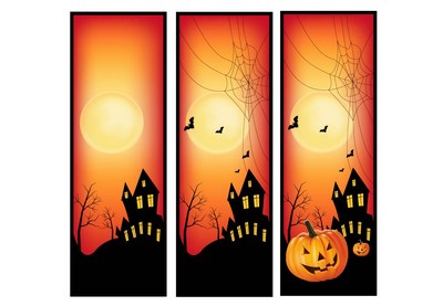
In this tutorial, you will have the opportunity to learn how to use the Gradient Mesh Tool to draw a Halloween banner.

If you’d like to skip this tutorial and just use this banner and three others in your work, you can go ahead and simply purchase Four Halloween Banners from GraphicRiver!

Four Halloween Banners

1. How to Draw the Jack O’Lantern

Step 1

To draw the pumpkin, consult my How to Create a Thanksgiving Background with a Pumpkin and Leaves in Adobe Illustrator tutorial.

Modify the pumpkin with Effect > Warp > Inflate, using -18% Bend.

Use Object > Expand Appearance afterwards.

warp effect

Step 2

Begin drawing the cutouts with Mesh.

Create an orange rectangle—the color is #F29F31.

Next, grab the Mesh Tool (U). Click to create nodes, which in turn create a Mesh Grid.
When you have a thick enough mesh grid, grab the edges of the
rectangle and move them to make the shape look like the one below.

Once you’re done with the shaping, select
the nodes on the right edge (they are already colored differently in the
screenshot) and color them with #4E2414.

Next, select the nodes that are darker (they’re selected below) and proceed to change their color to #AD681B.

Always make sure to select the nodes that are selected in each screenshot below and apply the corresponding color to them!

mesh pumpkin

Step 3

Continue using Mesh. Use these colors:

  1. #401A05
  2. #F29F31
  3. #5E210B
gradient mesh

Step 4

Draw one more part.

  1. #C26B10
  2. #4E2414
  3. #F29F31
vector pumpkin

Step 5

Combine the elements we made.

jack olantern

Step 6

Continue using Mesh.

  1. #FFB83A
  2. #6F3710
  3. #DD8D1C
  4. #C15F21
mesh tutorial

Step 7

  1. #8A2600
  2. #4C0F01
  3. #C35F22
  4. #B1511C
pumpkin vector

Step 8

Add a #2E1A0B triangle and create the next part.

vector adobe illustrator halloween banner

Step 9

  1. #F4AD24
  2. #3D1B06
  3. #823E06
  4. #E88015
halloween pumpkin tutorial

Step 10

  1. #F4AD24
  2. #491805
  3. #A96F1D
  4. #E98316
gradient mesh

Step 11

  1. #F4AD24
  2. #491805
  3. #E97723
  4. #76360C
  5. #A96F1D
mesh

Step 12

  1. #E9971E
  2. #2E150C
  3. #EB8023
  4. #F6B833
pumpkin tutorial

Step 13

Add a #381904 part to complete the look.

pumpkin mouth

Step 14

Place the elements onto the pumpkin.

jack olantern

2. How to Complete the Banner

Step 1

Draw a spider’s web with the Pen Tool. Use the #280707 color.

spiderweb vector

Step 2

Use a specific Stroke profile to draw black branches.

branch vector

Step 3

Create a dead tree out of the branches, and then Expand them and Unite them in the Pathfinder panel.

pathfinder

Step 4

Draw a black house with #FFCD34 windows.

halloween house

Step 5

Draw the moon. To create this round Mesh grid, begin with a rectangle and bend that into a circle.

Color it with these colors:

  1. #FDEEA4
  2. #FFD577
  3. #F9E682
  4. #FEF5C8

Set it to 80% Opacity.

moon vector

Step 6

Draw the Mesh banner.

  1. #F69F31
  2. #B5211D
  3. #FDE89A
mesh banner

Step 7

Add a black border.

vector banner

Step 8

Add all the details. You can learn to draw the bats in this tutorial of mine:

  • In this tutorial you will learn how to create a vector spooky Halloween background using the Mesh Tool and Image Trace in Adobe Illustrator!

halloween banner

Step 9

You’re done!

halloween banner

Awesome Work, You’re Now Done!

What now? You can try any of my other tutorials from my profile, or check out my portfolio on GraphicRiver, as well as the original vector we recreated in this tutorial.

I hope you enjoyed the tutorial, and I would be super happy to see any results in the comments below!

Four Halloween Banners

Check out some of my other tutorials!

How to Create a Detailed Stack of Books in Adobe Illustrator

Final product image
What You’ll Be Creating

Follow
this tutorial and learn how to easily create books with the help of
the 3D effect in Adobe Illustrator. Play with the settings to change the position of the
books and create a stack of them. Learn how to create the pages and
add extra details to level them up. Let’s start!

Need
more education resources and vectors? Head over to GraphicRiver and
you’ll find plenty of designs to choose from.

Tutorial
Assets

To
complete the tutorial, you will need the following assets:

1. How
to Open a New Document 

Launch
Illustrator
and
go to
File
> New
to
open a blank document. Type a name for your file, set the
dimensions, and then select
Pixels
as
Units
and
RGB
as
Color
Mode
.

Next,
go to
Edit
> Preferences > General
and
set the
Keyboard
Increment
to
1
px
and, while there, go to Units
to
make sure they are set as in the following image. I usually work with
these settings, and they will help you throughout the drawing process.

how to open new Illustrator document

2. How
to Create a 3D Book

Step
1

Grab
the Rounded Rectangle Tool and draw a shape with the dimensions
shown (1). Use the Direct Selection Tool (A) to select only the two
points on the right side and press the Delete key on your keyboard to
delete them. For the resulting path, select a 3 pt brown Stroke and
press the Round Cap option in the Stroke panel to get the rounded
ends (2).

how to create a 3D book path

Step
2

While
the path stays selected, go to
Effect
> 3D > Extrude & Bevel
.
There, set the Coordinates, the Depth, and the type of Surface, and you
will get the 3D book. How easy was that?

how to create a 3D book

3. How
to Map the Text on the 3D Book

Step
1

Let’s
create a new symbol. Grab the Type Tool (T) and write “Dictionary”
on your artboard. Choose Expand from the Object menu and then Rotate
-90 degrees
in the Transform panel.

Now,
go to Symbol Libraries Menu > Maps and find the Distance Maker
symbol. Drag it onto your artboard, Expand it, and then change the fill
color to black. Arrange one of these symbols at each end of the text
and, after you are done, drag everything into the Symbols panel to
save it.

how to create a new symbol

Step
2

While
the 3D book stays selected, open the Extrude & Bevel window again
from the Appearance panel. Press on the Map Art button and then
select the surface where you want to map the text along with the
symbol that you have saved. In my case, the side of the book was
Surface 12 of 14. You can scale the symbol and move it slightly until
you like the result. Hit OK.

how to map text on the 3D book

4. How
to Create the Pages of the Book

Step
1

With
the 3D book still selected, choose Expand Appearance from the Object
menu and then Ungroup (Shift-Control-G) once. Now, take a look at the
Appearance panel and open the resulting group, which I’ve named “brown
book
”. You will see a bunch of other groups and shapes. Select them
to see which one is which, and you can even rename some of them like
top cover”, “bottom cover”, and others.

Whilst
there, also find the shape shown below (1), which is the front edge of
the book, and then Ungroup (Shift-Control-G) and Copy and Paste in
Place (Shift-Control-V)
to make a copy of it, the blue edge (2). Grab
the Scissors Tool (C) and click on the two points indicated to cut
the shape in two and keep only the inner path (3). Now, select the
end points of this path and press Control-J to join them. You will
obtain the shape of the pages inside the book (4).

how to create the book pages

Step
2

Fill
the shape of the pages with the linear gradient shown (1); then
select only the points on the right side and move them slightly
inwards to reveal the corners of the book cover. Also, add an extra
point in the middle using the Add Anchor Point Tool (+) and make that
side a little rounded (2). Drag this shape in the “brown book
group, under the “top cover” but above the “bottom cover”.

how to color the book pages

Step
3

Copy
and Paste in Back (Control-B) the shape of the pages and replace the
gradient with a dark gray. Now, select the original shape of the
pages again and move it 1 px upwards and 2 px to the right using the
arrow keys on your keyboard to reveal the shadow shape underneath.

how to create shadow under book pages

Step
4

Let’s
add some details and create the appearance of actual pages. Use the
Pen Tool (P) to draw a bunch of straight paths of different lengths
on top of the pages shape (1). Do the same thing on the left side
(2). Give them a 2 pt light gray Stroke and select the Width Profile
4
in the Stroke panel (3).

how to add details on book pages

Step
5

Select
the shape of the pages and then Copy and Paste in Place
(Shift-Control-V)
to make a copy of it in front of everything. Set
this copy to stroke-none and fill-none. Now, select the group of
lines along with this copy (1) and go to Object > Clipping Mask >
Make (Control-7)
. Name the resulting group “page details” (2).

how to mask the book pages

Step
6

Use
the Pen Tool (P) to draw a path on the upper left side of the pages
(1). Give it a 2 pt black Stroke; then go to Effect > Blur >
Gaussian Blur
and apply a Radius of 3 px (2). Drag this path in the
page details” group under the mask. Also, drag the “page
details
” group in the “brown book” group above the pages (3).

how to add shadow on book pages

5. How
to Color the Text on the Book

Go
to the Layers panel, and in the “brown book” group, find and select
the text that was mapped on the side. Drag this group of text to the
top in the Layers panel (1). Change the fill color and then apply the
Drop Shadow effect.

how to color the text on the book

6. How
to Create Shading and Highlights on the Book

Step
1

Let’s
create the masking shape first. Go to the Layers panel, and in the
brown book” group, find and select the groups that make up the
side of the book. I had three groups (1). Copy and Paste in Place
(Shift-Control-V)
to make copies of them in front of everything.
Press Unite in the Pathfinder panel to merge them into a single shape
(2).

how to create the side shape of the book

Step
2

Use
the Pen Tool (P) to draw a straight path along the side of the book.
Give it a 2 pt black Stroke and then apply a 5 px Gaussian Blur.

how to create shading on side of the book

Step
3

Draw
another path along the side of the book to create a highlight this
time. Give it a 2 pt beige Stroke and then apply a 5 px Gaussian
Blur
.

how to create highlight on side of book

Step 4

Now,
select the shading and highlight paths along with the mask shape
created earlier that should be in front, and set to stroke-none and
fill-none. Go to Object > Clipping Mask > Make (Control-7).
Name the resulting group “side shading & highlight” and drag
it to the top of the “brown book” group in the Layers panel.

how to mask shading and highlight on side of book

Step
5

Use
the Pen Tool (P) to draw a path as shown below. Give it a 1 pt white
Stroke and also use the Black Blend Art Brush 100×3 (info below). Set
the Blending Mode to Soft Light and the Opacity to 75%.

I
have an entire tutorial dedicated to
Blend
Art Brushes
and
how useful they are. I use them in my drawings all the time. You can
find out how to create and save the
Black
Blend Art Brush 100×3
that
we are using today in
How
to Create a Set of Multi-Use Blend Brushes in Adobe Illustrator
.

Since
the Colorization of the brush is set to Tints, when you select white
as the stroke color, the brush becomes white as well, despite its
name. The same thing happens with any other color.

how to highlight the edge of book

7. How
to Create the Stack of Books

Step
1

At
this point, the brown book is ready, and you can create others in the
same way. Use a similar path as for the brown book, give it a 3 pt
blue Stroke, and don’t forget to press the Round Cap option in the
Stroke panel. Apply the 3D Extrude & Bevel effect with the
settings shown below, and you will get a new 3D book (2). 

After that,
follow the techniques explained so far to create the pages and the
details on the pages and to add shading and highlights, and use the same
settings. You can see the end result in the image below (3).

how to create a blue 3D book

Step
2

Use
another similar path, but slightly bigger, for the third book. Give it
a 3.5 pt red Stroke and then apply the 3D Extrude & Bevel effect
to obtain the 3D book. You can also map some text on the side of the
book as you did for the brown book (1). Finalize the book by creating
the pages, the details, the shading and highlights, and color the text
on the side (2).

how to create a red 3D book

Step
3

Here
are the settings and the final result of the fourth and final book,
the green one.

how to create a green 3D book

8. How
to Create Shadows of the Books

Step
1

To
create the shadows between the books, we will use the Blend Tool.
Focus on the green and red books and draw a path as shown in the next
image. Fill it with black and set the Opacity to 0% (1). Draw another
shape closer to the edge of the green book and fill it with black at
100% Opacity (2).

While
the two paths stay selected, go to Object > Blend > Blend
Options
and choose 10 Specified Steps. Go back to Object > Blend >
Make (Alt-Control-B)
. You can see the result in the image below (3).
You can modify these shapes and adjust the shadow if needed.

how to create shadow between books

Step
2

Use
the same technique to create shadows between the red and blue books
and between the blue and brown books, as shown in the next image.

how to create shadows in the stack of books

Congratulations,
You’re Done!

Here
is the final image of the stack of books. I hope you enjoyed this
tutorial and learned new things today. Apply these techniques in
other projects as well.

Need
more inspiration and resources? Head over to GraphicRiver, and you’ll
find plenty of designs to choose from. 

stack of 3D books final image

Looking to learn more? I recommend the following tutorials:

  • Want more character design? Here is how to create cute pencil characters in Adobe Illustrator.

  • Learn how to create a vector stack of colorful books and an e-book reader using the Mesh Tool in Adobe Illustrator!

  • It’s back to school time! Learn how to create school supply icons using basic shapes in Adobe Illustrator.

  • This infographic looks at how organisations worldwide are battling to improve education for girls. Here we’ll learn how to put together the infographic in…

How to Create an Easy Rangoli Design for Diwali in Adobe Illustrator

Final product image
What You’ll Be Creating

In the following steps, you will learn how to create an easy rangoli design for Diwali in Adobe Illustrator.

For starters, you will learn how to set up a simple grid and how to easily create the starting shape. Taking full advantage of the Appearance panel, you will learn how to decorate the edges of the first shape. Using basic vector shape building techniques, the Appearance panel and a bunch of Transform effects, you will learn how to stylize the interior of your circle.

Finally, you will learn how to create a flat background and how to add a subtle shadow below your final rangoli design.

For more inspiration on how to adjust or improve your final design, you can find plenty of resources at GraphicRiver.

What You Will Need

You will need the following resource in order to complete this project:

1. How to Create a New Document and Set Up a Grid

Hit Control-N to create a new document. Select Pixels from the Units drop-down menu, enter 850 in the width and height boxes, and then click that More Settings button. Select RGB for the Color Mode, set the Raster Effects to Screen (72 ppi), and then click Create Document.

Enable the Grid (View > Show Grid) and the Snap to Grid (View > Snap to Grid). You will need a grid every 10 px, so simply go to Edit > Preferences > Guides & Grid, and enter 10 in the Gridline every box and 1 in the Subdivisions box. Try not to get discouraged by all that grid—it will make your work easier, and keep in mind that you can easily enable or disable it using the Control-“ keyboard shortcut.

You can learn more about Illustrator’s grid system in this short tutorial from Andrei Stefan: Understanding Adobe Illustrator’s Grid System.

You should also open the Info panel (Window > Info) for a live preview with the size and position of your shapes. Don’t forget to set the unit of measurement to pixels from Edit > Preferences > Units. All these options will significantly increase your work speed.

set up grid

2. How to Create the First Circle

Step 1

Pick the Ellipse Tool (L) and focus on your Toolbar. Remove the color from the stroke and then select the fill and set its color to R=23 G=50 B=127. Move to your artboard and simply create a 490 px circle—the grid and the Snap to Grid will make things easier.

Open the Align panel (Window > Align). Set the aligning to Artboard (open the fly-out menu and go to Show Options if you can’t see the Align To section as shown in the following image) and then simply click the Horizontal Align Center and Vertical Align Center buttons. This will move your shape to the center of the canvas.

circle

Step 2

Make sure that your shape is still selected, and open the Appearance panel (Window > Appearance).

Select the stroke, set its color to R=255 G=213 B=6, and then open that Stroke fly-out panel. Set the Weight to 10 px and check the Align Stroke to Outside button.

stroke

Step 3

Make sure that your shape stays selected, and keep focusing on the Appearance panel.

Select the entire path (simply click that Path piece of text from the top of the panel) and go to Effect > Distort & Transform > Zig Zag. Enter the attributes shown in the following image, and click OK.

zig zag

3. How to Decorate the Edges of the First Circle

Step 1

Pick the Ellipse Tool (L) and create two 30 px circles. Fill both shapes with R=250 G=0 B=8 and place them as shown in the following image.

Select both shapes and turn them into a simple compound path (Object > Compound Path > Make or Control-8).

compound path

Step 2

Make sure that your compound path stays selected and focus on the Appearance panel.

Select the stroke and set its color to R=255 G=213 B=6. Change the Weight to 10 px and don’t forget to align it to outside.

align to outside

Step 3

Make sure that your compound path stays selected and focus on the Appearance panel. Use the Add New Fill button to add a second fill and select it.

Set the color to white (R=255 G=255 B=255) and go to Effect > Path > Offset Path. Enter a -10 px Offset and click OK.

offset path effect

Step 4

Make sure that your compound path stays selected and focus on the Appearance panel.

Select the entire path and go to Effect > Distort & Transform > Transform. Enter the attributes shown below and click OK.

transform effect

Step 5

Pick the Ellipse Tool (L) and create two 10 px circles. Fill both shapes with R=30 G=148 B=255 and place them as shown in the following image.

Select both shapes and turn them into a new compound path (Object > Compound Path > Make or Control-8).

second compound path

Step 6

Make sure that your new compound path stays selected and focus on the Appearance panel.

Select the stroke and set its color to R=255 G=214 B=6. Change the Weight to 10 px and don’t forget to align it to outside.

stroke

Step 7

Make sure that your newer compound path stays selected and focus on the Appearance panel.

Select the entire path and go to Effect > Distort & Transform > Transform. Enter the attributes shown below and click OK.

transform effect

Step 8

Make sure that your newer compound path is still selected, and go again to Effect > Distort & Transform > Transform. Enter the attributes shown below and click OK.

transform effect

4. How to Decorate the First Circle

Step 1

Switch to a gridline every 5 px. Just go to Edit > Preferences > Guides & Grid and enter 5 in the Gridline every box.

Pick the Ellipse Tool (L) and create an 80 x 145 px shape. Fill this new shape with white, place it as shown in the first image, and make sure that it stays selected.

Pick the Anchor Point Tool (Shift-C) and click the bottom anchor point. Move to the top anchor point, click on it, and then drag the handle 10 px to the right. Keep focusing on the handles of this anchor point and drag them as shown in the third image. The grid and the Snap to Grid feature will once again come in handy.

anchor point tool

Step 2

Make sure that your white shape stays selected, and focus on the Appearance panel.

Select the stroke and set its color to R=255 G=213 B=6. Change the Weight to 10 px and don’t forget to check the Round Join button.

stroke

Step 3

Make sure that your white shape stays selected and focus on the Appearance panel.

Select the entire path and go to Effect > Distort & Transform > Transform. Enter the attributes shown below and click OK.

transform effect

Step 4

Make sure that your white shape is still selected, and go again to Effect > Distort & Transform > Transform. Enter the attributes shown below and click OK.

transform effect

Step 5

Make sure that your white shape is still selected, and go one more time to Effect > Distort & Transform > Transform. Enter the attributes shown below and click OK.

transform effect

Step 6

Pick the Ellipse Tool (L) and create an 80 x 145 px shape. Fill this new shape with R=30 G=148 B=255, place it as shown in the first image, and make sure that it stays selected.

Pick the Anchor Point Tool (Shift-C) and click the bottom anchor point. Move to the top anchor point, click on it, and then drag the handle 5 px to the right, as shown in the second image.

anchor point tool

Step 7

Make sure that your blue shape stays selected and focus on the Appearance panel.

Select the stroke and set its color to R=1 G=1 B=71. Change the Weight to 10 px and don’t forget to align it to inside.

stroke

Step 8

Make sure that your blue shape stays selected and focus on the Appearance panel.

Use the Add New Stroke button to add a second stroke and select it. Set its color to R=1 G=1 B=71, change the Weight to 10 px, align it to outside, and don’t forget to check that Round Join button.

add new stroke

Step 9

Make sure that your blue shape stays selected and focus on the Appearance panel.

Select the entire path and go to Effect > Distort & Transform > Transform. Enter the attributes shown below and click OK.

transform effect

Step 10

Make sure that your blue shape is still selected and go again to Effect > Distort & Transform > Transform. Enter the attributes shown below and click OK.

transform effect

5. How to Create the Second Circle

Step 1

Pick the Ellipse Tool (L), create a 300 px circle, and center it using the same commands from the Align panel.

Fill this new shape with R=250 G=0 B=8 and then select the stroke. Set its color to R=255 G=214 B=6, change the Weight to 10 px, and don’t forget to align it to outside.

red circle

Step 2

Make sure that your red circle stays selected and focus on the Appearance panel.

Select the entire path and go to Effect > Distort & Transform > Zig Zag. Enter the attributes shown below and click OK.

zig zag

6. How to Decorate the Second Circle

Step 1

Pick the Rectangle Tool (M) and create a 60 x 100 px shape. Fill this shape with white and place it as shown in the first image.

Make sure that your rectangle stays selected and go to Object > Path > Add Anchor Points. Pick the Delete Anchor Point Tool (-) and simply click the corner anchor points to remove them. This will basically turn your rectangle into a rhombus.

Keep focusing on this shape and switch to the Direct Selection Tool (A). Select the left and right anchor points (highlighted in the third image) and simply drag them 10 px down as shown in the fourth image.

rhombus

Step 2

Make sure that your white shape stays selected and focus on the Appearance panel.

Select the stroke and set its color to R=255 G=214 B=6. Change the Weight to 10 px, align it to outside, and don’t forget to check the Round Join button.

stroke

Step 3

Make sure that your white shape stays selected and focus on the Appearance panel.

Select the entire path and go to Effect > Distort & Transform > Transform. Enter the attributes shown below and click OK.

transform effect

Step 4

Make sure that your white shape is still selected and go again to Effect > Distort & Transform > Transform. Enter the attributes shown below and click OK.

transform effect

Step 5

Make sure that your white shape is still selected and go one more time to Effect > Distort & Transform > Transform. Enter the attributes shown below and click OK.

transform effect

Step 6

Pick the Ellipse Tool (L) and create a 50 x 125 px shape. Fill this squeezed circle with a random green, place it as shown in the first image, and make sure that it stays selected.

Pick the Anchor Point Tool (Shift-C) and click the bottom anchor point. Move to the top anchor point, click on it, and then drag the handle 5 px to the right, as shown in the second image.

squeezed circle

Step 7

Make sure that your squeezed shape stays selected and focus on the Appearance panel. Change the fill color to R=250 G=0 B=8.

Select the stroke and set its color to R=1 G=1 B=71. Change the Weight to 10 px and don’t forget to align it to inside.

stroke

Step 8

Make sure that your squeezed shape stays selected and focus on the Appearance panel.

Use the Add New Stroke button to add a second stroke and select it. Set its color to R=255 G=214 B=6, change the Weight to 10 px, align it to outside, and don’t forget to check that Round Join button.

stroke

Step 9

Make sure that your squeezed shape stays selected and focus on the Appearance panel.

Select the entire path and go to Effect > Distort & Transform > Transform. Enter the attributes shown below and click OK.

transform effect

Step 10

Make sure that your squeezed shape is still selected and go again to Effect > Distort & Transform > Transform. Enter the attributes shown below and click OK.

ABCD

7. How to Create the Third Circle

Step 1

Pick the Ellipse Tool (L), create a 100 px circle, and center it using the same commands from the Align panel.

Fill this new shape with R=1 G=1 B=71 and then select the stroke. Set its color to R=255 G=214 B=6, change the Weight to 10 px, and don’t forget to align it to outside.

dark circle

Step 2

Make sure that your dark circle stays selected, and focus on the Appearance panel.

Select the entire path and go to Effect > Distort & Transform > Zig Zag. Enter the attributes shown below and click OK.

zig zag

8. How to Create a Speech Bubble and the Background

Step 1

Pick the Rectangle Tool (M) and create a 290 x 55 px shape. Fill this new shape with white and place it as shown in the following image.

white rectangle

Step 2

Pick the Rectangle Tool (M) and create a 60 px square. Fill this new shape with R=30 G=148 B=255 and place it as shown in the following image. Switch to the Delete Anchor Point Tool (-) and click the bottom-left anchor point to remove it.

triangle

Step 3

Pick the Type Tool (T) and open the Character panel (Window > Type > Character). Select the Baker Street Inline font and set the size to 270 px.

Move to your artboard and simply click on it. Type your text and set the color to R=30 G=148 B=255.

type tool

Step 4

Pick the Rectangle Tool (M) and create an 870 px square. Fill this new shape with R=5 G=26 B=115, make sure that it covers your entire artboard, and then send it to the back (Object > Arrange > Send to Back or Shift-Control-[).

background

Step 5

Pick the Ellipse Tool (L) and create a 490 px circle. Fill this new shape with R=1 G=1 B=71 and place it as shown in the following image.

shadow shape

Step 6

Make sure that your dark circle is still selected, change its Blending Mode to Soft Light and go to Effect > Blur > Gaussian Blur. Enter a 50 px Radius and click OK.

Send this shape to the back (Object > Arrange > Send to Back or Shift-Control-[) and then bring it one step forward (Control-]).

gaussian blur

Congratulations! You’re Done!

Here is how your easy rangoli design for Diwali should look. I hope you’ve enjoyed this tutorial and can apply these techniques in your future projects. Don’t hesitate to share your final result in the comments section.

Feel free to adjust the final design and make it your own. You can find some great sources of inspiration at GraphicRiver, with interesting solutions to improve your design.

easy rangoli design for Diwali

Looking for more awesome vector tutorials to try? I recommend these following tutorials as your next step: