How to Create a Scary Back Alley Scene in Adobe Illustrator

Final product image
What You’ll Be Creating

Welcome back to another Illustrator
tutorial, in which we’re going to take a close look at the process of
creating a scary scene. You’ll see how easy it is to put it together using nothing
more than a few geometric shapes and tools.

So assuming you already
grabbed a fresh mug of coffee, let’s get started!

Also, don’t forget you can always add new elements to the illustration by heading over to GraphicRiver, where you’ll find a great selection of scary vector assets.

1. How to Set Up a New Project File

Assuming you already have Illustrator up
and running in the background, bring it up and let’s set up a New Document (File > New or Control-N)
which we will adjust as follows:

  • Number
    of Artboards:
    1
  • Width:
    800
    px
  • Height:
    600
    px
  • Units:
    Pixels

And from the Advanced tab:

  • Color
    Mode:
    RGB
  • Raster
    Effects:
    Screen (72ppi)
  • Preview Mode: Default
setting up a new document

2. How to Set Up the Layers

Once we’ve finished setting up our project
file, it would be a good idea to structure our document using a couple of
layers, since this way we can maintain a steady workflow by focusing on one
section of the illustration at a time.

That being said, bring up the Layers panel, and create a total of two
layers, which we will rename as follows:

  • layer
    1:
    background
  • layer 2: foreground
setting up the layers

Quick tip: I’ve colored all of
my layers using the same green value, since it’s the easiest one to view when
used to highlight your selected shapes (whether they’re closed or open paths).

3. How to Create the Main Background Shape

Now that we’ve finished layering our
document, we can start working on the actual project, and we will do so by
gradually building the background. That being said, make sure you’ve positioned
yourself on the first layer, and let’s jump straight into it!

Using the Rectangle Tool (M), create an 800 x 600 px rectangle, which we will
color using #2A323D and then position in the center of the underlying Artboard
using the Align panel’s Horizontal and Vertical Align Center options.

creating the main background shape

4. How to Create the Brick Wall

With the main background shape in place,
we can shift our focus over to the center of the Artboard, where we will create
the visible section of the brick wall.

Step 1

Start by creating a 480 x 396 px rectangle, which we will
color using #F76C5E and then center align to the underlying Artboard, positioning it at a distance of 78 px from
its top edge.

creating and positioning the main shape for the brick wall

Step 2

Adjust the upper
section of the shape by individually selecting its two anchor points using the Direct Selection Tool (A), and then
pushing them to the inside by 200 px using the Move tool
(right click > Transform > Move
> Horizontal > +/- 200 px
depending on which side you start with).

adjusting the shape of the brick wall

Step 3

Start adding the
first row of bricks using sixteen 32 x
16 px
rectangles with a 4 px thick
Stroke (#DD4C45), which we will
group using the Control-G keyboard
shortcut and then center align to the bottom of the wall, making sure that
their bottom outline falls outside of its surface.

creating the first row of bricks

Step 4

Create a copy (Control-C > Control-F) of the row
that we’ve just grouped, and then position it above, making sure to push it to
the right by 16 px
using either the directional arrow keys or the Move tool (right click >
Transform > Move > Horizontal > 16 px
).

adding the second row of bricks

Step 5

Add the remaining
bricks by selecting the two rows that we currently have and then dragging them
to the top while holding down the Alt
and Shift keys, making sure their
outlines overlap as seen in the reference image. 

As soon as you have the first duplicates,
add the remaining ones by pressing the Control-D
keyboard shortcut until you’ve filled in the wall. Once you’re done, remove the
extra top row and then select and group (Control-G)
all the remaining ones together before moving on to the next step.

adding the remaining rows of bricks

Step 6

Next, we’re going to mask the
rows that we’ve just grouped using a copy (Control-C)
of the underlying wall, which we will paste in front (Control-F) and then, with both of them selected, simply right click > Make Clipping Mask.

masking the brick rows

Step 7

Take a couple of
moments and enhance some of the bricks by double clicking on them to isolate
them, and then opening up either their top or bottom paths as seen in the
reference image. Once you’re done, press the Escape key to exit Isolation
Mode
, and then select both the bricks and the wall and group them together
using the Control-G keyboard
shortcut.

opening up the paths of some of the bricks

5. How to Create the Sidewalk

Now that we’ve finished working on the
brick wall, we can move towards the bottom of the Artboard, where we will
quickly build the sidewalk.

Step 1

Create the main shape
for the projected light using a 560 x 48
px
ellipse, which we will color using #F76C5E and then position below the wall
as seen in the reference image.

creating the main shape for the projected light

Step 2

Add the visible
section of the sidewalk using a 560 x 24
px
rectangle (#2A323D), which we will position on the upper half of the
ellipse, making sure to select and group the two together afterwards using the Control-G keyboard shortcut.

creating the main shape for the sidewalk

6. How to Create the Suspended Street
Light

With the wall and sidewalk in place, we
can now focus on the last piece of the background, which we will create one
shape at a time.

Step 1

Create the vertical
body of the post using an 8 x 48 px rounded
rectangle (#2A323D) with a 4 px Corner
Radius
, which we will center align to the wall’s top edge as seen in the
reference image.

creating the vertical section of the light post

Step 2

Add the horizontal segment
holding the post to the wall using a 16
x 12 px
rectangle (#2A323D), which we will position 8 px from the previous shape’s bottom
edge.

creating the horizontal section of the light post

Step 3

Create the little
side details using two 2 x 4 px rectangles, which we will color using #2A323D and then position as seen in the reference
image. Once you’re done, select and group the four shapes together using the Control-G keyboard shortcut.

adding the side segments to the base of the light post

Step 4

Add the light bulb
using a 28 x 16 px ellipse, which we
will color using #FFE7C5 and then position on the upper section of the stand
so that its upper half goes outside of the wall’s surface.

creating the light bulb

Step 5

Adjust the shape that
we’ve just created by removing its upper half. You can do that by selecting its top anchor point
using the Direct Selection Tool (A)
and then pressing Delete, making sure
to close the resulting path using the Control-J
keyboard shortcut. Once you’re done, select and group (Control-G) all of the light’s composing shapes together, doing the
same for the entire background before locking the current layer and moving on
to the next section of the illustration.

adjusting the shape of the light bulb

7. How to Create the Door Entrance

Now that we have our background in place,
we can shift our focus over to the foreground, where we will continue working
on our scene. So assuming you’ve positioned yourself on the second layer,
let’s start working on the little door frame.

Step 1

Create the inner
section of the room using a 120 x 278 px
rectangle, which we will color using #2A323D and then center align to the
upper edge of the sidewalk.

creating the inner visible section of the room

Step 2

Start working on the
right section of the door frame by creating an 18 x 278 px rectangle (#FFE7C5), which we will position on the
left side of the previous shape.

creating the main shape for the left section of the door frame

Step 3

Add the bottom
decorative insertion using a 10 x 96 px rectangle
(#2A323D), on top of which we will add a smaller 2 x 88 px one (#FFE7C5), which we will group (Control-G) and then position 4 px from the previous shape’s bottom edge.

adding the bottom decorative insertion to the right section of the door frame

Step 4

Create the upper
insertion using a copy (Control-C >
Control-F
) of the one that we’ve just grouped, which we will then position
on the opposite side of the frame, making sure to maintain the same 4 px gap.

adding the top decorative insertion to the right section of the door frame

Step 5

Add the vertical
detail lines using three 2 x 70 px rectangles
(#2A323D) which we will horizontally stack 2 px from one another, grouping (Control-G) and then positioning them between the two decorative
insertions.

adding the decorative lines to the right section of the door frame

Step 6

Finish off the
current section of the frame by adding the hard shadow using an 18 x 8 px rectangle, which we will color
using #2A323D and then align to the upper edge of the frame. Once you’re done,
select and group (Control-G) all of its composing shapes together before moving on to the
next step.

adding the hard shadow to the right section of the door frame

Step 7

Create the left section of the frame using a copy (Control-C
> Control-F
) of the one that we’ve just finished working on, which we
will position on the opposite side of the entrance.

adding the left section of the door frame

Step 8

Start working on the
upper section of the frame by creating a 172
x 18 px
rectangle (#FFE7C5), which we will position on top of the entrance, as seen in the reference image.

creating the upper section of the door frame

Step 9

Add the round decorative
elements using two 14 x 14 px circles
(#FFE7C5), which we will position on the upper section of the frame, making
sure to center align them to the frame’s side sections.

adding the circular decorative pieces to the upper section of the frame

Step 10

Create the decorative
insertion using a 164 x 10 px rectangle
(#2A323D), on top of which we will add a smaller 156 x 2 px one (#FFE7C5), grouping (Control-G) and then positioning the two in the center of the
frame’s top section.

adding the decorative insertion to the upper section of the frame

Step 11 

Add the main shape
for the raised portion using a 108 x 12
px
rectangle, which we will color using #FFE7C5 and then position as seen
in the reference image.

adding the raised segment to the upper section of the door frame

Step 12

Create the side
curvatures using two 12 x 12 px circles
(#FFE7C5), which we will position on the sides of the previous shape and then
adjust by selecting their top and outer anchor points using the Direct Selection Tool (A) and then
removing them by pressing Delete.
Close the resulting paths using the Pen
Tool (P)
, and once you’re done, move on to the next step.

adding the round side sections to the raised portion of the door frame

Step 13

Add the vertical
insertion lines using thirteen 4 x 8 px rectangles
(#2A323D) horizontally stacked 4 px from
one another, grouping (Control-G)
and then center aligning them to the bottom edge of the raised section. Take
your time, and once you’re done, make sure you select and group (Control-G) all of the current section’s
composing shapes together, doing the same for the entire door afterwards.

adding the vertical insertion lines to the raised segment of the door frame

8. How to Create the Doorbell

Once we’ve finished working on the
entrance, we can move over to its right side and quickly create the little
doorbell.

Step 1

Create the base of
the bell using an 8 x 12 px rectangle, which we will color using #FFE7C5 and then position 14 px from the door frame’s right
section and 16 px from its three
vertical insertion lines.

creating and positioning the main shape for the doorbell

Step 2

Add the smaller side
sections using two 2 x 8 px rectangles, which we will color using #FFE7C5 and then position as seen in the reference
image.

adding the side sections to the doorbell

Step 3

Create the round
endpoints using two 4 x 4 px circles
(#FFE7C5), which we will position onto the doorbell’s center shape so that
their inner halves overlap it.

adding the circular endpoints to the doorbell

Step 4

Finish off the
doorbell by adding the little button using a 4 x 4 px circle, which we will color using #2A323D and then center
align to the larger body. Once you’re done, select and group (Control-G) all of its composing shapes, before moving on to the next section of the illustration.

adding the circular button to the doorbell

9. How to Create the Scary Monster

As soon as we’ve finished working on the
doorbell, we can shift our focus back to the entrance, where we will change the
mood of the scene by adding the dark yet friendly presence.

Step 1

Start working on the
mouth by creating a 56 x 8 px ellipse, which we will color using #F76C5E and then center align to the entrance,
positioning it 84 px from
its top edge.

creating the main shape for the mouth of the monster

Step 2

Adjust the shape that we’ve just created by
first selecting it and then pinching its left and right anchor points using the
Anchor Point Tool (Shift-C).

adjusting the outer anchor points of the mouth

Step 3

Select the resulting
shape’s top anchor point using the Direct
Selection Tool (A)
and then push it to the bottom by 16 px using the Move tool (right click >
Transform > Move > Vertical > 16 px
).

adjusting the shape of the mouth

Step 4

With the fill color
set to #2A323D, draw the crooked teeth with the help of the Pen Tool (P), using the reference image
as your main guide. Once you’re done, select the resulting
shape and the mouth and group the two together using the Control-G keyboard shortcut.

drawing the teeth

Step 5

Create the main shape
for the right eye using a 10 x 10 px circle
(#F76C5E), which we will adjust by selecting and pushing its top and bottom
anchor points to the right side by 1 px and its left and right ones to the bottom by another 1 px. Once you’re done, position the
resulting shape above the mouth as seen in the reference image.

creating the main shape for the right eye

Step 6

Add the iris using a 2 x 6 px ellipse (#2A323D), which we
will center align to the resulting eye, making sure to position it 3 px from its right
edge. Once you have the shape in place, select and group the two together using
the Control-G keyboard shortcut.

adding the iris to the right eye

Step 7

Create the left eye
using a copy (Control-C > Control-F)
of the one that we’ve just finished working on, which we will vertically reflect
(right click > Transform > Reflect
> Vertical
) and then position on the opposite side of the mouth. Once
you’re done, select and group (Control-G)
all of the monster’s composing shapes, before moving on to the next section.

adding the left eye

10. How to Create the Ball

We are now down to the last section of our
little composition, which will help us achieve that level of scariness that we
want our illustration to portray. So, assuming you’ve finished working on the
monster, shift your focus over to the bottom section of the entrance, and let’s
wrap things up!

Step 1

Create the main shape
of the ball using a 28 x 28 px circle, which we will color using #F76C5E and then align to the entrance’s bottom edge.

creating and positioning the main shape for the ball

Step 2

Add the little rings
using four 32 x 16 px ellipses with
a 2 px thick Stroke (#2A323D), which we will adjust by selecting and removing
their top anchor points, vertically stacking the resulting shapes 4 px from one another. Once you’re
done, select and group (Control-G)
all the rings together, doing the same for the entire ball afterwards.

adding the rings to the ball

Step 3

Create the main shape
for the dripping blood using a 4 x 8 px rectangle
(#F76C5E), which we will adjust by setting the Radius of its bottom corners to 2 px from within the Transform
panel’s Rectangle Properties,
positioning the resulting shape on the sidewalk as seen in the reference
image.

creating the main shape for the dripping blood

Step 4

Add the side sections
using two 8 x 8 px circles (#F76C5E), which we will adjust by removing their bottom and outer anchor points, closing
and positioning the resulting paths on the sides of the previous shapes as seen
in the reference image. Make sure to select and group (Control-G) all three of them afterwards.

adding the side sections to the dripping blood

Step 5

Finish off the current section, and with it the project itself, by adding the projected shadow, which we will
create using a 24 x 20 px ellipse (#2A323D). Position it on the lower section of the sidewalk, at a distance of
10 px from the projected light’s
bottom edge. Once you’re done, select and group all of the foreground’s
composing shapes using the Control-G
keyboard shortcut, before hitting that save button.

finishing off the illustration

Great Job!

As always, I hope you had fun working on
the project and most importantly managed to learn something new and useful
along the way.

If you have any questions, feel free to post them within the comments section, and
I’ll get back to you as soon as I can!


finished project preview

How to Create a Tribal African Inspired Pattern in Adobe Illustrator

Final product image
What You’ll Be Creating

In this tutorial we will create a simple yet beautiful circular African pattern in Adobe Illustrator. We’ll use basic shapes to create various spiritual symbols such as the ankh cross and cowrie shells. Then we’ll combine them into a neat composition, forming a seamless pattern that will fit perfectly as a wallpaper, prints, on a shirt, or any other things you would like to use this for. Let’s get started!

If you’re looking for vector patterns for your projects, why not head on over to GraphicRiver.

1. How to Set Up the Artboard

Create a new 600 px by 600 px document in Illustrator with the given settings:

Setting up the canvas

2. How to Create the Base Circular Shapes

Step 1

Activate the Pen Tool (P), fill the first shape with black #000000, and draw a circular shape on the left corner as shown below.

Drawing the first layer

Step 2

Next, activate the Pen Tool (P), fill it with yellow #dc942e, and draw another layer as shown below. Then, Right-Click > Arrange > Send to Back.

Adding another layer

Step 3

We want to add more layers. Activate the Pen Tool (P), fill it with red #c8282f, and draw another layer as shown below. Leave a bit of white space.

Adding a red layer

Step 4

We want to add more layers, so select the Pen Tool (P), fill it with black #000000, and add another layer as shown below.

Adding a black layer

Step 5

Next, use the Pen Tool (P), and fill it with red #c8282f. Then, draw another layer and fill it with yellow #dc942e.

Adding two extra layers

Step 6

Now, use the Pen Tool (P), fill it with dark magenta #691125, and then draw another layer and fill it with yellow #dc942e as shown below. Next, activate the Pen Tool (P), fill with red #c8282f, and then draw a wavy shape under the yellow shape. Select the shape, and add a 4 pt black stroke.

Adding four more layers to the pattern

Step 7

Next, we want to add four more layers. Select the Pen Tool (P). Fill the first layer with yellow #dc942e, the second layer in black #000000, the next layer in red #c8282f, and the last one in black #000000, as shown below.

Adding 4 extra layers

Step 8

Next, we want to add four more layers. Select the Pen Tool (P) and fill the first layer with red #c8282f, the second layer in black #000000, the next layer in yellow #dc942e, and the last one in red #c8282f, as shown below.

Adding 4 more layers

Step 9

Now we want to add the final layers of the base. Activate the Pen Tool (P), and fill the first layer with black #000000 and the last layer with dark turquoise #065a5e.

Adding the final layers of the base

3. How to Add Elements Inside the Circular Shapes

Step 1

Let’s start adding elements inside each circular shape, from the top. Activate the Pen Tool (P), fill it with dark turquoise #065a5e, and draw the shape shown below. Next, duplicate the shape to fill the space. Select the shape, hold down the Alt key, and drag the shape on the artboard. Then press Control-D to duplicate it.

Adding shapes inside the third black layer

Step 2

Next, we want to add circles inside the new shapes that we have just created. Activate the Ellipse Tool (L), fill it with yellow #dc942e, and draw small circles inside each turquoise object as shown below.

Adding circles

Step 3

Now, we want to add more depth in the layer. Select the Ellipse Tool (L), fill it with black #000000, and draw a small circle inside each yellow circle as shown below.

Adding black circles inside the yellow ones

Step 4

Now let’s move on to the next layer. Activate the Ellipse Tool (L), fill it with black #000000, and draw a stretched circle between each space as shown below.

Adding circles on the next layer

Step 5

Next, let’s add more objects on the next layer. Activate the Rectangle Tool (M), fill it with black #000000, and drag four small rectangles on the red layer as shown below.

Adding rectangles inside the red layer

Step 6

Now, we want to add more depth on this layer also. Activate the Rectangle Tool (M). Fill the first rectangle with yellow #dc942e and place it inside the first black rectangle. Next, duplicate the yellow rectangle, hold down Alt on the keyboard, and drag it onto the second black rectangle, changing the color to dark turquoise #065a5e. Next, duplicate each colored rectangle and place them as shown below.

Adding more elements on the red layer

Step 7

Next, we want to add circles on the next layer. Activate the Ellipse Tool (L), fill it with yellow #de9b3f, and fill the space with circles as shown below. Duplicate the first one by pressing Alt on the keyboard, and then press Control-D to duplicate more circles. 

Adding circles on the black layer

Step 8

Now, we want to add more elements on this layer. Select the Ellipse Tool (L), fill it with dark turquoise #065a5e, and draw a circle inside each yellow circle as shown below.

Adding more circles

Step 9

Next, we want to add more circles on this layer. Activate the Ellipse Tool (L), fill it with white #ffffff, and then fill the space with small circles as shown below. 

adding more circles

4. How to Create the Ankh Cross

Step 1

Activate the Pen Tool (P), change the stroke to white #ffffff, and draw a water drop outline.

Base of the Ankh cross

Step 2

Next, activate the Pen Tool (P), and draw the outer layer to finish the cross as shown below.

Finish the cross

Step 3

Now we want to change the color of the ankh before adding it on the next layer. Activate the Selection Tool (V), select the first shape, and fill it in black #000000. Select the outer shape and fill it in white #ffffff, and then Right-Click > Arrange > Send to Back.

Changing the color of the cross

5. How to Add the Ankh Cross & Other Elements

Step 1

Now we want to add the cross on the black layer. Drag the cross on the layer, activate the Selection Tool (V), and resize the cross, holding Shift while resizing. Then, hold down Alt to duplicate the object and fill the space as shown below.

Adding the Ankh cross

Step 2

Next, we want to add elements on the next layer. Activate the Pen Tool (P), no filling, and change the stroke color to white #ffffff and the stroke size to 3 pt. Then draw three vertical lines and press Control-G to group them. Then, draw four horizontal lines and press Control-G to group them. Next, duplicate each grouped object by holding down Alt on the keyboard, and fill the space as shown below.

6. How to Duplicate the Design to Fill the Artboard

Step 1

Now that we have finished drawing all elements, we want to duplicate the same design on the other side of the artboard to finalize the pattern. Activate the Selection Tool (V), select all elements, and press Control-G to group them. Next, press Alt on the keyboard and drag the duplicated shape to the empty side of the artboard. 

Step 2

Next, select the duplicated design, and Right-Click > Transform > Rotate. Change the Angle to 180 and click OK.

Step 3

Now that we’ve rotated our design, we want to change the turquoise color to red and the red color to turquoise to bring a bit more contrast. Activate the Direction Selection Tool (A), click on the turquoise layer, and use the Eyedropper Tool (I) to sample the red color from any red layers. Use the same technique to change the red layer. 

Changing colors of the duplicated design

Step 4

Next, activate the Pen Tool (P), change the stroke to black #000000, and draw a line at the border of the turquoise and red layer as shown below.

Adding the black layers to break down the design

7. How to Add More Objects to Fill the Remaining Space

Step 1

Activate the Selection Tool (V), select one grouped design, and hold down Alt to duplicate it. Then resize it and place it in the bottom left corner. Then, activate the Direction Selection Tool (A) and click on each turquoise area, changing the color to yellow and the last layer to black as shown below. Use the Eyedropper Tool (I) to sample colors.

Adding more designs on the artboard

Step 2

Next, duplicate the designs from the bottom left corner to the top right corner. Select the design, press Alt, and drag it to the top right corner. Then, Right-Click > Transform > Rotate. Change the Angle to 180 and click OK.

Duplicating the designs at the top right corner

Step 3

We want to fill the white space. First activate the Pen Tool (P), fill it with yellow #dc942e, and draw over the left white space. Then Right-Click > Arrange > Send to Back. Next, use the Pen Tool (P), fill it with red #c8282f, and draw over the right white space. Then Right-Click > Arrange > Send to Back.

Adding colors on the white background

Step 4

Activate the Pen Tool (P), fill it with black #000000, and draw some layers on the shapes we’ve created previously as shown below.

Adding black layers on the colored shapes

8. How to Draw the Cowrie Shell

Step 1

Activate the Pen Tool (P), and draw half of the shell as shown below. Start from the top. Don’t worry—it doesn’t have to be perfect. 

Drawing the cowrie shell

Step 2

Continue drawing the shape as shown below, and close the path at the starting point. 

Finishing the cowrie shell

Step 3

Now that we’ve finished drawing our shell, select it and change the color to white #ffffff.

Filling the color in white

Step 4

Next, we want to add the shell on the two black layers in the middle. Select the cowrie shell, resize it while holding Shift, and duplicate the shells to fill both black layers as shown below. Press Alt, and drag the shell to duplicate it as many times as needed.

Adding the cowrie shells

Step 5

Now that we’ve added the cowrie shells, we want to add circles on the empty black layers under the triangle created previously. Activate the Ellipse Tool (L), fill it with white #ffffff, and draw circles as shown below.

Adding more circles on the black layers

9. How to Make a Seamless Pattern

Step 1

Here is the fun part!. We want to make the pattern seamless, but first we want to get rid of any objects hanging off the canvas. Select the Rectangle Tool (M), fill it in any color, and then drag it on the artboard. Next, select everything on the artboard, and Right-Click > Make Clipping Mask.

Making a clipping mask
End result of clipping mask

Step 2

Now, we want to create a seamless pattern. Select the pattern, and go to Object > Pattern > Make. Change the Width and Height to 600 px.

Showing how to create a seamless pattern

Congratulations! Our Circular African Pattern Is Finished!

I hope you’ve enjoyed the tutorial and discovered some useful things! Keep creating!

Final Pattern

How to Create a Retro Interior in Adobe Illustrator

Final product image
What You’ll Be Creating

In this tutorial, you will learn how to create a retro interior in Adobe Illustrator. We will use basic shapes and effects to create our image.

For all you retro lovers out there, this image is an amazing art piece to create. I just adore retro style and clean, retro homes. Even if getting such a home in real life is a bit difficult, creating it in Adobe Illustrator doesn’t have to be. For more images and inspiration, you can go to GraphicRiver. They have a selection of amazing retro illustrations that can truly inspire you to get drawing.

So grab a drink, and let’s get started!

1. How to Create the Chair

Step 1

After opening Adobe Illustrator and creating a new document with 850 px Width and Height, we are going to start our interior by creating a chair. First, we are going to create a wooden base for it.

Grab the Rectangle Tool (M) and draw a long rectangle. While holding the Shift and Alt keys, move this rectangle to the right. You’ll get a new copy. You were holding the Alt key to create the copy, and the Shift key to make sure that the copy was aligned perfectly.

Then, change its fill color to a lighter color.

how to create the wooden base of the chair

Step 2

Let’s create the chair’s legs. You’ll need the Rectangle Tool (M) to create a rectangle. After that, take the Direct Selection Tool (A), select the left and right bottom anchor points, and move them to the left. Notice that you need to move the bottom left anchor point less than the right one.

how to create the leg  of the chair

Step 3

Attach the leg to the wooden base of the chair. While holding the Shift and Alt keys together, move the leg to the right. You’ll get a new copy of the leg.

Keep them both selected and hit the Reflect Tool (O). Immediately, while holding the Alt key, click to the right of these two legs. In the new dialogue window which will pop up, select Axis Vertical, Angle 90 degrees, and then press Copy. You’ll get two more legs.

Finally, you should change the fill color of the two legs marked in the image below.

how to create another legs  of the chair

Step 4

Take the Rounded Rectangle Tool and create a dark blue rounded rectangle as shown in the image below. Using the same tool, draw another rounded rectangle. Finally, add a circle on top of the last one. To create a nice, even circle, use the Ellipse Tool (L), holding the Shift key while creating it. This will be the back of our chair.

how to create the  cushions of the chair

Step 5

Add a new rounded rectangle by using the Rounded Rectangle Tool. Notice that it has to stay behind. So select it, cut it off (Control-X), and place it behind (Control-B).

Using the Ellipse Tool (L), draw an ellipse as shown below. I marked this ellipse with a yellow stroke which you actually don’t need, just the fill color.

Using the Rectangle Tool (M), draw a rectangle behind.

Be sure you have checked the Corner Widget (View > Show Corner Widget). Next, take the Direct Selection Tool (A) and select just the top right corner of the previously created rectangle. Near this corner has to be a tiny circle, which is the corner widget tool. Using this tool, drag this tiny circle inside the rectangle. You’ll notice that this corner (anchor point) becomes rounded. That’s exactly what you need: the top right corner needs to be rounded.

continue creating the  cushions of the chair

Step 6

Using the Rounded Rectangle Tool, add a new rounded rectangle. I marked it with a yellow stroke for you, so you can see it better.

Then, add a circle by using the Ellipse Tool (L), holding the Shift key while creating it.

continue creating the  cushions of the chair

Step 7

Add a small rectangle behind the lighter blue part of the chair and the darker part.

While holding the Shift and Alt keys together, move this rectangle to the right. You’ll get a copy of this rectangle.

Add a long rounded rectangle to create the armrest.

Select the whole armrest, and again while holding the Shift and Alt keys together, move it to the right to get an armrest for the other side.

The chair is ready!

how to create the armrests  of the chair

Step 8

We finished the chair, but we still want to get the small padded stool.

For this, we’ll take all the parts from the chair that are marked in the image below by red strokes. Select them, and while holding the Shift and Alt keys, move them to the right. You have a padded stool now!

how to create the padded stool

Make the padded stool smaller.

placing together the padded stool and the chair

2. How to Create the Bookshelf

Step 1

We will start our bookshelf from a tall, narrow rectangle.

Add a small circle on top of it.

Then, add a small square. To get an even square, use the Rectangle Tool (M) while holding down the Shift key.

After that, we want to rotate this square exactly 45 degrees. Select the square using the Selection Tool (V). By holding down the Shift key while rotating, you’ll be able to rotate it exactly 45 degrees.

Finally, take the Direct Selection Tool (A) and select the top anchor point on the square. Using the same tool, move this anchor point up.

how to create the vertical parts of the bookshelf

Step 2

Don’t be confused by the green rectangles you see in the image below because they are actually there just for better orientation.

Currently, you have the first part of the bookshelf, which will be the frame. Create a new copy of this: while holding down the Shift and Alt keys together, move it to the right.

Next, we are going to create the shelves. Draw a long rectangle that connects the two vertical parts of the bookshelf.

While holding the Shift and Alt keys, move the horizontal shelf down. After that, press Control-D a few times to repeat your last movement. Stop when you have enough shelves.

how to create the horizontal parts of the bookshelf

Step 3

Draw a darker rectangle behind to get the back of the bookshelf.

To make our bookshelf even more retro, let’s create a few rounded rectangles as shown in the image below. Note how the rounded rectangles get smaller the further you go up.

how to create the back of the bookshelf

3. How to Create the Books

Step 1

For the stack of books, we’ll start from a rounded rectangle.

Then cut off its right side: make the right side of the rounded rectangle overlap with a rectangle of any color. While keeping those two selected, press the Minus Front button on the Pathfinder panel (Window > Pathfinder).

This shape will be the pages for our book. Make a new copy of it behind (Control-C, Control-B). While keeping it selected, delete the fill color and set a thick, blue stroke. To increase the stroke Weight, you go to the Stroke panel (Window > Stroke). After that, expand this stroke (Object > Expand). In the new dialogue window, make sure Fill and Stroke are checked and then press OK.

Make the blue shape overlap any colored rectangle. While keeping those two shapes selected, press the Minus Front button in the Pathfinder panel (Window > Pathfinder).

Finally, add two tiny rectangles as shown below to complete the book. To make sure that these rectangles are exactly where you want, make sure you have checked View > Smart Guides, which will help you. Keep in mind that the black stroke is there only for better visibility.

how to create the laying book

Step 2

Create a few more books by changing the fill color of the covers. Feel free to play around with the sizes.

how to create another laying books

Step 3

Since bookshelves should have many books, go ahead and create a bunch more by using basic shapes. Feel free to change the colors and designs to your liking.

how to create the standing books

Step 4

Distribute the books on the bookshelf however you want.

how to distribute the books

4. How to Create the House Plants on the Bookshelf

Step 1

We are going to create the flowerpot. Create a rectangle and, while keeping it selected, go to Effect > Warp > Bulge. In the new dialogue window, enter the options you see below, and then press OK.

how to create the yellow flower pot

Step 2

To create the leaf, start with an ellipse. Take the Anchor Point Tool (Shift-C) and click on its top and bottom anchor points. You’ll get a simple leaf shape.

how to create the leaf shape

Step 3

Put many leaves into the flower pot. Change the fill color of a few of them.

how to place the leaves in the flower pot

Place the house plant on the bookshelf. Feel free to place it wherever you like.

placing the house plant on the bookshelf

Step 4

For the other flowerpot, we will also start from a rectangle. While keeping it selected, go to Effect > Warp > Bulge. In the new dialogue window, enter the options you see below, and then press OK.

how to create the red flower pot

Step 5

You can also add a plate for the flowerpot. You should create it the same way as you created the flowerpots.

how to create the plate for the flower pot

Step 6

Delete the fill color and set the stroke color shown below. Take the Arc Tool and draw the stalks for our future monstera leaves.

how to create the stalks

Step 7

To create the monstera leaves, you can follow this tutorial.

To get the half leaf, while creating the monstera leaf (after you already created the leaf shape and before the erasing the monstera holes), take the Delete Anchor Point Tool (-) and delete one side of the leaf. Simply click on the anchor points using this tool to delete them.

placing the Monstera leaves on the stalks

Step 8

If you would like to have a doily under the houseplant, draw a square over the bookshelf. Using the Selection Tool (V) and while holding down the Shift key, rotate it 45 degrees. Make sure that, after rotating, the left and right anchor points of the square stay as shown in the image below.

Then grab the Delete Anchor Point Tool (-) and delete the top anchor point of the square. You should get a triangle (it’s another way to create a triangle).

Finally, place the monstera on the doily.

how to place the Monstera leaves on the dolly

5. How to Create Plants in Hanging Baskets

Step 1

Create a flowerpot. It’s the same way as we created all our flower pots before in this tutorial.

how to create another yellow flower pot

Step 2

You already know how to create a simple leaf shape from an ellipse. So make a few of them and combine them as shown below.

Create another copy of this group of leaves and change its fill color.

how to create the palm leaves

Step 3

Take your newly created flowerpot, and using the Arc Tool, draw some stalks. Remember, the stalks need just the stroke and no fill color.

After that, put the previously created leaves on top of the stalks. Our new plant is ready!

how to create the stalks and place the palm leaves on them

Step 4

Make sure you have no fill color and set a white stroke color. Take the Line Segment Tool (/) and start to draw a macrame pattern following the lines in the image below. Actually, you don’t need to follow my exact pattern—you can just create your own macrame basket.

how to create the macrame

Step 5

I took the same flowerpot as I had for the previous plant and changed its fill color.

Then, using the Arc Tool and a green stroke, draw a few stalks for our future houseplant.

After that, draw many small ellipses which will be the leaves.

how to create another house plant

Step 6

Take the previously created macrame basket and put the newly created houseplant inside it.

placing the house plant in the macrame

6. How to Create the Background

Step 1

Gather all the elements you created so far. You do not need to place them exactly as in the image below, so feel free to arrange them differently.

gathering all the objects together

Step 2

Hit the Rectangle Tool (M) and click on your artboard. In the new dialogue window, enter Width and Height 850 px, and press OK. Then set the fill color shown below. It’s our background.

how to create the background

Step 3

Add four darker rectangles as a window, and a long one where the chair and bookshelf will be.

continue creating the background

Step 4

Place all the objects on the background. And you’re done!

placing all the objects on the background

Conclusion

Great job! Now you know how to create a retro interior in Adobe Illustrator. I hope you enjoyed following this tutorial and learned something new. Well, that’s it for today. See you next time!

final

How to Create a Lighthouse in Adobe Illustrator

Final product image
What You’ll Be Creating

In today’s tutorial you will learn how to create a lighthouse with the help of the most basic shapes and tools in Adobe Illustrator.

If you would like to skip the tutorial and just purchase the result together with other lighthouses and homes, just go to GraphicRiver to get my Flat Lighthouses and Sea Guide Lights.

Flat Lighthouses and Sea Guide Lights Set

1. How to Set Up a New Document

First, we need to set up a New Document (File > New or Control-N) with these settings:

  • Number of Artboards: 1
  • Width: 1200
  • Height: 1200
  • Units: pixels

From the Advanced Tab:

  • Color Mode: RGB
  • Raster Effects: Screen
  • Preview Mode: Default
  • Uncheck Align New Objects to Pixel Grid
Creating a New Document

2. How to Make a Lighthouse Tower

Step 1

Let’s start creating lighthouse tower by taking the Rectangle Tool (M) and building a 220 x 460 px rectangle which we will fill with #D7DBDE.

Building a Rectangle

Step 2

Create two outstanding stripes (#2E4C66) on the central part of the shape and make them rounded by selecting and pulling the circle indicators to the middle.

Add a 220 x 23 px rectangle of the same color, placing it on the top of the main shape.

Adding Stripes

Step 3

Pick the top-right anchor point of the upper rectangle with the Direct Selection Tool (A) and press Enter to open the Move window. Set the Horizontal value to 20 px and the Vertical value to 0 px and press OK, moving our anchor to the right.

Then open the Move window for the top-left anchor and move it to the left by setting the Horizontal value to -20 px.

Add a 260 x 5 px rim (#092C4A) on top of our angled rectangle.

Forming a Ledge

Step 4

Build the upper part of the lighthouse by adding a 158 x 68 px rectangle (#092C4A) and a 158 x 100 px rectangle (#FBC318) on the top.

Let’s make sure that the new shapes are perfectly aligned to the tower. Select both rectangles, add the main tower shape to the selection, and click again on the white shape, making it a Key ObjectAlign to Key Object is automatically selected in the Control panel and Align panel. In the Align panel (Window > Align) or Control panel, click on the Horizontal Align Center button, aligning both top shapes to the central axis of the tower.

Building a Lantern Window

Step 5

Copy the bottom angled rectangle and downscale it by dragging the Bounding Box corner with the Selection Tool (V) while holding down Shift and Alt, making the copy precisely sit on the top edge of the yellow part.

Set the color of the copy to #092C4A.

Adding a Ledge Above the Window

Step 6

Create a rectangle sitting on the top of the upper angled shape, making its width equal to the width of the angled shape and setting its height to about 180 px. Color it with #2E4C66.

Using the Move option window, as we did before, move the top anchors of the rectangle by about 20 px to the central axis.

Select the top anchors with the Direct Selection Tool (A) and drag the circle indicators to the middle, making the shape rounded.

Creating a Rounded Roof

Step 7

Let’s create a decorative cap for the lighthouse.

Take the Ellipse Tool (L) and form a 45 x 45 px circle (#2E4C66). Add a 27 x 15 px rectangle (#092C4A) overlapping the bottom part of the circle, aligning to its middle.

Make a 36 x 4 px stripe (#2E4C66) going across the center of the rectangle and Group (Control-G) all the parts together.

Place the cap on the lighthouse top using Object > Arrange > Send Backward to hide the bottom part of the cap behind the upper part of the lighthouse.

Forming a Decorative Cap

Step 8

Now it’s time to create a small waving flag on top of the lighthouse.

Form a narrow pole, hiding its bottom edge behind the circle cap. Add a small red (#D43C34) rectangle on the top and round its top-right and bottom-right anchors.

Make a copy of the rectangle, and turn it upside down by holding down Shift and dragging with the Selection Tool (V). Move it slightly towards the bottom-right, imitating the waving part of the flag. Set the color of the copy to #B52D2D and use Object > Arrange > Send Backward.

Add a small decorative ledge on the central part of the flagpole.

Creating a Flag

Step 9

Let’s add a fence under the lighthouse cabin.

Start by creating a 4.5 x 34 px rectangle (#63798C) for a fence stand on the left side of the bottom ledge.

Select the stand and choose the Reflect Tool (O). Holding the Alt key, click on the middle of the yellow lighthouse window. In the Reflect option window, set the Axis to Vertical and press Copy, reflecting the shape to the right side of the ledge.

Creating a Fence

Step 10

Select both vertical shapes with the Selection Tool (V) and choose Object > Blend > Make.

By default, Illustrator creates a smooth color transition. Fix it by selecting Object > Blend > Blend Options or double-clicking the Blend Tool. Change the Spacing option to Specified Steps, setting the value to 9.

Copy the horizontal, thin upper part of the ledge, and place the copy over the top of our fence, making a parapet. Set its color to #63798C.

Creating a Fence

Step 11

Now we are going to add a few windows to our tower.

Start by creating a 52 x 74 px rectangle outside the lighthouse. Fill it with #63798C

Add one more 38 x 56.5 px rectangle inside (#2E4C66). Select it and go to Object > Path > Offset Path. Set the Offset value to -5 px, adding a smaller shape inside. Set the shape’s color to #8CABC0, forming a window.

Add a narrow stripe of 5 px width dividing our window into two halves. Create one more horizontal line of the same width going across the center of the window.

Building a Window

Step 12

Select the Anchor Point Tool (Shift-C) and drag the upper edge of the window frame slightly to the top, making it curved.

Add a 57 x 8.5 px rectangle (#2E4C66) under the window for a window ledge and Group (Control-G) all the window parts together.

Position the window on the top section of white lighthouse part near the left side, and add two copies on the lower sections, aligning the first copy to the center of the tower and placing the second copy closer to the right side.

Building Windows

3. How to Create the Bottom Part of the Lighthouse

Step 1

Start to build the main bottom part of the lighthouse by forming a 497 x 183 px rectangle (#63798C) under the tower, aligning to its right edge.

Add one more 497 x 26 px shape (#2E4C66) above the bottom edge of the rectangle and create a 510 x 6.5 stripe of the same color above the top edge, aligning it to the center of the main shape with the help of the Align panel.

Adding Two Rectangles under the Tower

Step 2

Build a 90 x 163 px rectangle (#D7DBDE) in the middle of the grey part for the door. Make the top edge rounded by dragging it up with the Anchor Point Tool (Shift-C).

Form a 62 x 68.5 px rectangle on the upper half of the door for the window frame (#2E4C66). Add a window inside it by going to Object > Path > Offset Path and setting the Offset value to -5 px. Set the color of the window to #8CABC0 and add two perpendicular stripes going across its center (#2E4C66).

Move the copy of the window to the lower half of the door and add a small vertical rectangle for the door handle.

Drawing a Door

Step 3

Let’s add windows on the bottom part. Make a copy of the previously created windows by Alt-dragging one of them. Change the window frame’s color to #D7DBDE and add two vertical rectangles (#2E4C66) on the outer sides for the window shutters.

Group (Control-G) all the parts together and copy the window to the left side. Select both windows and Group them (Control-G). Then add a main grey shape to the selection and Alt-click on it, making it a Key Object. Use the Horizontal Align Center option of the Align panel to make the window group perfectly aligned to the large grey shape.

Forming Shuttered Windows

Step 4

Spread small, darker rectangles of different sizes over the grey wall to imitate a brick texture.

Creating Bricks

Step 5

Build a 277 x 84 px rectangle (#D7DBDE) on the left outer side of the lighthouse tower, placing it on the upper ledge of the bottom grey part.

Create one more 258 x 128.5 px rectangle of the same color above, aligning it to the left side of the previous one.

Then add one anchor point on the middle of the upper edge of the shape with the Add Anchor Point Tool (+). Delete the left and right top anchors by clicking on them with the Delete Anchor Point Tool (), getting a triangle shape.

Adding a Rectangle and a Triangle

Step 6

Select the triangle shape and add a 10 px outline of #2E4C66 color using the Offset Path method.

Select the lower rectangle and press Control-C and Control-F, getting a copy in front of the shape. Widen the copy by dragging it to the right (or the left) with the Selection Tool (V) while holding down Alt.

Add a dark outline of the rectangle to the selection, take the Shape Builder Tool (Shift-M) and, while holding down the Alt button, drag the pointer across the wide rectangle and overlapping part of the triangle to cut them off.

Forming an Outline for the Triangle

Step 7

Select the dark roof rectangle, copy it, and press Control-B, getting a copy behind the shape. Then move the copy to the right by about 120 px.

Set the color of the triangle to #63798C and add one more anchor on the left edge of the shape by clicking on it with the Add Anchor Point Tool (+).

Using the Direct Selection Tool (A), move the anchor to the left and up, making it sit on top of the roof.

Creating a Roof

Step 8

Now I’m going to show you a useful trick for creating objects like texture or inner overlapping shapes inside the main shape.

Select the side part of the roof that we’ve just created and choose Draw Inside drawing mode on the Tools panel, below the Color Selector Tool. A dotted open rectangle appears around our shape, showing that Draw Inside mode is active. This mode allows us to draw inside the selected shape and all the overlapping paths are clipped by the path that was selected.

Make a stripe going across the roof shape and copy it by Alt-dragging to the bottom. Create a few more copies by clicking Shift-D a few times.

To exit Draw Inside mode, double-click outside the selected area or switch to Draw Normal mode on the Tools panel. You can also use Shift-D to switch between the drawing modes.

Forming a Roof Texture

Step 9

Create a vertical decorative stripe (#2E4C66) going across the top of the roof and a horizontal stripe under it.

Add two windows under the roof by copying the shuttered window from the lower part of the lighthouse. Change the Fill of the window frames to #63798C and color the right window with #FBC318.

Adding Decorative Stripes and Two Windows

4. How to Add Shadows and Highlights to the Lighthouse

Let’s make our lighthouse more vivid and real by adding some shadows and highlights.

Step 1

Select the rounded lighthouse top and Copy it with Control-C. Then paste the copy right in the front of the shape, pressing Control-F. Select the new shape with the Selection Tool (V) and, while holding down Alt, drag the edges of the bounding box toward the center of the copy, making it narrower.

Add the original rounded shape to the selection and use the Divide option of the Pathfinder panel, getting three shapes. Ungroup (Control-Shift-G) them and change the color of the left shape to #63798C and the color of the right shape to #092C4A, creating the highlight and the shadow.

Forming Shadow and Highlight on the Top

Step 2

Using the same method, add highlights and shadows to the rectangle part under the yellow lantern cabin and to the rectangle ledge below the fence.

Adding Highlights and Shadows

Step 3

Dividing and recoloring objects is not the only way we can create shadows and highlights. Let’s try something different for the main tower shape.

Select the tower, copy it, and paste two copies in the front by clicking Control-F twice. Move the top selected shape to the bottom and to the right, add the second copy to the selection, and use the Minus Front option of the Pathfinder panel.

Change the Blending Mode of the resulting shape to Multiply while lowering the Opacity levels to 40% in the Transparency panel, getting the shadow.

Forming Shadow on the Tower

Step 4

In the same way, form shadows under the roof and on the grey bottom part.

Adding Shadows under the Roof and on the Bottom Part

Step 5

Add two shadows on the lantern window, creating an effect of transparent glass.

Finish off the illustration by adding shadows for smaller elements like the window shutters, ledges, and decorative cap.

Final Illustration

Awesome Work! Congratulations!

And there we have it! Nicely done!

If you need to check out the source file to see all the details or if you want to get more different lighthouse illustrations, you can grab my Flat Lighthouses and Sea Guide Lights on GraphicRiver.

I hope you have enjoyed the process and learned some useful tips and tricks for your future illustrations.

Feel free to share how your project turned out or ask questions in the comments below.

Flat Lighthouses and Sea Guide Lights Set

Envato Tuts+ Community Challenge: Created by You, May 2018 Edition

Welcome to our monthly feature of fantastic tutorial results created by
you, the Envato Tuts+ community! 

Every day, visitors like you take the
time not only to read our tutorials but also to try them out. This is an
assortment of those comment submissions found throughout the Design
& Illustration section. Check out this set of results and join in
for the next roundup, published next month!

Vector Tutorial Results

Taken from the
comments section of your favorite tutorials, these first pieces are an
assortment of results created with vector drawing programs. Check out
these amazing results!

How to Create a Subtle Summer Sunset Textured Illustration in Adobe Illustrator

Elsa Pakopoulou tackled this Subtle Summer Sunset Illustration from with success! Check out her work below!

How to Create a Subtle Summer Sunset Textured Illustration in Adobe Illustrator

Create a Burning, Vector Match Using Gradient Meshes

Célia designed a fiery match using this Burning Vector Match tutorial from . See her result below!

Create a Burning Vector Match Using Gradient Meshes

How to Create a Deep Diving Illustration in Adobe Illustrator

Inspired by this magical Deep Diving Illustration by , Caroll Boubou created a beautiful sea blue version. Check it out below!

How to Create a Deep Diving Illustration in Adobe Illustrator

How to Create a Vintage Spring Portrait of a Girl in Adobe Illustrator

Olga Chernyateva made a delightful version of this Vintage Spring Portrait from instructor . Check out her design below!

How to Create a Vintage Spring Portrait of a Girl in Adobe Illustrator

How to Create a Cute Cartoon Kitten in Adobe Illustrator

Sevvel Sundaramoorthy made this super cute Cartoon Kitten Illustration thanks to a tutorial by . Check out their cartoon below!

How to Create a Cute Cartoon Kitten in Adobe Illustrator

How to Draw Heart-Shaped Daisies in Adobe Illustrator

In celebration of spring, Ilaria made this lovely Heart-Shaped Daisy Illustration from a tutorial by . Check out her result below!

How to Draw Heart-Shaped Daisies in Adobe Illustrator

How to Create a Flat Design Wall Shelves Illustration in Adobe Illustrator

Nada Wagih made a perfect recreation of this awesome Flat Design Wall Shelves Illustration by . Check it out!

How to Create a Flat Design Wall Shelves Illustration in Adobe Illustrator

How to Create a Watercolor Mermaid Illustration in Adobe Illustrator

Ahmed Mahmoud created his own beautiful Watercolor Mermaid Illustration inspired by this great tutorial by . Check out his design below!

How to Create a Watercolor Mermaid Illustration in Adobe Illustrator

How to Draw Sailor Moon in Adobe Illustrator

Dolores Lombardi did a great job with this Sailor Moon Illustration from . Check out her pretty work below!

How to Draw Sailor Moon in Adobe Illustrator

How to Create a Gradient Icon Inspired by Instagram in Adobe Illustrator

Daniel Johnson used this Instagram Gradient Icon tutorial from to work out his own design for a special project. Check out his result below.

How to Create a Gradient Icon Inspired by Instagram in Adobe Illustrator

Adobe Photoshop Tutorial Results

Let’s
take a look at this next set of results inspired by Adobe Photoshop
tutorials published here on Envato Tuts+. Contributions range from photo
manipulations to text effects and more! Check out these wicked results
below!

How to Create a Sketch vs. Camera Effect in Adobe Photoshop

Debayani Das made a brilliant Sketch vs. Camera Effect using this fun tutorial by . Check it out below!

How to Create a Sketch vs Camera Effect in Adobe Photoshop

How to Create an inFamous Inspired Text Effect in Adobe Photoshop

Atka Kaa made a perfect recreation of this brilliant inFamous Text Effect from instructor . Check out their work below!

How to Create an inFamous Inspired Text Effect in Adobe Photoshop

How to Create a Mysterious Forest Scene With Adobe Photoshop

Liya Rybakova ventured into the forest with this Mysterious Forest Scene tutorial from . Check out her magical version below!

How to Create a Mysterious Forest Scene With Adobe Photoshop

How to Create a Vintage Portrait Photo Manipulation in Adobe Photoshop

Midolu36 explored vintage portraits with this Vintage Photo Manipulation from instructor . Check out their awesome version below!

How to Create a Vintage Portrait Photo Manipulation in Adobe Photoshop

How to Create a Retro ‘Saved by the Bell’ Inspired Text Effect in Adobe Photoshop

Erica went for a retro effect with this cool Saved by the Bell Text Effect from . Check out her cool glitch-inspired result below!

How to Create a Retro Saved by the Bell Inspired Text Effect in Adobe Photoshop

How to Create a Photo Manipulation of a Cat and Flying Fish With Adobe Photoshop

Susana González Gutierrez created this adorable Cat and Flying Fish Photo Manipulation after following one of tutorial. Check out her fabulous result below!

How to Create a Photo Manipulation of a Cat and Flying Fish With Adobe Photoshop

How to Create a Cartoon Text Effect in Adobe Photoshop

Photoshop newbie H. Pronk smashed this Cartoon Text Effect tutorial from . Make sure to check out their wicked result below!

How to Create a Cartoon Text Effect in Adobe Photoshop

Design Tutorial Results

These final
pieces are inspired by an assortment of design tutorials that don’t quite
fit the previous categories. They include everything from print design
to drawing and more! Enjoy these beautiful pieces created by the
community below!

How to Create a Fall-Themed Wedding Invite in Adobe InDesign

Jael did a beautiful job with this Fall-Themed Wedding Invite from instructor . Check out her work below!

How to Create a Fall-Themed Wedding Invite in Adobe InDesign

How to Draw a Realistic Eye

Gure Shav took on this Drawing a Realistic Eye tutorial from to create a stunning result of their own. Check out their drawing below!

How to Draw a Realistic Eye

How to Create a Summer Picnic Community Event Flyer in Adobe InDesign

RD designed a pretty sweet Summer Picnic Event Flyer inspired by this design from . Check out their work below!

How to Create a Summer Picnic Community Event Flyer in Adobe InDesign

How to Be Involved in the Next Showcase

Have
you created a piece based on one of our tutorials here in the Design
& Illustration section of Envato Tuts+? We’re keen for you to share
your results with us! Check out the general guidelines below to join in
with our community:

  • Your artwork should be similar in some
    way to the tutorial that you followed or that inspired it. The aim of
    these showcases is to share what readers have created after following
    the tutorial.
  • Comment on the tutorial you used, attaching an
    image of your result. We’re keen on all levels of ability: from beginner
    to advanced!
  • Include a comment about your result, yourself, or your process. We like knowing about you and what you’re sharing.
  • Share
    the tutorial when you share that artwork elsewhere on the web. If
    you’ve posted your piece on sites like Facebook, Tumblr or Behance, link
    back to the tutorial so that other users know your source and can join
    in on the fun.

Thanks to everyone who was highlighted above for sharing your results with the Envato Tuts+ community. We look forward
to checking out your brilliant versions of our tutorials in the near
future, and welcome users new and old to participate in upcoming
showcases.

How to Vector Hands Holding a Plant in Adobe Illustrator

Final product image
What You’ll Be Creating

In this tutorial, you will learn how to use the Mesh Tool in Adobe Illustrator to create a pair of photo-realistic vector hands holding a plant!

If you want to skip the tutorial and just use this vector in your work, purchase Hands holding young plant from GraphicRiver!

Hands holding young plant

1. How to Draw the Hands With Mesh

Step 1

Let’s learn how to use Gradient Mesh!

Begin by drawing a rectangle and filling it with #DAA592. Next, take the Mesh Tool (U) and create a mesh grid inside the object by clicking on different spots.

Bend the object into the shape seen in the screenshot below. Once the shape and the mesh grid matches the image, select the upper left nodes and color them with #F0C1B3.

Continue by selecting and coloring the indicated nodes with the respective colors.

You will need these:

  1. #DAA592
  2. #F0C1B3
  3. #D99F8A
  4. #D18F76
  5. #CC8A71
  6. #C0826B
gradient mesh hand

Step 2

Continue drawing the arm, using Mesh to color the indicated nodes.

  1. #C48268
  2. #C5846E
  3. #C27B67
  4. #F5E4DF
vector mesh hand

Step 3

Finish this part of the arm.

  1. #B97A61
  2. #CA8972
  3. #CE8F78
  4. #D69E8A
arm mesh deconstruction

Step 4

Begin drawing the next part of the arm.

  1. #CB8B73
  2. #903023
  3. #E6BAAD
  4. #E3A999
mesh grid photo-realistic hand

Step 5

Finish this part of the arm.

  1. #DA9A86
  2. #D18570
  3. #C27561
  4. #C47E68
human arm mesh

Step 6

Align both arm parts together.

vector arm

Step 7

Move the parts close enough to put the border nodes on top of each other. Then select each pair of nodes (with the Lasso Tool (Q)) and color them with the same color code to match them perfectly.

  1. #C8876F
  2. #C8876F
  3. #C7866F
  4. #C5846E
  5. #CB8B73
  6. #C27B67
  7. #C6846E
  8. #C5846E
  9. #CC8A71
  10. #CB8A72
  11. #CB8A72
  12. #D69F8B
  13. #F0C1B3
adobe illustrator vector hand mesh

Step 8

Draw the finger.

  1. #DB9883
  2. #F2C7BE
  3. #D68372
  4. #F4B9AC
  5. #E8A897
finger vector mesh tutorial

Step 9

Continue drawing the finger.

  1. #E29B86
  2. #DA927C
  3. #E6A593
  4. #ECA592
  5. #DD927C
  6. #A94A3F
gradient mesh tutorial

Step 10

Finish the drawing.

  1. #C8816A
  2. #D4907A
  3. #D77165
realistic mesh tutorial

Step 11

Draw the nail.

  1. #E58F8C
  2. #FCC1C1
  3. #FAD0D3
  4. #DF7C77
  5. #FECDD1
  6. #E89D9A
  7. #F984B7
vector mesh nail

Step 12

Attach the nail to the finger.

human finger drawing deconstruction

Step 13

Attach the finger to the rest of the hand the way we did in Step 7.

  1. #EDCEC5
  2. #E1AB99
  3. #CF917A
  4. #CF917A
  5. #C9826B
how to draw hands

Step 14

Begin drawing another finger.

  1. #EBA79A
  2. #FCD5D4
  3. #DB8776
  4. #CE8E79
  5. #D69486
  6. #DD907F
vector finger

Step 15

Finish the finger.

  1. #D89788
  2. #F4BCAF
  3. #E69787
  4. #FCD5D4
mesh tool finger hand arm

Step 16

Draw another nail.

  1. #F0AAA9
  2. #FFD9CD
  3. #FFB9B8
  4. #FCCCCC
  5. #FAA69C
  6. #FDC0B5
nail drawing vector

Step 17

Draw another finger.

  1. #DE9D8E
  2. #EEADA3
  3. #F0BFB6
  4. #C77863
finger mesh

Step 18

Finish the finger and attach the nail to it.

  1. #DB8C7B
  2. #E7B2A5
  3. #CE8D76
  4. #D89782
gradient mesh drawing

Step 19

Draw the last finger of the first arm.

  1. #E2A998
  2. #D18B76
  3. #D79987
  4. #E5B8AA
photo-realistic mesh arm

Step 20

Draw the second arm.

  1. #DB8C7B
  2. #E2B9A9
  3. #D28F76
  4. #CD8F7A
vector mesh deconstruction

Step 21

Draw a finger for the second arm.

  1. #DC9F8A
  2. #DA7D68
  3. #EBC0B6
  4. #D78F76
human finger draw

Step 22

Finish the drawing.

  1. #E6A591
  2. #E49587
  3. #D38F7D
gradient mesh

Step 23

Assemble the hand out of the parts we made.

human hands drawing vector tutorial

Step 24

Match the node colors just like before.

  1. #CE8E79
  2. #CE8E79
  3. #CF8F7A
  4. #CF8F7B
  5. #D3937D
  6. #D99984
  7. #D59680
  8. #D1917A
  9. #E0AD9D
  10. #E6B9AC
mesh nodes

2. How to Draw the Leaves and the Soil

Step 1

Draw a green mesh base (#638F35), and then add some mesh nodes colored with #5F8730 to the middle of it.

Draw an #ADAD4D outline, place it on top of the mesh, and then draw an outline for the leaf. Place it on top of both elements we made before, select everything, and use Make Clipping Mask after right-clicking on the image.

draw mesh leaf

Step 2

Draw a stem for the plant and fill it with a Linear Gradient (#331408#6F9700#6F9700).

gradient stem

Step 3

Draw another part of the stem with Mesh.

  1. #759334
  2. #679134
mesh stem

Step 4

Make the left edge of the object completely transparent.

opacity

Step 5

Create a copy of the leaf we made before and proceed to Edit > Edit Colors > Adjust Colors, using these settings:

  • Red: 7%
  • Green: 8%
  • Blue: -43%
recoloring leaf

Step 6

Assemble the plant.

young plant vector

Step 7

Draw an outline of soil and fill it with #2D2115.

soil vector

Step 8

Place the soil and the plant into the vector hands.

hands with plant vector mesh

Awesome Work, You’re Now Done!

What now? You can try any of my other tutorials from my profile or check out my portfolio on GraphicRiver, as well as the original vector we recreated in this tutorial.

I hope you enjoyed the tutorial, and I would be super happy to see any results in the comments below.

hands holding young plant
Hands holding young plant.

How to Create a Set of Organic, Hand-Drawn, Retro Patterns in Adobe Illustrator

Final product image
What You’ll Be Creating

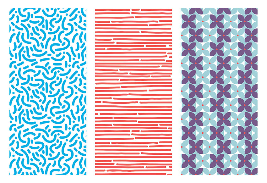
Have you always wondered how to make seamless patterns in Illustrator? Patterns that look effortless and are pleasant to the eye? In this tutorial, you will learn how to use the Pattern Option tool in Illustrator to create a set of fun patterns. 

If you’re looking for Adobe Illustrator addons and patterns, head on over to GraphicRiver.

1. How to Create a New Document in Adobe Illustrator

Step 1

Open Adobe Illustrator and head to File > New. Let’s name our file Patterns-v1, and let’s create a single square Artboard. Set the Width and Height to 1080 x 1080 px. Under Advanced, choose RGB for our Color Mode and 72 ppi for Raster Effects. If you are planning on printing it, use 300. Click OK.

Create a new document in Illustrator

Step 2

Let’s bring up our Pattern Options panel by going to Windows > Pattern Options. Let’s open the Swatches panel as well by going to Windows > Swatches. The new patterns we create will be added to the Swatches panel.

Bring up the Pattern Options and Swatches panel by going to Windows

2. How to Set Brush Options

Step 1

Let’s start by setting the brush for our first organic pattern. Select the Paintbrush Tool (B) from the Tools panel. For the Fill and Stroke color, double-click the stroke color and select a blue color with the following code: #00B0E6. Click on the fill color and select None (/).

Select a blue stroke color and none for fill color

Step 2

Head over to the Control bar. Click on Brush Definition and double-click on the round brush to open the Calligraphic Brush Options. On the new window, change the Size brush to 40 pt and change the Name to 40 pt. Round. Click OK.

Change the size of the brush on the Calligraphic Brush Options

Step 3

Go to the Tools panel and double-click on the Paintbrush Tool (B) to open the Paintbrush Tool Options panel. I am using the settings in the image below. This is to create a soft shape with curves and no hard edges, which will result in fewer points to edit.

Change the settings on the Paintbrush Tool Options

3. How to Create an Organic Pattern

Step 1

Using the Paintbrush Tool (B), create soft C shapes. I created the bigger shapes first and later filled them in with smaller dots and strokes. You can create anything—there’s no right or wrong in this! 

Try to focus on staying inside the page and making the shapes evenly spaced. We will fix the edges later on.

Create soft C shapes

Step 2

Add smaller details within the frame, like dots and short strokes. Remember not to worry too much about the edges as they will be fixed later on. Use the Direct Selection Tool (A) to select single points of the shapes and edit.

Fill in the gaps to avoid odd white spaces

4. How to Use the Pattern Tool

Step 1

Select the composition you just created, head over to the Pattern Options panel, and click on the dropdown menu on the top right side. Select Make Pattern, which will open up a window letting you know that the new pattern will be added to the Swatches panel. A second window will let you know that the strokes will now be extended into shapes. Click OK in both cases.

At this point you will enter Pattern Editing Mode, where you can edit the composition you just created as a whole pattern. You will notice you are in this mode when there is a bar over the document with a red stroke under it. Please note that the compositions around the main pattern are not clickable objects

Create a pattern with the composition we created

Step 2

Let’s start by setting up the basics to edit the pattern. Head over to the Pattern Options and name the pattern. I will name mine New Pattern 1. Set the Tile Type to Grid and the Width and Height to the same size as the artboard we created, 1080 x 1080 px. 

Under Copies I have 3×3 selected, which is the number of sets that appear around the main pattern. Make sure that Show Tile Edge is checked, which will add a blue margin to see the edge of the composition that we want to work on now. 

Change the settings on the Pattern Options panel

Step 3

Let’s edit the pattern. Use the Zoom Tool (Z) to get closer into the composition. Remember that only the composition within the blue stroke is editable. 

Use the Paintbrush Tool (B) to add elements. The new elements will be automatically drawn in the other compositions. This is a great tool for creating seamless patterns. Command-Z will be your friend for this stage as you will need to go back and forth to find the right balance.

Add more elements on the composition

Step 4

Let’s work on the edges. Continue using the Paintbrush Tool (B) and draw a line over the blue margin. The exceeding part will be drawn on the opposite side of the main composition; this is a great way to know how the elements are being connected. 

A seamless pattern works better when there’s no visible margin on the main composition. You can Zoom (Z) in and out to see what the pattern looks like and fix elements that seem too obvious to the eye.

Add elements over the margin of the composition

Step 5

To save the pattern, simply head over to the top of the document, above the red line, and click on Save a Copy. This will save a copy of the pattern. You can save as many copies as you like throughout the process so you can go back and forth. 

Another way of saving the pattern is by pressing Command-S to save the original pattern with its original name. This won’t create a whole new pattern, but will save the one you have been editing. A window will open letting you know that the strokes will be expanded. Click OK.

Save the pattern

5. How to Use and Edit the Pattern

Our pattern has been added to the Swatches panel, so now it’s time to use it! Click on the Rectangle Tool (M), draw a square, and select our newly created pattern in the Swatches panel as the Fill color.

If the pattern seems too big or small, you can resize it in the Pattern Options panel and lower the Width and Height to change the margin. Once you have resized the margin, proceed to resize the composition by selecting all of it, as if you were working normally outside Pattern Editing Mode

Now you are ready to use the pattern anywhere!

Create a square with the Rectangle Tool and click on the pattern under the Swatches panel as a Fill

6. How to Create a Hand-Drawn Pattern

Step 1

Let’s duplicate the artboard we created by hitting Shift-O, and you will get an outline around the artboard. Press Option-Shift and drag the artboard to duplicate and maintain the same XY level.

Duplicate the artboard we created at the beginning

Step 2

Using the Paintbrush Tool (B) from the Tools bar, create horizontal lines across the artboard. For this pattern, feel free to go outside the board and to change the point size of the brush. I am using a brush size of 40 pt, but remember we can change the size of our pattern later on. I am also using red color: #F05A54.

Using the Paintbrush Tool draw horizontal lines

Step 3

Open the Pattern Options panel by going to Window > Pattern Options. Select the shapes and, in the Pattern Options panel, click on the dropdown menu in the top right corner. Select Make Pattern. The pattern will be added to the Swatches panel. 

Select the lines and create a pattern through the Pattern Options

Step 4

Pattern Editing Mode will be activated. Let’s experiment with the options in the Pattern Options panel. Change the Tile Type to Hex by Column, which will make the pattern change from a square grid to a hexagonal grid margin in which the composition will overlap. Change the Height and Width to have a smaller size; I am activating the Maintain Width and Height Proportion option and changing the Width to 400 px. Resize the pattern to fit the margin.

On the Pattern Options change the Tile Type to Hex by Column

Step 5

Feel free to edit the pattern. When you are good with it, click Done on the top of the document, above the red stroke. This will take us out of Pattern Editing Mode, and our pattern will be edited in the Swatches panel. Our second pattern is ready to use!

Edit the pattern to fill in the gap save and it is ready to use

7. How to Create a Geometric Pattern

Step 1

Let’s create one last pattern inspired by the 70s. Using the Ellipse Tool (M), create two circles and make them overlap to create a leaf. Using the Pathfinder panel, Intersect the two shapes.

Using the Ellipse Tool create two overlapping circles Intersect using the Pathfinder panel to create a leaf

Step 2

Duplicate the leaf by pressing Command-Shift and clicking and dragging. We need four leaves to create a flower. Using the Rotate Tool (R), rotate each leaf while pressing Shift for an even rotation. Let’s add a red circle in the centre. I am using the following codes: blue #A3D1DA and red #F05956.

Duplicate the leaf to create a flower and add a red circle in the middle

Step 3

Duplicate the flower shape, and change the leaves’ color to purple with the color code #775988, and add a square as a background. Duplicate the two tiles by pressing Command-Shift and clicking and dragging horizontally. Do the same vertically until it looks like the image below:

Duplicate the flower and change the color to purple Duplicate the flowers to fill in the artboard

Step 4

Open the Pattern Options panel by going to Window > Pattern Options. Select the shapes and, in the Pattern Options panel, click on the dropdown menu in the top right corner. Select Make Pattern. The pattern will be added to the Swatches panel. For this pattern, let’s choose a Height and Width of 400 px and resize the composition so that the pattern is smaller.

Create a pattern of the flowers Feel free to resize the pattern to make the flower bigger or smaller

Step 5

I am choosing to select alternate horizontal lines of flowers and shifting them slightly to the left to add visual interest. As you can see, anything that appears outside of the left margin will reappear on the right side.

Edit the flower pattern

Step 6

Click on Done at the top of the document, above the red line. 

Save the flowers pattern

Step 7

Duplicate the square we created previously and apply the pattern. Now you have three patterns that you can use for anything! 

Duplicate a square and use the pattern under the Swatches panel

Awesome Work, You’re Done!

Congratulations! In this tutorial we’ve learned to:

  • Use the Pattern Option tool in Illustrator.
  • Set and change options for brushes.
  • Work in different grid settings to give a different look to our patterns.
End result

How to Create a Portrait With One Colour in Adobe Illustrator

Final product image
What You’ll Be Creating

When you’ve not created a new vector in a while, Adobe Illustrator can seem very scary. And if you’ve been creating vectors as long as I have, you don’t want your first vector in over a year to be a “run of the mill” one or predictable. You want to set yourself a challenge, whilst still in your comfort zone.

In today’s tutorial, I’m going to show you how to create a portrait by following a stock image, using only one colour. So the final image above may seem like click bait, and you’d be right in saying that’s more than one colour… but the portrait itself is entirely one colour. Check out the one-colour portrait and the colourful one below:

Comparing portraits

There are only a couple of steps at the end to add the colour and crop, which use only three additional colours. This is an advanced vector portrait tutorial, so previous knowledge of creating portraits is required. If you’re looking to learn how to create detailed vector portraits, please check out my main tutorials and video courses, available here on Envato Tuts+.

So without further ado, let’s get started!

1. Pick Your Stock Image & Prepare

Step 1

You can pick any stock image you want to work with for this exercise, as the steps and theory work behind this will be the same. I’ve specifically picked this stock image as there’s nothing too complicated about it (a simple hairstyle, no difficult shadows/lighting effects, and it looks fun to vector).

If your stock image isn’t black and white, then modify it in your software of choice. I’ve also rotated and cropped the image over in Adobe Photoshop.

Reference image

Step 2

Open up Adobe Illustrator and create a new document. I’ve set up my Layers panel with the reference image File > Placed in the bottom layer, a 50% white rectangle over the image in BG, and then a new layer for my bases.

Layers panel

2. How to Create Skin Shading With One Colour

Step 1

For all of the shapes I’ll be creating, I’ll be using a mid-grey (#999999). The trick for this project is to play with different Blending Modes and Opacities. I’ll be letting you in on which settings I use for this throughout.

So let’s start by creating the base layer for the skin. I use the Pen Tool (P) for this to maintain accuracy. I often switch between the Pen Tool and the Pencil Tool (N) depending on the level of detail required. 

Create the base shape

Step 2

If you’ve tried my other portrait tutorials, you’ll be familiar with the process I’m going to use for the skin shading. I use a duplicate of the skin base layer and use Pathfinder > Minus Front to remove shapes to create large shapes of shading. I will then combine the shapes into a Compound Path (Control-8) to keep them organised into “single” objects.

Creating Compound Paths

Step 3

Once the initial shapes are created, set these to Blending Mode Multiply and Opacity to 7%. Blending Mode Multiply and Color Burn are both great modes to use to darken your colours. Blending Mode Multiply will darken overall, whereas Color Burn works more by enhancing contrast. 

Initial Skin Shading

Step 4

Smaller, more focused shapes will have a higher Opacity. So these shapes are set to Blending Mode Multiply, Opacity 15%.

Darker areas

Step 5

As these shapes are overlapping the skin shading base, I’m going to use a duplicate of the skin base shape to create a Clipping Mask (Control-7).

If you’re going to be adding multiple shapes to a clipping mask, I would suggest keeping each type of shape (as in settings, colour, etc.) within its own Group (Control-G) as it will be easier to go back to. Organised vector files are the best vector files!

Use Groups and Clipping Masks

Step 6

Here’s where the Pencil Tool (N) comes in handy. I like to create the highlights on the skin using radial gradients as they create soft edges. This helps the highlights blend into the shapes below. 

I tend to go over the top with the gradients as well and reduce their Opacity to a low percentage as this helps to create an even more seamless effect.

Highlight shapes

These gradients are set to Blending Mode Screen, Opacity 15%. They’re then Grouped (Control-G) and included in the shading clipping mask.

Highlight gradients with the Gradient Tool

Step 7

A tip for when you’re working with shadow and strong light sources from one direction is to use duplicates of the skin base and fill it with a transparent radial gradient. I’m using an inverse one here, set to Blending Mode Multiply, Opacity 100%, and placing it underneath all the other shading. 

You can see from the placement of the source with the Gradient Tool (G) that the transparent source, where there will be no darkening, is where the highlight is on the face. Therefore it darkens the edges, and especially the mid-back area on the shape. 

Shading the back

Step 8

You can do a similar thing with multiple gradients on a duplicate of the base shape, by using the Appearance panel. 

Here I’m adding highlights to the cheekbone (x2), the forehead, and the shoulder. I’ve used Blending Mode Screen as it adds overall lightening rather than Color Dodge which works with contrast.

Adding Highlights

Step 9

When you want to darken areas further, Blending Mode Color Burn is the way to go. And if you want a smooth transition of contrasted darkness, then using a transparent radial gradient helps.

I’ve used the Pencil Tool (N) to create shapes where I need more intense darkness. These are set to Opacity 10%. A little goes a long way with Color Burn.

Adding contrast

3. How to Add Detailing to the Face

Step 1

When it comes to adding details to a monochrome image such as this, you don’t need to put too much detailing into the focal points, such as the eyes and lips. This is where you can rely solely on tracing the image underneath with the Pen Tool or Pencil Tool

For the eyes, I’ve used radial gradients again, and these are set to Blending Mode Screen, Opacity 30% as I want to create shapes which are lighter than what is underneath.

Creating the eyes

Step 2

For the teeth I’ve done a similar process of creating lighter shapes… this time with a solid fill and set to Blending Mode Screen, Opacity 15%.

Teeth close up

Step 3

I’m going to add darker detailing around the eyes by adding solid shapes of Blending Mode Multiply, Opacity 40%. Use higher opacities sparingly as you don’t want to have so much contrast it sticks out above everything else.

Darkening the eyes

4. How to Vector the Hair

If you’re new to creating vector hair, may I recommend two of my tutorials. One will especially be helpful, as we’re creating short hair.

Step 1

For the hair, I’m going to be using solid shapes and a tapered Art Brush

You can create your brush using a squashed Ellipse (L) and then Convert Anchor Points to Corners for the points on either side. Alternatively, you can purchase this brush as part of a Hair Brush set available on Envato Market.

Create a taper brush

Step 2

In order to lay the strands of hair, I’m going to need to work from a base shape. 

Using the Pen Tool, I’ve created a shape on top of all the shading layers and one underneath all the shapes, so I have hair behind her head. 

Create the hair base shape

Step 3

For the time being, I’m going to darken the hair so I can see it in comparison to the skin shading. 

I’m going to add strands of hair around the outside of the base shape with the Paintbrush Tool (B). Depending on how big you’ve created your brush, start by adding larger Stroke Weight strands first and then adding smaller ones. I started with 10 pt Stroke Weight and then 3-4 pt.

Adding hair strands

Step 4

As I want to keep the same colour throughout, I then selected all the strokes and Object > Expanded them. I then combined them with the top hair base, using Pathfinder > Unite. I’ve then applied the below Appearance panel settings to create a dark grey without straying from my original plan.

Creating the hair

Step 5

I use the taper brush for the eyebrows and eyelashes too. The eyebrows are set to Blending Mode Multiply, Opacity 50%.

Adding the eyebrows

Step 6

The eyelashes are set to Blending Mode Multiply, Opacity 100%

Do not add the eyelash and eyebrow shapes to the skin base clipping mask as you may trim off any hairs which overlap the base.

Adding the eyelashes

Step 7

To add depth and detailing to the hair, I’ve added strokes with our tapered Art Brush set to Blending Mode Screen, Opacity 5%. I’ve overlapped the strokes several times to create varied levels of highlight throughout. 

My tutorial on creating vectored short hair goes into this process in more depth if you want to learn more.

Adding details to the hair

5. How to Add Finishing Touches & Colour

Step 1

You could leave the portrait as it is; however, I do like to tinker with my portraits towards the end.

In this case, I’ve added my standard collection of moles on the skin. I love adding them to the skin as no one’s skin is flawless, and moles hold a lot of symbolism

I also added texture around the eyes by using Blending Mode Screen and Color Dodge to add dots to create a glitter effect. I added lines around the lips and nose to add a highlight to help define these areas better.

Adding details to the face

Step 2

You could finish your portrait now, and here would be the end result you’d be aiming for with just one colour:

One colour portrait

However, I want to add a dash of colour and do some easy cropping. 

I first add a pink to blue gradient, using only two colours. This is included in a filled Rectangle (M) over the top of the portrait with the below Appearance panel settings.

Adding colour

Step 3

I finish off the portrait by adding a white filled shape of an Ellipse (L) removed from a Rectangle (M) to create a curved edge to the back area. 

You could do this with a clipping mask, but it can be memory intensive when you’re working with so many shapes. Sometimes it’s easier to cover up the area with a white shape.

Adding a curved crop

Awesome Work, You’re Done!

Thanks for joining me in this project. I’d love to see what others have created with just one fill colour or using very few colours. 

It’s not the first time I’ve used a limited palette for a portrait. You can check out my four colours portrait if you’re looking for something more vibrant. 

Until next time, happy vectoring!

Final result

Transitioning From Adobe Illustrator to Affinity Designer

It’s not all that often that you come to a moment in life when you end up feeling stuck, gasping for a breath of fresh air while every cell in your body keeps telling you to make a change. Believe it or not, it happens to us visual tinkerers too, as I learned not too long ago.

So here we are seven years later, seven years of using the same digital product to help me grind and shape every little pixel that I ever pictured in my mind, and for some reason I’ve never had the courage to cast away and experience something new, something different, until now.

Today, I’m going to share with you my journey, my experience of switching from Adobe Illustrator to Affinity Designer, and list the key road bumps that I had to conquer all on my own using my trusty mouse and keyboard.

So, if you’ve found yourself down the very same hole, let me give you a helping hand, so that you can embark on your new journey.

Jump straight in with our Affinity Designer tutorials, or read on to find out more.

1. The User Interface

The first thing you always notice when you finally decide to switch it up and try
a new graphic design application is the actual interface itself, which can
sometimes be a deal breaker, especially if the layout is completely different from what you are used to.

Now, I’m happy to say that Affinity Designer maintains almost the same layout as Illustrator, where the UI is carefully divided into a left tool panel, a top control
panel
, and of course your docked panel
groups
on the right.

affinity designer interface

2. Setting Up a New Document

The next thing
that I checked out once the software was up and running was the process of
setting up a fresh project.

It might seem weird to mention this, but when it comes to creating a New Document, the most powerful feature
that I believe Illustrator has is
that of giving the user the ability to set up multiple Artboards from the get-go.

illustrator new document setup

I was a little bit
heartbroken to see that Affinity
Designer
took a slightly different approach, since it only allows you to
create one artboard from within the window prompt (which isn’t even checked by
default), giving you the option to add more afterwards.

Now, this isn’t necessarily a bad implementation, but I would have loved to
be able to stack and distribute my artboards
using input fields instead of having to drag and position them manually using a
mouse.

affinity designer new document setup

3. Navigation and Interaction

Okay, so as we’ve
seen, the good people at Serif made sure that Affinity embraces a
similar layout, but how does the application perform when it comes to essential
tasks such as navigating and interacting with the Artboard?

3.1. Zooming

In Illustrator, to zoom in or out, all you
have to do is press and hold down the Alt
key, while scrolling up or down using the mouse wheel to get as close or as far
as you want to be from the Artboard.
You can achieve the same result by holding down the Control key and then pressing the + / – symbols, or by using the dedicated Zoom Tool (Z), which you can alternate by holding down the Alt modifier key.

Affinity Designer
follows the same approach, only it uses the Control
key instead of the Alt one, in
combination with the mouse wheel or the +
/ –
symbols to zoom in or out of the Artboard.

To me, this was a simple change to get used to once I’d spent a few
minutes playing with the application.

3.2. Scrolling

When it comes to
scrolling, which I’ll be honest I don’t use all that often, Illustrator allows you to vertically
scroll through a document by holding down the Shift key and then using the mouse wheel. To go horizontally, all you
have to do is press and hold the Control
key while moving the scroll wheel.

In Affinity, you use the Shift key in combination with the mouse
wheel to scroll horizontally, and the Alt
key to go vertically. Now this isn’t a big change, but I thought it would be
good to mention, especially if you’re used to navigating this way.

3.3. Navigation

When it comes to being able to navigate to a specific section of your
Artboard, Illustrator gives you the option to do that using a dedicated Navigator panel.

illustrator navigator panel

If you rely heavily on this function, you’ll be
happy to see it implemented using a very similar approach in Affinity Designer,
where you can easily click on a specific section and the software will
immediately move to that part of the Artboard, allowing you to zoom in or out
using either the two dedicated buttons or the percentage slider.

affinity designer navigator panel

Personally, I prefer using the Hand Tool (H) (View Tool (H) in Affinity
Designer
) which you can easily switch back and forward to by holding down
the Spacebar, while clicking and
dragging to move the Artboard around.

4. Basic Shape Creation and Selection

As soon as I’d gotten
used to interacting with my Artboard, I went on to see how Affinity handles shape creation and selection, since that’s usually
what you actually do in this type of graphics application. This is where
things start to change a bit, but not so much as to make you go crazy.

4.1. Creating Geometric Shapes

When it comes to
creating simple geometric shapes, Illustrator
gives you five types of shape tools that you can use to start creating your
artwork: the Rectangle Tool (M), a Rounded Rectangle Tool, an Ellipse Tool (L), a Polygon Tool, and the Star Tool.

All of them can be
found within the left tool panel, underneath the Rectangle Tool (M), and can be quickly accessed by simply holding
down the left mouse button until the dropdown list appears or by using the keyboard
shortcut for those that have one.

While there isn’t a dedicated visual indicator, both the Polygon and Star tools give you the ability to add or remove sides, using the Up and Down arrow keys, which can increase or decrease the complexity of
the object, allowing you to create different shapes.

illustrator shape tools

To create an actual shape, you have the option
of going manually by clicking and holding while dragging the mouse to get the
desired size and shape, where the Shift
key allows you to create a perfect shape (be it a square, an ellipse, a
polygon, etc.) and the Alt one lets
you draw or resize the shape from the center out. You can also move the shape
around as you’re creating it by holding down the Spacebar, and then repositioning it using the mouse.

creating a square using the click-and-drag method in illustrator

The second method—which I personally use a lot—gives you a higher level of precision, since you can select the desired shape
tool and then left click anywhere within the work area to bring up a little pop-up window, which allows you to fine tune its different features (width, height, corner radius, radius, sides, and/or points).

example of creating a rounded rectangle in illustrator

At a first glance, Affinity seems to follow a similar approach since you have your Rectangle Tool (M), an Ellipse Tool (M), a Rounded Rectangle Tool (M), and a Triangle Tool, which come individually
separated within the left toolbar.

affinity designer shape tools

Now, if we take a closer look at the Triangle Tool, you’ll notice that it has a little dropdown arrow which, if
you click on it, will show you the other available options, which to my surprise are
quite a few.

affinity designer shape tools expanded

When it comes to using one of the tools and creating
an actual shape, things get a little bit different since the only way you can
do it is using the click-and-drag method. This isn’t necessarily a bad thing,
since you get a visual Width and Height indicator, but can be a little
slower and more annoying, especially when you know the exact dimensions that the
shape needs to take. Another thing that’s different is that you can’t add or
remove sides to the different types of shapes, as you were able to do in Illustrator using the Up and Down arrow keys, but to be honest I never used that option all that
much.

example of creating a square in affinity using the click-and-drag method

Similar to Illustrator,
Affinity gives you the ability to use the Shift key to
constrain the proportions of the shape while dragging (useful when creating
squares, perfect circles, etc.), and/or the Control key to draw or resize the shape from the center out. You
can also move the shape as you draw it by holding down the Spacebar, and even rotate it—whaat?—using the mouse’s right click.

example of rotating a square while creating it in affinity designer

4.2. Basic Shape Selection

So we’ve seen that creating shapes in Affinity isn’t all that different, but how does it behave when it
comes to selecting them afterwards? Well, if you’re familiar with Illustrator, you probably know that you
can easily select a shape by left
clicking
on it using the dedicated Selection
Tool (V)
.

example of shape selection in illustrator using the selection tool

If you need to select multiple shapes, you can
quickly do that by holding down the Shift
key, while clicking on the ones that you want to include in your
selection.

example of multiple shape selection using the click-and-drag method in illustrator

You can achieve the same result using the
click-and-drag method, where you click and drag using the Selection Tool (V) in order to select the desired shapes. While it might be faster, this isn’t as precise and helpful once you’re dealing with
a larger number of overlapping objects.

example of multiple shape selection using the click-and-drag method in illustrator

Another way of making a selection is by using
the Layers panel, where if you
expand a layer, you can see all of the shapes on it, which you can then easily
select using the little target
circle.

example of shape selection using the layers panel in illustrator

If you need to
select all the existing shapes, you can quickly do this using the Control-A keyboard shortcut.

When it comes to shape selection, Affinity
comes equipped with its own Move Tool
(V)
, which basically behaves the same way as Illustrator’s Selection Tool
(V)
, where you can easily select a shape by simply clicking on it.

example of shape selection using the move tool in affinity designer

If you try to use the click-and-drag method,
you’ll notice that things are a little bit different, since you’ll have to make
sure that your selection overlaps the entire surface of the shape(s), otherwise
the software won’t include it/them within your selection.

example of multiple shape selection using the click-and-drag method in affinity

After working on a few projects, I found that
the easiest way to make a selection out of a larger number of shapes is using
the Layers panel, where you can
quickly select a shape by simply clicking on it, adding and/or removing new
ones from the selection while holding down the Control key.

example of shape selection using the layers panel in affinity designer

As with Illustrator,
you can quickly select all your shapes when you need to by using the Control-A keyboard shortcut.

4.3. Shape Grouping

When dealing with multiple shapes, the ability to select and group them together
becomes a must have, and I’m excited to say that Affinity takes a familiar approach, where you can quickly create a
group of objects by right clicking > Group
or by using the Control-G keyboard
shortcut.

how to make a group in affinity designer

To break a group, simply select it and then right click > Ungroup or use the Control-Shift-G keyboard shortcut.

how to ungroup shapes in affinity designer

5. Adjusting the Shape of an Object

Okay, so we’ve seen
how Affinity behaves when it comes
to creating basic geometric shapes, but how about when you want to adjust them?

5.1. Terminology: Anchors vs. Nodes

As you probably know, Illustrator
uses what it calls anchor points to
define the shape of a path (be it open or closed), which behave as little squared
pins that help constrain its form.

illustrator anchor points example

Affinity works pretty much identically since it uses what
it calls nodes, which are basically
the same thing, since they serve the same function.

affinity designer node example

5.2. Anchor/Node Selection

The key difference
between the two is in the way the applications handle their selection.

In Illustrator, the anchors aren’t directly accessible using the regular Selection Tool (V), which is why it
comes with a dedicated Direct Selection
Tool (A)
that allows you to individually select each and one of them by
simply clicking on them.

Affinity also comes with a dedicated Node
Tool (A)
of its own, but it behaves slightly differently, since if you’re
dealing with basic geometric shapes you won’t be able to directly access their nodes until you convert them to curves
using the Convert to Curves function.

node selection example in affinity designer

Once your shape
has been converted to curves, you can easily select any of its nodes by clicking on them, which will
fill the little box in order to let you know the selection was made.

Now, I’ll be honest, if you’re new to the software and don’t go through
the official documentation, this will probably throw you off a bit, especially
if you’re used to the way Illustrator
handles this specific type of selection, which is why I wanted to point it out.

individual node selection in affinity designer

5.3. Basic Shape Adjustments

When it comes to basic shape adjustments, based on anchor repositioning, Illustrator
gives you the ability to quickly change the appearance of an object, by selecting
and dragging anchor points using the mouse or by pushing them using the directional
arrow keys. Depending on the level of precision you need, you might choose one
over the other.

basic shape adjustment in illustrator

Once you go through that extra step, Affinity basically allows you to
achieve the same result using a click-and-drag approach, which is pretty
understandable since it’s probably the most natural way of doing these types of
adjustments.

basic shape adjustment in affinity designer

Now, if you want the achieve the highest level
of precision, Illustrator comes
prepacked with a dedicated Move tool
(right click > Transform > Move
or Shift-Control-M) which allows you
to reposition any selected anchor point
(or even an entire shape) using an exact numeric value of your own choosing.

basic shape adjustment in illustrator using the move tool

Unfortunately, Affinity doesn’t come with a similar
tool. Instead, it allows you to achieve the same result using the Transform panel, where you can control
the x and y positioning of your nodes
(or the entire shape) in a similar manner.

The problem is that it’s kind of tricky, since each time you make an
adjustment, you have to add or remove the number of pixels that you want the nodes to move from the respective
coordinate. For example, in my case, I wanted to re-align the top-left node to the right one, which means I
have to do some quick math where I remove the distance between the current
position and the one that I want to achieve from my y coordinate, so 288-128=160
px
.

basic shape adjustment in affinity using the transform panel

5.4. Advanced Shape Adjustments

So we’ve seen
that you can easily change the shape of a geometric object by repositioning
its anchor points/nodes, but how
does Affinity handle more advanced
adjustments?

Most of the time, when I’m working on a detailed composition based on basic geometric shapes, I
find myself making finer adjustments to them by removing parts of their paths.

For example, let’s
say we want to open up a circle by completely removing its left half.

In Illustrator, you can easily
achieve this by selecting the left anchor
point using the Direct Selection
Tool (A)
, and then removing it by simply pressing Delete.

example of opening up a path in illustrator

Affinity makes things a little bit more complicated (but
for the better), since if you try and apply the same method, you’ll notice that
instead of opening up the path, it ends up removing the node from the shape’s path.

example of opening up a path in affinity using a similar method

To achieve the same result, you’ll have to select
the desired node using the Node Tool (A) and then open it up using
the Break Curve Action, which will separate its two composing paths. Then, you can
individually select and remove them using the Delete key, which will give you the desired result.

example of opening up a path in affinity

This happens
because the software sees the left half as being composed out of two smaller paths
that unite where their horizontal nodes
meet. At first I looked at it as being impractical, but after getting
used to it I found it really helpful, especially when I needed to remove smaller
sections of a shape’s path.

In Affinity you can easily
remove the bottom-left quarter of the circle’s path using the Break Curve Action, where in Illustrator
you would have to add and remove a new anchor
point from it.

example of removing the bottom quarter of a circle in affinity designer

6. Shape Alignment and Distribution

So we’ve seen how
shapes are created and adjusted. Now let’s talk a bit about alignment.

I’ll be completely
honest. When it comes to aligning a shape, I found that Illustrator has the upper hand since its Align panel, as simple as it may look, is really well thought out.

Using just a couple of clicks, you can easily position any shape in the
center of your Artboard as long as
you make sure that the alignment is made to it (Align To > Align to Artboard).

example of center aligning a shape in illustrator using the align panel

If you need to align one or more shapes to a specific
object, you can easily do that by selecting them and then clicking on the one
that you want to make the alignment to, in order to instruct the software to use
it as the key object.

example of aligning multiple shapes to a key object in illustrator

Want to distance two or multiple shapes from one
another, you can quickly do that using the Distribute
Spacing
options, where you assign a key
object
from your selection, and then enter the number of pixels that you
want the software to push the other shapes from it.

multiple shape distribution in illustrator

Switch over to Affinity Designer, and all the regular individual alignments
work as you would expect them to, since you can easily align a shape to any
edge of the Artboard or its center using the Align Horizontally and Vertically
options.

example of center aligning a shape in affinity designer

What’s actually interesting
is that the two axis controls come separated, giving you more control over the
alignment method, since if you have multiple shapes selected, not only can you
align them to different parts of the Artboard, but to one another as well.

I don’t know exactly how useful this would be
for a real day-to-day workflow, but I was actually pleasantly surprised by the
implementation.

aligning multiple shapes in affinity

Things start taking a turn for the worse when it
comes to distributing multiple objects using a specific numeric value, since compared
to Illustrator where you can select
the key object to which the
distribution is made, in Affinity the
distribution is always made from the Selection
Bounds
. This isn’t necessarily a deal breaker, but it does take some time
getting used to, especially if your workflow relies heavily on this particular
tool.

distributing multiple shapes in affinity designer

7. Copying and Pasting Behavior

Once I saw how shape alignment and distribution work, I wanted to check
out how the process of copying and pasting behaves, since I tend to use this
feature a lot.

In Illustrator, to copy a shape you use the Control-C keyboard shortcut, which will add it to the Clipboard, enabling you to paste it back
onto the Artboard using five
different methods:

  • Control-V, which will paste the
    copy randomly within the Artboard’s surface
  • Control-F, which will paste the copy
    in front of the original shape
  • Control-B, which will paste the
    copy behind the original shape
  • Shift-Control-V, which will paste the
    copy in place
  • Alt-Shift-Control-V,
    which will paste a copy of the shape on all the
    available Artboards
pasting shortcuts in illustrator

In Affinity, you get to use the
same Control-C keyboard shortcut to
add a copy of a shape to the Clipboard.

What’s different is that to paste the copy, you use the Control-V shortcut, which will create and position the duplicate in
front of the original, which is something that I absolutely love, since when I
copy a shape, I expect the duplicate to appear in exactly the same place.

There are a couple of other variations that can
be viewed from within the Edit top
menu, but for me this one feels sufficient.

pasting shortcuts in affinity designer

8. Shape Isolation

A lot of the times when I work on more intricate projects, I often end up
isolating specific sections of it in order to take the time and fine tune their
composing shapes without being distracted by all the clutter.

Illustrator comes with a dedicated Isolation
Mode
, which allows you to focus on a specific shape or group of shapes by
double clicking on them, or by right
clicking > Isolate Specified Path/Group
. Once in Isolation, all the other shapes become unselectable, their Opacity levels being lowered so that
they won’t distract you from your work.

isolated shape example in illustrator

Another way that
you can isolate a single shape, a group, or even an entire layer is by using the Layers panel, where you first select
what you want to isolate and then open up the panel’s menu and hit Enter Isolation Mode.

The panel will immediately indicate that you’re in Isolation Mode by hiding all the other shapes, so that if you have
a larger group or a layer, you will only be able to select those shapes that are
part of it.

example of isolated shapes in illustrator

To exit Isolation
Mode
, all you have to do is press the Escape
key, or right click > Exit
Isolation Mode
.

Affinity Designer enables you to isolate any individual shape, group, or layer, but it does things a little bit differently, since you can only do it
from the Layers panel, by left
clicking on their thumbnail while holding down the Alt key. As soon as you enter isolation mode, all the other shapes are
completely hidden so that the entire focus is on the one that you need to work
on.

example of isolated shape in affinity designer

To exit isolation mode, all you have to do is press
the Escape key, which will bring back
all the other shapes.

9. Clipping Masks

One of my favorite
Illustrator features is that of
being able to use Clipping Mask in
order to hide certain sections of the surface of an object.

The process is really simple, since all you have to do is create the
desired shape, which you will position on top of the object or group that you
want to mask, and then with both of them selected, you simply right click > Make Clipping Mask.

example of creating a clipping mask in illustrator

The shape from underneath will immediately clip
to the surface of the top one, the software hiding the entire section that
falls outside of that of the mask.

example of masked shape in illustrator

To release the mask, all you have to do is
select it, and then right click >
Release Clipping Mask
.

example of releasing a clipping mask in illustrator

Affinity, on the other hand, takes a different approach
(again), where in order to mask an object you have to use the Layers panel, inside of which you will
have to drag the shape that you want to use as a mask over the one that will be
masked.

example of creating a clipping mask in affinity designer

To release the mask, you’ll have to click on the
second thumbnail (the one with the little crossed square) and drag it to the
bottom, which will immediately break it free.

10. Grid Options

The last bullet of
my list is in regards to grids, which is where Affinity took me by surprise and brought the game to a whole other
level.

Don’t get me
wrong, Illustrator gives you a very
powerful Grid system that you can
edit and use, but what Serif managed
to implement makes me take all the little shortcomings and throw them out the
window, since the grid possibilities are truly endless.

If you want to know what I’m talking about, just go to View > Grid and Axis Manager, which
will bring up the following window.

affinity grid and axis manager

Once the window appears, check the Show grid option, making sure to
uncheck the Use automatic grid one,
which will allow you to choose between Basic
and Advanced. Since we want to use the
full capabilities of the software, make sure you select the latter, and then
click on the Grid type dropdown menu,
and let it all sink in.

example of available grids in affinity designer

I won’t go into any further details, since my
colleague Kezz Bracey did a fantastic job of presenting all the different
functions and possibilities that come with setting up a custom grid within Affinity Designer, which I strongly
recommend you read.

Conclusion

So, as you can
see, transitioning to Affinity Designer
can be a little tricky, especially if you’re deeply rooted to the way
Illustrator handles different tasks.

As I pointed out, not too long ago I was in the same situation as many of you are right now,
where I needed to find out if there are any viable alternatives to Illustrator, and I’m glad to say that
I’ve managed to find one in Affinity.

I’m going to end on that note, but if you have any
questions, feel free to post them within the comments section and I’ll get back
to you as soon as I can.

Also, don’t forget you can further expand your Affinity Designer skills by checking out these awesome tutorials:

  • Affinity Designer is a powerful program that allows you to create and combine both raster and vector graphics. This A to Z list breaks down all the tools and…

  • Learn how to create your very own dream catcher in Affinity Designer. Using a step-by-step workflow, we’re going to see how we can achieve a detailed…

  • In this tutorial, we’ll go all the way through the exciting process of designing a cartoon character from scratch to the finished piece! Join me and let’s…

  • For many of us, summer is the most exciting season. Hot sun, bright clothes, warm sea waves and vacations—these are what we’re waiting for with impatience!…

  • In this tutorial I’ll walk you through the process of designing a welcome screen for an iOS fitness application. We’ll be working with Affinity Designer, a…

How to Create a Text Editor Icon Set in Adobe Illustrator

Final product image
What You’ll Be Creating

In today’s tutorial, we’re going to tackle another icon project, in which we’re going to gradually learn how to create
a set of text editor elements, using some of the basic shapes and tools found
within good old Illustrator.

So, if that sounds
like something right up your alley, make sure you grab a fresh cup of that
magic bean juice and let’s get started!

And don’t forget, you can always expand the pack by heading over to
GraphicRiver where you’ll find a huge selection of UI icons.

1. How to Set Up a New Project File

Assuming you already have Illustrator up
and running in the background, bring it up and let’s set up a New Document (File > New or Control-N)
using the following settings:

  • Number
    of Artboards:
    24
  • Spacing:
    20 px
  • Columns:
    4
  • Width:
    32
    px
  • Height:
    32
    px
  • Units:
    Pixels

And from the Advanced tab:

  • Color
    Mode:
    RGB
  • Raster
    Effects:
    Screen (72ppi)
  • Preview Mode: Default
setting up a new document

2. How to Set Up a Custom Grid

Since we’re going to be creating the icons
using a pixel-perfect workflow, we’ll want to set up a nice little Grid so that we can have full control
over our shapes.

Step 1

Go to the Edit > Preferences > Guides & Grid submenu, and adjust
the following settings:

  • Gridline
    every:
    1 px
  • Subdivisions:
    1
setting up a custom grid

Quick tip: you can learn more about grids by reading this
in-depth piece on How Illustrator’s Grid System Works.

Step 2

Once we’ve set up our custom grid, all we
need to do in order to make sure our shapes look crisp is enable the Snap to Grid and Snap to Pixel options found under the View menu, which will transform into Snap to Pixel each time you enter the Pixel Preview mode (if you’re using an older version of the software).

Now, if you’re new to
the whole “pixel-perfect workflow”, I strongly recommend you go through my How
to Create Pixel-Perfect Artwork
tutorial, which will help you widen your
technical skills in no time.

3. How to Set Up the Layers

With the New Document created, it would be
a good idea to structure our project using a couple of layers in order to
separate the reference grids from the actual icons. If you’re familiar with my
previous tutorials, you’ll notice that with this one we’re taking a slightly
different approach, since we’re basing the project on Artboards instead of
Layers due to the high icon count.

That being said, bring up the Layers panel, and create a total of two
layers, which we will rename as follows:

  • layer
    1:
    reference grids
  • layer 2: icons
setting up the layers

4. How to Create the Reference Grids

The
reference grids (or base grids)
are a set of precisely delimited reference surfaces, which allow us to build
our icons by focusing on size and consistency.

Usually, the size of the grids determines
the size of the actual icons, and they should always be the first decision you
make once you start a new project, since you’ll always want to start from the
smallest possible size and build on that.

Now, in our case, we’re going to be
creating the icon pack using just one size, more exactly 32 x 32 px, which is on the smaller side of the scale.

Step 1

Make sure you’re on
the right layer (that would be the first one), and then grab the Rectangle Tool (M) and create a 32 x 32 px orange (#F15A24) square
which we will center align to the first Artboard and use to define the overall
size of our icons.

creating the main shape for the reference grid

Step 2

Add a smaller 28 x 28 px one (#FFFFFF) which we will
position on top of the previous shape, since it will act as our active drawing
area, thus giving us an all-around 2 px padding
to work with.

creating the main shape for the active drawing area

Step 3

Select and group the
two squares together using the Control-G
keyboard shortcut, and then create the remaining grids using 23 copies
(Control-C > Control-F) which we
will position onto each of the empty Artboards. Take your time, and once you’re
done, make sure you lock the current layer before moving on to the next section.

adding the remaining reference grids

5. How to Create
the Justify Icon

Assuming you’ve
successfully managed to create and position the little reference grids, move on
to the next layer (that would be the second one), and let’s kick off the
project by creating the first icon of the set.

Step 1

Start by creating the bottom horizontal line using a 2 px thick Stroke, which we will color using #252A2D and then position at a
distance of 2 px from the center of
the active drawing area’s bottom edge.

creating the bottom line for the justify icon

Step 2

Finish off the icon by adding the remaining
lines using two copies (Control-C >
Control-F
twice) of the one that we’ve just created, which we will
vertically stack at a distance of 4 px from
the original. Once you’re done, select and group all three of them together
using the Control-G keyboard
shortcut before moving on to the next reference grid.

finishing off the justify icon

6. How to Create
the Align Left Icon

As soon as we’ve
finished working on the second icon, we can move on to the next active drawing
area, where we will quickly put together our next one.

Step 1

Since some of the upcoming icons are based on the one that we’ve just
finished working on, we will make a copy (Control-C)
of it which we will then paste (Control-F)
onto the current reference grid, making sure to click on the underlying
Artboard first to make it active.

creating the main shapes for the left align icon

Step 2

Isolate the middle stroke by double
clicking on it, and then shorten its length from 24 px to 16 px—you can do this by
selecting its right anchor point using the Direct
Selection Tool (A)
 and then pushing it to the left by 8 px using the Move tool (right click >
Transform > Move > Horizontal > – 8 px
). 

Once you’re done, press the Escape key to exit Isolation
Mode, and then make a copy (Control-C) of the resulting icon before
moving on to the next grid.

finishing off the left align icon

7. How to Create
the Right Align Icon

Next, we’re going
to quickly create the right align icon, so make sure you’re on the right Artboard (that would be the third one) and let’s get started.

Step 1

Paste a copy of the icon that we’ve just finished working on onto the
empty active drawing area using the Control-F
keyboard shortcut.

creating the main shapes for the right align icon

Step 2

Adjust the copy that we’ve just created by vertically reflecting it
using the Reflect tool (right click > Transform > Reflect
> Vertical
). Once you’re done, don’t forget to make a copy (Control-C) of the resulting icon,
before moving on to the next one.

finishing off the right align icon

8. How to Create
the Center Align Icon

Since no text
editor is complete without a center align option, we’re going to quickly add
one in the following moments.

Step 1

Paste a copy of the previous icon onto the fourth Artboard using the Control-F keyboard shortcut so that it
places it in exactly the same position.

creating the main shapes for the center align icon

Step 2

Isolate the middle Stroke of
the copy that we’ve just created by double clicking on it, and then center
align it to the underlying Artboard using the Align panel’s Horizontal
Align Center
option. Once you’re done, quickly exit Isolation Mode by
pressing the Escape key.

finishing off the center align icon

9. How to Create
the Increase Indent Icon

Move on down to the second row, and then zoom in on the first artboard where we will start working
on our next icon.

Step 1

Create the icon’s main shapes using a copy (Control-C) of the justify one, which we will paste (Control-F) onto the current active
drawing area and then adjust by isolating and shortening the length of its
middle and bottom Strokes from 24 px to 12 px using the Move tool
(left anchor points selected > right
click > Transform > Move > Horizontal > 12 px
).

creating and adjusting the main shapes for the increase indent icon

Step 2

Add the main shape for the right-facing arrow
using an 8 x 12 px rectangle, which
we will color using #252A2D and then position on the left side of the active
drawing area, as seen in the reference image.

creating the main shape for the arrow of the increase indent icon

Step 3

Finish off the icon by turning the shape that
we’ve just created into an arrow by first adding a new anchor point to the
center of its right edge using the Add
Anchor Point Tool (+)
, and then removing its top and bottom ones using the Delete Anchor Point Tool (-). Once
you’re done, exit Isolation mode,
and then make a copy (Control-C) of
the entire icon before moving on to the next Artboard.

finishing off the increase indent icon

10. How to Create the Decrease Indent Icon

Assuming you’ve finished working on the previous icon, position yourself
on the neighboring Artboard, where we will create its alternate version.

Step 1

Use the Control-F
keyboard shortcut to paste a copy of the increase indent icon onto the
current active drawing area.

creating the main shapes for the decrease indent icon

Step 2

Double click on the little arrow to isolate it, and
then quickly adjust it by vertically reflecting it using the Reflect tool (right click > Transform > Reflect > Vertical). Once you’re
done, don’t forget to exit Isolation
Mode
using the Escape key before
moving on to the next icon.

finishing off the decrease indent icon

11. How to Create the Add Space Before Paragraph Icon

As soon as you’ve finished working on the decrease indent icon, we can move
on to the next active drawing area, where we will create our next item.

Step 1

Create the main shapes of the icon using a copy
(Control-C) of the justify one,
which we will paste (Control-F) onto
the current Artboard, making sure to center align it to the active drawing
area’s bottom edge.

creating the main shapes for the add space before paragraph icon

Step 2

Ungroup the copy that we’ve just pasted (right click > Ungroup or Shift-Control-G), and then adjust it by
removing its top Stroke line by
selecting it and then pressing Delete.

adjusting the shapes of the add space before paragraph icon

Step 3

Finish off the current icon by adding the down-facing arrow. We will create it using a 12
x 8 px
rectangle (#252A2D), which we will adjust by adding a new anchor
point to the center of its bottom edge using the Add Anchor Point Tool (+), and then removing its bottom ones using
the Delete Anchor Point Tool (-).
Once you’re done, select and group (Control-G)
all three shapes together before moving on to the next one.

finishing off the add space before paragraph icon

12. How to Create the Add Space After Paragraph Icon

Next, we’re going to quickly create an alternate version of the icon that
we’ve just finished working on.

Step 1

Create a copy (Control-C) of the previous icon, which we will paste (Control-F) onto the empty active
drawing area, as seen in the reference image.

creating the main shapes for the add space after paragraph icon

Step 2

Ungroup the copy that we’ve just created (right click > Ungroup or Shift-Control-G), and then adjust the
icon by flipping the position of its Strokes
with its arrow as seen in the reference image, making sure to select and group
(Control-G) them before moving on to
the next one.

finishing off the add space after paragraph icon

13. How to Create the Type Tool Icon

Assuming you’ve already moved down to the third row, let’s start working on
the next category, which has to do with text formatting.

Step 1

Create the upper section of the icon using a 20 x 6 px rectangle with a 4 px thick Stroke, which we will color using #252A2D and then center align to
the active drawing area’s top edge.

creating the upper section of the type tool icon

Step 2

Open up the path of the shape that we’ve just
created by adding a new anchor point to the center of its bottom edge using the
Add Anchor Point Tool (+) and then
immediately selecting and removing it by pressing Delete.

opening up the path of the upper section of the type tool icon

Step 3

Add the center section using a 20 px tall 8 px thick vertical Stroke
line (#252A2D), which we will center align to the previous shape, as seen in the
reference image.

adding the vertical section to the type tool icon

Step 4

Finish off the icon by creating the bottom
section using a 16 px wide 4 px thick Stroke line (#252A2D), which we will center align to the active
drawing area’s bottom edge. Take your time, and once you’re done, select and
group (Control-G) all three shapes
together before moving on to the next one.

finishing off the type tool icon

14. How to Create the Bold Icon

Next, we’re going to quickly create one the most used icons in all text
editor history, so make sure you’ve positioned yourself on the next Artboard, and let’s jump straight into it.

Step 1

Create the lower section of the icon using a 12 x 12 px square with a 4 px thick Stroke, which we will color using #252A2D and then center align to
the active drawing area’s bottom edge.

creating the lower section of the bold icon

Step 2

Quickly adjust the shape that we’ve just created
by setting the Radius of its right
corners to 6 px from within the Transform panel’s Rectangle Properties.

adjusting the lower section of the bold icon

Step 3

Finish off the current icon by adding the upper
section using an 8 x 8 px square
with a 4 px thick Stroke (#252A2D), which we will adjust
by setting the Radius of its right
corners to 4 px from within the Transform panel’s Rectangle Properties. Once
you’re done, position the resulting shape as seen in the reference image, making
sure to select and group them together afterwards using the Control-G keyboard shortcut.

finishing off the bold icon

15. How to Create
the Underline Icon

As usual, make
your way to the next Artboard, where we will see how to put together the
underline icon.

Step 1

Start by creating the lower section using a 24 px wide 4 px thick Stroke line, which we will color using
#252A2D and then center align to the active drawing area’s bottom edge.

creating the lower section of the underline icon

Step 2

Create the main shape for the “U” letter using a 12 x 14 px rectangle with a 4
px
thick Stroke (#252A2D), which
we will center align to the active drawing area’s top edge so that its path
overlaps it.

creating the upper section of the underline icon

Step 3

Start adjusting the shape by setting the Radius of its bottom corners to 6 px from within the Transform
panel’s Rectangle Properties.

adjusting the upper shape of the underline icon

Step 4

Finish off the icon by opening up the path of the shape that we’ve
previous adjusted, by adding a new anchor point to the center of its top edge
using the Add Anchor Point Tool (+),
and then immediately selecting and removing it by pressing Delete. Once you’re done, don’t forget to select and group the two
shapes together using the Control-G
keyboard shortcut.

finishing off the underline icon

16. How to Create
the Italic Icon

We are now down to
the last icon of the current row, so assuming you’ve already positioned
yourself onto the Artboard, let’s create the next item.

Step 1

Create the bottom and upper sections of the “I” shaped letter using two 16 px wide 4 px thick Stroke lines
(#252A2D), which we will position as seen in the reference image.

creating the bottom and upper sections of the italic icon

Step 2

Finish off the current icon by adding the diagonal line connecting the
two horizontal sections using a 4 px thick
Stroke (#252A2D). As always, once
you’re done, select and group (Control-G)
all three shapes together before moving on to the next one.

finishing off the italic icon

17. How to Create
the Bring to Front Icon

Assuming you’ve
moved down another row, zoom in on its first Artboard and let’s create our next
icon.

Step 1

Start by creating the front shape using a 12 x 12 px square with a 4
px
thick Stroke, which we will
color using #252A2D and then align to the active drawing area’s top-left
corner.

creating the front shape of the bring to front icon

Step 2

Create the back shape using another 12
x 12 px
square with a 4 px thick
Stroke (#252A2D), which we will align
to the active drawing area’s bottom-right corner.

creating the back shape of the bring to front icon

Step 3

Adjust the shape of the square that we’ve just created by adding a set
of new anchor point where its paths intersect those of the first one using the Add Anchor Point Tool (A), making sure
to reposition its corner one as seen in the reference image.

adjusting the back shape of the bring to front icon

Step 4

Finish off the icon by adding a fill to the resulting shape, which we
will create using a copy (Control-C)
which we will paste in place (Control-F)
and then adjust by flipping its Stroke
with its Fill (Shift-X). Once you’re done, select and group (Control-G) the two shapes together, doing the same for the entire
icon afterwards.

finishing off the bring to front icon

18. How to Create
the Send to Back Icon

By now, you already
know the drill, so jump on the next Artboard and let’s carry on working on our next item.

Step 1

Create the back shape using a 12
x 12 px
square with a 4 px thick
Stroke (#252A2D), which we will
align to the active drawing area’s top-left corner.

creating the back shape of the send to back icon

Step 2

Finish off the current icon by adding the front shape using another 12 x 12 px square with a 4 px thick Stroke (#252A2D) and a 12 x
12 px
fill shape (#252A2D), which we will group (Control-G) and then align to the active drawing area’s bottom-right
corner. Once you’re done, select and group (Control-G) all of the shapes together before moving on to the next
one.

finishing off the send to back icon

19. How to Create
the Insert Header Icon

Make sure you’ve
positioned yourself onto the empty neighboring Artboard, and then let’s get
started working on our next icon.

Step 1

Create the upper section using a 20
x 6 px
rectangle with a 4 px thick
Stroke, which we will color using #252A2D and then center align to the active drawing area’s top edge.

creating the upper section of the insert header icon

Step 2

Add the main shape for the lower section using a 20 x 8 px rectangle with a 4
px
thick Stroke (#252A2D), which
we will position so that its bottom path overlaps the edge of the active
drawing area, as seen in the reference image.

creating the lower section of the insert header icon

Step 3

Open up the path of the shape that we’ve just created by adding a new
anchor point to the center of its bottom edge using the Add Anchor Point Tool (+) and then immediately selecting and
removing it by pressing Delete.

adjusting the lower section of the insert header icon

Step 4

Finish off the icon by adding the little fill segment using a 12 x 4 px rectangle (#252A2D), which we
will center align to the active drawing area’s bottom edge. Once you’re done,
select and group all of the composing shapes together using the Control-G keyboard shortcut.

finishing off the insert header icon

20. How to Create
the Insert Footer Icon

Next, we’re going
to quickly create another version of the header icon, so make sure you position
yourself onto the next active drawing area, and let’s get started.

Step 1

Create a copy (Control-C) of
the previous icon, which we will then paste onto the current Artboard using the
Control-F keyboard shortcut.

creating the main shapes for the insert footer icon

Step 2

Finish off the current icon by horizontally reflecting the copy that
we’ve just created (right click >
Transform > Reflect > Horizontal
), making sure to center it again afterwards.

finishing off the insert footer icon

21. How to Create
the List Icon

Our next item is a
must have for any good text editors, so hop on down to the next row and let’s
jump straight into it.

Step 1

Create the upper bullet using a 4
x 4 px
square, which we will color using #252A2D and then align to the
active drawing area’s left edge, positioning it at a distance of 2 px from its top one.

creating the main bullet for the list icon

Step 2

Add the list item using a 16 px wide 4 px thick Stroke line (#252A2D), which we will
position next to the bullet as seen in the reference image, making sure to
select and group (Control-G) the two
together before moving on to the next step.

adding the top horizontal line to the list icon

Step 3

Finish off the icon by creating two copies (Control-C > Control-F twice) of the
shapes that we’ve just grouped, which we will vertically stack
below at a distance of 4 px from the
original. Once you have your shapes in place, don’t forget to select and group
all of them together using the Control-G
keyboard shortcut.

finishing off the list icon

22. How to Create
the Sublist Icon

We now have a list
icon, but how about we move on to the next Artboard and create a sub-level one.

Step 1

Start by creating a copy (Control-C)
of the previous icon, which we will paste onto the current active drawing area
using the Control-F keyboard
shortcut.

creating the main shapes for the sublist icon

Step 2

Finish off the current icon by isolating the middle and bottom list
items, and then adjusting their length so that their bullets align to the top
one as seen in the reference image. Take your time, and once you’re done, exit Isolation Mode by pressing the Escape key.

finishing off the sublist icon

23. How to Create
the Insert Page Break Icon

Number 19 off our items’ list is the page break icon, which we will create in a blink of
an eye.

Step 1

Start by creating the center line using a 24 px wide 4 px thick Stroke, which we will color using #252A2D and then center align to the underlying Artboard.

creating the center line for the insert page break icon

Step 2

Add the main shapes for the pages using two 12 x 6 px rectangles with a 4
px
thick Stroke (#252A2D), which
we will position onto the top and bottom edges of the active drawing area as seen
in the reference image.

adding the main rectangles for the insert page break icon

Step 3

Finish off the icon by opening up the paths of the shapes that we’ve
just created by adding a new anchor point to the center of their outer edges
and then immediately selecting and removing them using the Delete key. Once you’re done, select and group all three shapes
together using the Control-G
keyboard shortcut.

finishing off the insert page break icon

24. How to Create
the Resize Icon

Next off, we have
another simple yet useful tool that most of the time goes overlooked, but not
today.

Step 1

Create the icon’s main body using a 20
x 20 px
square with a 4 px thick
Stroke (#252A2D), which we will
center align to the underlying Artboard.

creating the main shape for the resize icon

Step 2

Finish off the current icon by creating a smaller 12 x 12 px square with a 4 px thick Stroke (#252A2D), which we will align to the active drawing area’s
bottom-right corner. Once you’re done, don’t forget to select and group (Control-G) the two together before
moving on to the next one.

finishing off the resize icon

25. How to Create
the Shapes Icon

We are now down to
our sixth and last row of icons, so assuming you’ve already positioned yourself
onto the first of its Artboards, let’s create our next item.

Step 1

Start by creating a 16 x 16 px
circle with a 4 px thick Stroke, which we will color using #252A2D and then
align to the active drawing area’s top-left corner.

creating the circle for the shapes icon

Step 2 

Add a smaller 12 x 12 px square with a 4
px
thick Stroke (#252A2D), which
we will position on the circle as seen in the reference image.

adding the square to the shapes icon

Step 3

Finish off the current icon by adding a set of new anchor points to the
edges of the square where the two paths overlap using the Add Anchor Point Tool (+), and then selecting and removing its
corner one using the Delete key. As
always, don’t forget to select and group (Control-G)
the two shapes together once you’re done.

finishing off the shapes icon

26. How to Create
the Chart Icon

If you love
charts, you’ll be happy to know that we’re going to be building one of our own
in the following moments.

Step 1

Create the lower section of the icon using a 24 px wide 4 px thick Stroke line (#252A2D), which we will
center align to the active drawing area’s bottom edge.

creating the lower section of the chart icon

Step 2

Add the vertical chart segments using three 16 px tall 4 px thick Strokes (#252A2D), which we will
position 4 px from
one another horizontally, and then center align them to the active drawing area’s top edge.

adding the vertical lines to the chart icon

Step 3

Finish off the chart, by adjusting the length of its outer vertical
segments as seen in the reference image. Take your time, and once you’re done, make sure you select and group (Control-G)
all of the icon’s composing shapes before moving on to the next one.

finishing off the chart icon

27. How to Create the Table Icon

The next item off our list is one that you probably use quite a lot, so make sure you position yourself onto the next
Artboard, and let’s quickly learn how to create it.

Step 1

Start working on the upper section by creating an 8 x 8 px square with a 4 px
thick Stroke (#252A2D), which we
will align to the active drawing area’s top-left corner.

creating the smaller square for the table icon

Step 2

Add a wider 12 x 8 px one
with the same 4 px thick Stroke (#252A2D), which we will
position onto the square’s right side so that their outlines overlap.

adding the top rectangle to the table icon

Step 3

Create the left shape for the icon’s lower section using an 8 x 12 px rectangle with a 4 px thick Stroke (#252A2D), which we will align to the active drawing area’s
bottom-left corner.

adding the bottom rectangle to the table icon

Step 4

Finish off the current icon by adding a 12 x 12 px square with a 4
px
thick Stroke (#252A2D) in the
lower-right corner of the active drawing area, making sure to select and group
all four shapes together afterwards using the Control-G keyboard shortcut.

finishing off the table icon

28. How to Create
the Ruler Icon

We are now down to
our last icon, so make your way to the remaining Artboard, and let’s wrap
things up!

Step 1

Create the upper section of the ruler using a 20 x 6 px rectangle with a 4
px
thick Stroke (#252A2D), which
we will center align to the active drawing area’s top edge.

creating the upper section of the ruler icon

Step 2

Finish off the icon, and with it the project itself, by adding a 6 x 20 px rectangle with a 4 px thick Stroke (#252A2D), which we will center align to the active drawing
area’s left edge. As always, once you’re done, don’t forget to select and group
(Control-G) the two shapes together
before hitting that save button.

finishing off the ruler icon

Great Job!

It might have been
a longer one than usual, but if you made it to the end, you should now have a
nice little practical icon set that you can put to use in any future project.

As always, I hope
you’ve managed to keep up with each and every step and learned something new
and useful along the way.

That being said, if you have any questions, feel free to post them within
the comments section and I’ll get back to you as soon as I can!

finished project preview