How to Get More Out of Low-Resolution Images Using Adobe Photoshop & Illustrator

Final product image
What You’ll Be Creating

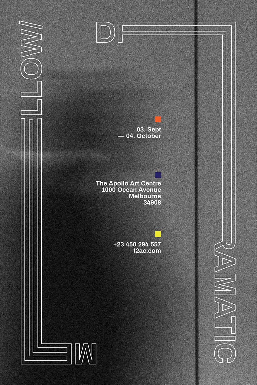
For this tutorial we will use the Noise Tool in Adobe Photoshop in order to be able to use a low-resolution image for print and create a type poster. Then we’ll finish off the poster in Illustrator.

Looking for bold fonts for your next poster project? Head on over to GraphicRiver to find thousands of fonts!

What You Will Need

You will also need to download and install the following font file and image: 

1. Getting the Image Ready

Step 1

Open the London’s Financial District image in Photoshop. We are using this image as the background for our poster. We will crop down to the area that has the most movement to create a “barely there” look.

Open the Londons Financial District Image

Step 2

In the Tools panel, select the Crop Tool (C), hold Shift and click and drag from one of the corners to keep the ratio of the photo. I am choosing this part of the photo because it is not as defined as other parts. It is not necessary to be very precise as there is no right or wrong! 

Crop the image to where is the least amount of definition

2. How to Change the Size and Resolution of an Image

We will be using this poster for print. Head over to the menu and select Image > Image Size. In the pop-up window, check the options Constrain Proportions and Resample Image > Bicubic Automatic. Under Document Size in the same window, change the Height to 18 in and change the Resolution to 300 Pixels/Inch. Hit OK

This isn’t normally done for high-resolution photos. In this specific case we are trying to make a low-resolution photo work to our advantage.

Change the image size and resolution

3. How to Use the Noise Tool and Contrast Tool

Step 1

We want to create a more interesting image for the background of our poster. We will head over to the menu and select Filter > Noise > Add Noise. On the right side of the pop-up window, check Preview so we can see the changes live on the image. 

Under the Distribution option, select Gaussian and also check Monochromatic at the bottom of the window. Gaussian will give an uneven noise to the image while Monochromatic will only give us black and white noise rather than CMYK. You can play around with the percentage in the Amount option. I will do 30% because I am looking to maintain some of the contrast on the photo and not have it too washed out. Click OK.

Adding noise to the image

Step 2

Head over to the bottom of the Layers panel and click on Create New Fill or Adjustment Layer > Brightness/Contrast. This will create a new layer over our initial image. Simultaneously the Properties panel will pop up with options to adjust the layer. If this doesn’t pop up, double-click the sun icon on the new layer. I changed the values to Brightness: -25 and Contrast: 55 to make the lightest parts more grey. 

Adding a new adjustment layer to set brightness and contrast

4. How to Convert an Image to CMYK and Save the File

Step 1

Head over to the menu and select Image > Mode > CMYK. A new window will pop up; click on Don’t Flatten

Step 2

We will save our image in Layers in case we need to edit it later. Hit Shift-Command-S and name the file Street_Background.PSD. Under Format, choose Photoshop. Click Save. We will do the same again and save as a TIFF file to use in the Illustrator part of this tutorial.

5. How to Create a New File in Illustrator and Guides

Step 1

Head over to File > New (Command-N). Let’s name our file Mellow-Dramatic and set the Width to 12 in and Height to 18 in. Head down to the Advanced section and set the Color Mode to CMYK. Let’s say this poster is intended to be printed, so set the Raster Effects to 300 dpi and Preview Mode to Default. Click OK.

Create a new document in Illustrator

Step 2

To create guides in our document, let’s bring up the Rulers by pressing Command-R. My rulers are set in inches; you can change this by going to the menu and selecting Illustrator > Preferences > Units. In the new Preferences window that pops up, under Units, select Inches for the General option. Click OK.

Change your rulers preferences to inches

Step 3

We want to have margins that are 1 inch from each edge. Click and drag from the rulers over to the page for a new guide to be created. You can place this anywhere on the page, and if the guides are unlocked you will be able to move them around more than once. You can unlock or lock your guides by pressing Option-Command-;

To set the guide to a specific point on our page, we can use the Transform panel. You can activate it from the menu, Window > Transform. For our left vertical margin, we will set X: 1 in. For the right side we will set X: 11 in. For the top and bottom, we will set Y: 1 in and Y: 17 in respectively. 

Create guides that are 1 inch inwards from each side of the page

6. How to Add Images in Illustrator

Let’s find the TIFF file we saved of our Street_Background file. Let’s drag and drop it onto the new Illustrator Mellow-Dramatic File. 

You will notice the image is looking a bit rougher than we last saw it. To look at the real image, we will need to Embed the file in Illustrator. Head over to the Controls panel and click on Embed. A TIFF Import Options window will pop up. Under Options, select Flatten Layers to a Single Image and click OK. 

TIFF import options to embed the image onto Illustrator

7. How to Add Text

Step 1

In the Layers panel, let’s create a New Layer by clicking at the bottom of the panel.

Create a new layer

Step 2

In the toolbar, select the Type Tool (T) icon, and click and drag to create a text box. Type Mellow and a “/ ” all in uppercase. Now let’s bring up the Character panel by pressing Command-T and use the font Archivo Bold, setting the Font Size to 100 pt

Step 3

Let’s duplicate this text box by pressing the Option key and clicking and dragging the text box. In this second box, type Dramatic.

Duplicating a text box

8. How to Create Text Outlines and Editing

Step 1

Select one of the text boxes and hit Shift-Command-O. The text box will turn into a grouped object. Select the other text box and do the same. If you had selected these two boxes and then converted them into Outlines, they would be grouped together, and we want the two words to be separated. 

Convert text boxes into outlines

Step 2

Select both words and hit Shift-X to swap the fill and stroke colour. Head over to the toolbar and activate the Stroke colour. In the Color panel (F6), change the black colour to white. Let’s bring up the Stroke panel by going to the menu and clicking Stroke, and set the thickness to 2 pt

Set the weight of the stroke to 2 pts on the Stroke Panel

Step 3

In the Layers panel, lock Layer 1 by clicking on the empty space next to the eye icon. We will edit each of the words on Layer 2 separately. Let’s start with Mellow/. Duplicate the object by pressing Option while clicking and dragging the object. 

We want to separate M and ellow/, so use the Direct Selection Tool (A) from the Tools panel, select the M, and delete this letter. Rotate (R) the remaining letters and align to the top left corner of the margin.

Separating and aligning the words to different guides to create the composition

Step 4

Using the same Direct Selection Tool (A), select llow/ from the previously duplicated object and delete. Drag a new Guide from the Ruler and place it at 4.25 inches from the left edge of the poster. Select the Me duplicated object and Rotate it 180 degrees, and then place it on the bottom margin and align it to the new guide we created.

Aligning the word ME to the bottom guide

Step 5

Use the Direct Selection Tool (A) to select only certain points in an object. For instance, on the letter E, we will use it to select only the left side, as shown in the image below. The points that are activated will be filled in, and the points that are not activated will be hollow; you will only see the outline of a square. 

Once the left side of the upside-down E is selected, click to drag to the left margin while holding down Shift to keep it at the same level. Let’s do the same with the E aligned on the top left side, but this time we will stop before the bottom margin.

Using the Direct Selection Tool to select only certain points of an object

Step 6

Using the Direct Selection Tool (A), select the horizontal strokes on the E aligned vertically and delete them as shown in the picture below. 

Aligning vertical strokes to the bottom of the objects

Step 7

Select the first two point-strokes with the Direct Selection Tool (A), right-click, and select Join. Do the same for the next two and the last two points.

Select two points with the Direct Selection Tool and join them

Step 8

Select both words and Ungroup by hitting Shift-Command-G. Let’s select the two E’s and hit Shift-X to swap the stroke and fill colour.

Swapping stroke and fill colour to fill the letters E with white

Step 9

Using the Direct Selection Tool (A), move and join the vertical lines with the horizontal lines of the E’s as shown in the image below. Feel free to Zoom in to align to perfection!

Joining the two strokes to later use the Pathfinder tool

Step 10

Once these three lines are aligned, let’s bring up our Pathfinder panel by going to Window > Pathfinder, and under Shape Mode select Unite. This tool will merge both objects into one. To finish with the same style as the other letters, press Shift-X and make sure the stroke is 2 pt on the Stroke panel.

Using the Pathfinder tool to joing the strokes and create one shape

Step 11

Now we will do the same steps with the word Dramatic, but this time we will extend around the letter R. Let’s give it a try!

Lets give it a try with the other word

9. How to Add Text Details and Pops of Colour

Step 1

To create a square, let’s use the Rectangle Tool (M). Click and drag while holding Shift to create a perfect square shape. Let’s multiply the square by pressing Option while clicking and dragging. You can also hold Shift at the same time to duplicate the object along the same X or Y value. Let’s colour each of the squares with the following codes: #F05A28, #252166, and #EBE732

Adding pops of colour to the poster

Step 2

Let’s add some more space between the square objects and add some details to the poster. I added date, place, and contact information using the Text Tool (T). By clicking on the poster, you can control the break of the sentences; in my case, I divided things to create balance. I aligned each text box under each of the squares. To align the text boxes and the squares to the right, you can use the Align panel from Window > Align, and in the panel under Align Object, select the Horizontal Align Right icon.

Aligning all objects to the right side

10. How to Save for Print

To save the poster as an Illustrator file, head over to File > Save, name the poster, and hit Save. To print, select PDF when saving the poster. Additionally, the Save Adobe PDF window will pop up. Under Adobe PDF Preset, select High Quality Print. On the right side of the panel, select Marks and Bleeds, and under Marks, select Trim Marks. Click on Save PDF.

Saving the poster as PDF to print

Awesome Work, You’re Done!

Congratulations! You did it! In this tutorial:

  • We learned how to use the Noise Tool on an image to add texture.
  • We learned to extend the value of a low-resolution image.
  • We learned to use the Outline Tool in Illustrator to create an interesting play with typography.

Quick Tip: How to Create an Illustration of Pussy Willow With a Chick in Adobe Illustrator

Final product image
What You’ll Be Creating

In today’s quick tutorial you will learn how to create a pussy willow and chick illustration. We will basically create one branch and then turn it into many. We will then make three compositions using these branches. At the end, we will cheer up our illustration by creating a little chick. 

This is a quick and easy illustration that is perfect for beginners. To create this image, we will be using basic shapes in Adobe Illustrator and deforming them to create a cute illustration.

To remind yourself how the real willow catkins look, be sure to check out Envato Market.

Whenever you’re ready, let’s go!

1. How to Create the Pussy Willow 

Step 1

After opening Adobe Illustrator, create a new document with 850 x 850 px Width and Height

Let’s start with the catkin of the willow. Set the fill color as you see in the image below. Now take the Ellipse Tool (L) and create a grey ellipse. Then we will transform this ellipse by going to Effect > Distort and Transform > Roughen. You can play with the options for the rough effect (Size and Detail) to get a result close to the one shown below or whatever you like. Expand this shape (Object > Expand Appearance).

Now create a copy of the rough ellipse in the front (Control-C, Control-F) and shift it to the upper left side. In the image below, the black stroke color of these ellipses is used only for better visibility. 

Next, create another copy of the first ellipse in front (Control-C, Control-F) and, while keeping this copy and the shifted one selected, press the Minus Front button on the Pathfinder panel (Window > Pathfinder). This action leaves us with a new crescent shape. Change the color of the crescent shape to a darker grey.

After this, add a light colored ellipse on the top left side to show the volume of the catkin. To finish the catkin, add small yellowish circles of different sizes all over it. It is better to group the whole catkin now, as it will be easier to move it later (right-click > Group).

how to create the willow catkin

Step 2

Using the Rounded Rectangle Tool, create a thin, vertical rounded rectangle for the stem. Place the catkins on both sides of the stem. Rotate and change the size of some catkins to get a result similar to the image shown below. Do not place each catkin evenly, but place them more randomly.

how to create the branch

Step 3

To make the stem look more realistic and not so perfectly straight, we will roughen its surface by using the Warp Tool. Double-click on the Warp Tool (Shift-R) and enter Width and Height dimensions for the brush of around 20-30 px, Intensity 100% and hit OK. Place the rounded rectangle in front the catkins (Control-C, Control-F), and select it before you use the Warp Tool (Shift-R), otherwise you will affect the other objects surrounding it.

Move your mouse over the stem (as shown in the image) to create the part where the catkin sits on a branch.

In a similar way, create another stem, which should be smaller and should have a different number of catkins. Group each stem (right-click > Group). Later in this tutorial we will combine them in different ways, so it’s important to have at least two different stems.

making the branch more natural

Step 4

In this step we will create a set of stems, which will be used for the three different compositions. Therefore make a few copies of the large and small stems and combine them.

First, we will select one stem and warp it. Go to Effect > Warp > Arc. For your convenience, select Preview while adjusting the options to get a result you like. In the new dialogue window, select Vertical, Bend -20%, Distortion Horizontal 0%, Vertical 0%, and hit OK. Do the same warping process for each branch, just by varying the Bend percentage.

Expand each branch (Object > Expand Appearance).

how to create the different branches

2. How to Create the Compositions of Pussy Willow

Step 1

First, let’s create our first composition. Draw a blue circle (use the Ellipse Tool (L) while holding down the Shift key for an even circle).

Add a set of willow branches on the left side of the circle. Now select all of the stems, right-click the mouse, and select Transform > Reflect. This will bring up the Reflect dialogue window, where you should enter Axis Vertical, Angle 90 degrees, and press Copy. Move the copy of the newly created stems to the right. You’ll end up with a composition similar to the one shown below.

how to create the first composition

Step 2

Now we will create our second composition.

Make another copy of the blue circle created in the previous step, and place a set of pussy willows on the circle as shown in the image below. Notice that the willow is overlapping the sides of the circle.

Next, select the circle and make a copy of it in front of the willows (Control-C, Control-F), cut it off (Control-X), and place it in front of everything (Control-F). To be able to see the willows under the circle, we will remove its fill color and add a black stroke color.

Now, as we want to make the top part of the willows visible, we have to distort the top circle so as to be able to cover the willow on top. Move the handles of the anchor points of this circle by using the Direct Selection Tool (A) to achieve the result you need. You want to place the black stroke color inside the top part of the willow.

After that, select the willow and the front shape, and then go to Object > Clipping Mask > Make (Control-7). This action will cut the part of the willow beyond the blue circle.

how to create the second composition

Step 3

For the third composition, create a copy of the blue circle again. Place the willow branches around the circle to have a wreath look as shown below.

how to create the third composition

Step 4

Place all three compositions together.

three compositions together

3. How to Create the Chick

Step 1

We will start by drawing the head of the chick. Using the Ellipse Tool (L), draw an oval. In the image below, you can see which fill color you need. Then go to Effect > Warp > Inflate to shape the head. Enter the options you see below.

For the eyes, create a brown ellipse and add a tiny white circle to brighten up the eye. Place this eye on the left side of the head. While keeping the eye selected, take the Reflect Tool (O). Hold down the Alt key and click in the middle of the head. In the new dialogue window, select Vertical, Angle 90 degrees, and press Copy. You should now have two eyes.

how to create the chicks head

Step 2

Let’s add the chick’s beak. In the middle of the head, add a pink oval and modify it with a warp effect: go to Effect > Warp > Inflate. Select the required options and expand the shape.

Next, select the pink shape, and create a copy behind it (Control-C, Control-B). Using the Direct Selection Tool (A), select the bottom anchor point of the upper copy. Then move this anchor point a little bit upward.

Change the fill color of the bottom copy to a darker color. The beak of our chick is ready!

how to create the chicks beak

Step 3

For the chick’s body, add an ellipse below the head and distort it with the warp effect: Effect > Warp > Inflate. After adjusting the options as shown, expand the resulting shape.

how to create the chicks body

Step 4

In this step, we will create the chick’s wing. Start with an ellipse and modify it with the Arc effect (Effect > Warp > Arc). Enter the options shown below. Expand the shape.

Next, add four ellipses that should be slightly rotated to the right, and place them over the deformed ellipse. For better visibility, I added a black stroke color which should not be present in the final image. In the end, group the whole wing (right-click > Group).

how to create the chicks wing

Step 5

Put the wing on the left side of the chick’s body. Then make a vertically reflected copy of this wing to get another one. To do so, while keeping the wing selected, right-click your mouse and select Transform > Reflect. Once you get the dialogue box, select Axis Vertical, Angle 90 degrees, and press Copy. Move the new wing to the right.

how to create another wing

Step 6

To create the chick’s leg, start with a pink ellipse. Next, use the Direct Selection Tool (A) to select the left and right anchor points and move them up.

Then, create a copy of the shape, place it on the left side, and rotate it to the left. Make another copy and rotate it to the right to get the three toes of the chick’s leg.

Finally, add a fourth copy of the shape, make it smaller, and place it as the fourth toe.

how to create the chicks fingers

Step 7

Below the chick’s body, add two circles to start creating the legs. Place the foot (which should be grouped together) below the chicken, and slightly rotate it to the left as shown below.

Next, we will add chick’s leg. First, we will delete the fill color and set the stroke color. To do so, hit the double arrow Swap Fill and Stroke (Shift X) in the Tools panel. You should now have the same pink fill color as you had for the toes. Increase the stroke Weight and check Round Cap on the Stroke panel (Window > Stroke). Now, create an arc which will connect the two legs (you should rotate the arc) and place it behind the chick’s body. Move the handles of the arc by using the Direct Selection Tool (A) until you get the necessary result.

Make a vertical copy of the chick’s toes and attach them to the right leg.

how to create the chicks legs

Step 8

Place the chick in the middle of the two compositions, as shown below.

placing the chicks

4. How to Create the Background

Step 1

Create a blue square with Width and Height of 850 px, send it to the back (Control-X, Control-B), and center it to the artboard. For the alignment, select this square and on the Align panel (Window > Align) from the pop-up menu, choose Align to: Align to Artboard, and hit the Horizontal Align Center and Vertical Align Center buttons.

how to create the background

Step 2

Arrange the created compositions on the background to get the complete image.

placing the compositions with chicks on the background

Conclusion

Good job! I hope you had fun creating these cute compositions. To make them brighter, you can add some bows. If you want to know how to create such a bow, you can follow the instructions from one of my previous tutorials. You can also add other details if you wish. Just be creative and enjoy the process! See you again in my next tutorial!

final

How to Create a Vacation Beach Background in Adobe Illustrator

Final product image
What You’ll Be Creating

In this tutorial you will learn how to use the Mesh Tool to create a summer background with a vacation scene!

If
you’d like to skip this tutorial and purchase the end result with a couple more elements, head
over to GraphicRiver to purchase Vacation Background.

Vacation background

1. How to Draw the Palm Trees

Step 1

Let’s begin by drawing the stem! Using the Pen Tool (P), draw a curved line as shown below, and then change its Stroke Profile accordingly.

Finally, apply a Radial Gradient to the Stroke. It should go from #D3D991 to #5A6B00 to #576900.

draw stem

Step 2

Proceed to Object > Expand Appearance to create an object out of the stroke.

expand appearance

Step 3

Draw another line, coloring its Stroke with #7C9808, and then apply a Profile to it.

Next, go to Object > Expand Appearance.

draw leaf

Step 4

We will be modifying this object with Mesh!

Take the Mesh Tool (U) and place a few nodes onto the object, as shown below, to create a Mesh grid. Then, select the nodes as below and recolor them with #75840A.

Proceed by coloring the Mesh further, using the #B2AE5B and #91AB11 colors.

mesh

Step 5

Take the finished object and go to Effect > Warp > Arc. Set the Bend to 7%, and then Expand Appearance of the objects.

warp leaf

Step 6

Make a smaller copy of the leaf, and then create a copy of that as well, and recolor it with Edit > Edit Colors > Adjust Colors, setting the Red to 8%. You should have three different leaves after this step.

recolor leaf

Step 7

Take these leaves and add them to the stem we made before, creating a palm leaf.

assemble leaf

Step 8

Take a copy of the finished leaf and warp it with Effect > Warp > Arc. Use these values:

  • Bend: 8%
  • Horizontal Distortion: -2%
  • Vertical Distortion: -12%

Don’t forget to Expand Appearance of the result.

bend leaf

Step 9

Create another copy of the first leaf we made and recolor it with Edit > Edit Colors > Adjust Colors. Use these:

recolor

Step 10

Take the leaf we just made and apply Effect > Warp > Bulge to it.

  • Bend: 22%
  • Horizontal Distortion: -18%
  • Vertical Distortion: -8%

Expand Appearance.

warp leaf

Step 11

Modify the leaf further, now with Effect > Warp > Arc.

  • Bend: 24%
  • Horizontal Distortion: -2%
  • Vertical Distortion: -12%

Don’t forget to Expand Appearance of the result.

bend leaf

Step 12

Layer the leaves we made.

create leaves

Step 13

Draw an outline, keeping the part of leaves you want to see inside the rectangle.

crop leaves

Step 14

Select everything, right-click, and choose Make Clipping Mask.

clipping mask

Step 15

Our leaves are done!

result

2. How to Draw the Sea and the Sand

Step 1

For this step, you will need to download the attachment of this tutorial. You will be able to find it in the right sidebar.

Open sea.jpg in Adobe Illustrator and drag the image into your vector file. Bring up the Image Trace panel (you can do so by going through Window) and change the number of Colors to 3. Trace the image.

image trace

Step 2

Take the trace result, and then Ungroup it until you are left with different elements.

ungroup

Step 3

Divide the sea into different colors by selecting one colored element and clicking Select > Same > Fill Color.

select same colors

Step 4

You will get three different layers of elements. Keep the ones that are colored with #38D8F4 and #11B9D7, but delete all the elements colored with #5CEAFC, instead creating a full rectangle filled with that color.

Create a copy of the middle layer and put it aside for later.

divide into colors

Step 5

Combine these layers back into one background.

assemble sea

Step 6

Draw a new rectangle, filling it with #88DEE5, and then grab the Mesh Tool (U) and add a few mesh nodes.

Color the lower row of the object with #E7EFF0, and then add more nodes and color the new row with #CFEBED.

Modify the shape of the object by dragging its nodes with the Mesh Tool. Give it an organic, wavy shape.

draw mesh sea

Step 7

Select the nodes on the top and the bottom row of the object, changing their Opacity to 0%.

adjust opacity

Step 8

Begin drawing the sand with Mesh.

  1. #E7D9BD
  2. #CBA880
  3. #FFFFFF
draw sand with mesh

Step 9

Assemble the coastline.

coastline

Step 10

Take the copy we made in Step 4. Draw a rectangular outline in the upper part of the texture, and then go to Pathfinder > Crop to crop out a part of it.

crop

Step 11

Delete some parts of it to make it look more organic.

ajust texture

Step 12

Create an Art Brush out of the texture.

art brush

Step 13

Draw a line and apply the new brush to it.

Use the #EFEFEF color and set the Stroke to 0.5 pt.

add brush

Step 14

Expand Appearance of the object, and then set it to Screen and 50% Opacity.

set screen

Step 15

Place it on the coastline.

place brush

3. How to Draw the Sky and Clouds

Step 1

Draw the sky with Mesh.

  1. #53A0D0
  2. #FFFFFF
  3. #88C0E1
  4. #89C2E0
draw sky with gradient mesh

Step 2

Make the bottom row transparent.

transparent

Step 3

Draw the cloud with Mesh.

  1. #000000
  2. #808080
  3. #535353
  4. #353535
draw cloud

Step 4

Set the object to Screen.

screen

Step 5

Overlay some copies of the clouds.

clouds

Step 6

Add the sky and the clouds to the background.

add sky

Step 7

Add the palm leaves.

add leaves

Step 8

You can also draw a sun with a Radial Gradient from white to yellow to black. Use Screen on the object.

add sun

Step 9

Add the sun to the sky.

You can also add transparent Screen highlights—learn how to create this sort of highlight in the last section of my window frame tutorial.

add highlights

Step 10

Finally, learn how to draw flip flops in this tutorial of mine!

flip flops

Congratulations, You’re Now Done!

What now? You can try any of my other tutorials from my profile, or check out my portfolio on GraphicRiver, as well as the original image we recreated in this tutorial.

I hope you enjoyed the tutorial, and I’ll be extremely happy to see any results in the comments below!

original image
Vacation Background

How to Create a Minecraft Skin in Adobe Illustrator

Final product image
What You’ll Be Creating

Always wanted to create your very own Minecraft character skin, but never knew exactly where to start? Well, today it’s your
lucky day since I’m going to give you an in-depth look at the entire process,
showing you how to take a basic template and turn it into a finished usable
product.

If that sounds interesting, quickly grab a fresh cup of coffee and let’s
get crafty!

Before we start, I
wanted to point out that the entire project is a follow-up to an older
tutorial, where I showed you how to create an isometric Minecraft
character
using Affinity Designer’s powerful
Isometric Grid.

Today, we’re going
to switch things up by taking that finished character and translating it to Adobe Illustrator, using a custom
template that I’ve put together.

At this point,
some of you might point out that there are a bunch of online editors that allow
you to achieve a similar result, but since I like to have full control over the
creative process from start to finish, I took the time to put together a custom
template that I’ve attached in order to make things easier.

If you wanted to recreate the tutorial in Affinity,
don’t worry, since I’ve created a separate template for you too so that
everybody can partake and enjoy themselves.

Also, don’t forget you can always expand the project by heading over to GraphicRiver, where you’ll find a great selection of vector pixel art.

That being said, let’s shift our focus back to the project and jump
straight into it.

1. How to Load the
Resource File

Before we start working on the actual skin, we have to take a couple of moments and prepare by loading the resource template.

So, assuming you’ve already downloaded it, open it up either by
loading it from within Illustrator (File > Open and then going to the
folder where you downloaded it) or by double-clicking directly on the file.

loading the custom template

As soon as the file is loaded, you’ll be able to
see the actual template, which consists of a basic 64 x 64 px wireframe spread of the entire character’s body, which has been carefully labeled so that you know exactly what each shape is.

default template preview

2. How to Set Up a
New Project File

Since we don’t want to alter the template file, we’re going to take a
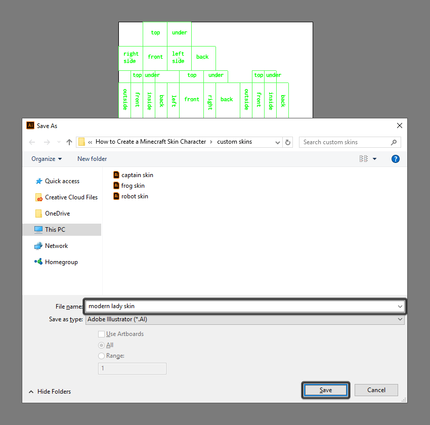
couple of moments and save it as a new project of its own (File > Save as), making sure to give it a custom name so that we
can distinguish it later on from other designed skins.

saving the default template as a custom skin

3. How to Use Custom Layers

If you open up the Layers
panel, you can see that I took the time to set up a few separate layers for each
body section, which I’ve individually labeled so that you can easily use them to gradually
build the character.

example of the custom layers found within the template

The guides layer itself has a few sub-layers that
you can turn off and on in order to identify and isolate a specific section of
the body, if you want to keep the design process as clean as possible.

expanded preview of the guides layer

When you start
working on the actual project, I recommend you lock all the layers except the
one that you’re currently on, in order to be able to focus on one section at a
time, which will help streamline the entire design process.

That being said, let’s move on to the actual creative process, where we
will see how easy it is to make a custom character skin using nothing more than
a couple of simple rectangles.

example of locking the custom layers

4. How to Create
the Main Body Shapes

As soon as our new
project file is all set up, we can start working on the actual skin, and we
will do so by laying out its main shapes.

Step 1

Select the Rectangle Tool (M)
and, using #95693D as your Fill
color, start drawing over each of the different guides, making sure to position the
resulting shapes onto their respective layer.

drawing the main shapes of the skin

Step 2

Now, since I already have a character that I’ve created in Affinity Designer, I’m going to copy (Control-C) and paste (Control-F) the design into Illustrator, and then use the Eyedropper Tool (I) to pick and apply
colors to the different body parts of the skin by holding down the Alt key and then simply clicking on them.

applying colors to the different sections of the skin

5. How to Add
Details to the Character’s Head

Once we have all
our body sections laid out, we can gradually add details to them, and we will
do so starting with the head. So, assuming you’re on the right layer (that
would be the seventh one), zoom in on the top section of the Artboard and let’s
jump straight into it.

Step 1

Turn on Pixel Preview mode
(Alt-Control-Y), and then draw the
mouth using a 2 x 1 px rectangle
which we will color using #BC9069 and then center align to the front face,
positioning it at a distance of 1 px from
its bottom edge.

creating the mouth of the character

Step 2

Add the right eye using two 1 x 1
px
squares horizontally stacked next to one another, coloring the left one
using #FFFFFF and the right one using #402C1B. Once you’re done, select and
group the two together using the Control-G
keyboard shortcut, positioning them as seen in the reference image.

creating the right eye of the character

Step 3

Create the left eye using a copy (Control-C
> Control-F
) of the one that we’ve just finished working on, which we
will vertically reflect (right click
> Transform > Reflect > Vertical
) and then position on the
opposite side of the face.

creating the left eye

Step 4

Using a couple of #4D3723 colored rectangles, draw the front section of
the hair, following the reference image as your main guide. Take your time, and
once you’re done, select and group (Control-G)
all of the front face’s composing shapes together before moving on to the next
one.

creating the front section of the hair

Step 5

Move on to the left section of the head, and create the little earring
using a 1 x 1 px rectangle which we will
color using #E09A50 and then position at a distance of 3 px from the larger square’s left edge and 2 px from its bottom one.

adding the earring to the side section of the head

Step 6

Add the back hair segment to the bottom section of the head using an 8 x 4 px rectangle (#402C1B), on top of which
we will add a smaller 4 x 2 px one
(#95693D), which we will group (Control-G)
and then position as seen in the reference image. Once you’re done, select and
group (Control-G) all of the current
section’s shapes together, doing the same for the entire head afterwards.

adding the hair segment from underneath the head

Quick note: this step is kind of optional if you’re dealing
with characters that have short hair, since when you load the skin within the
game and move the head around, it doesn’t look weird as it would if
you’re dealing with longer hair.

6. How to Add
Details to the Character’s Torso

Once we’ve
finished adding details to the head, we can move down a layer and focus on the
torso, which we will gradually refine one section at a time.

Step 1

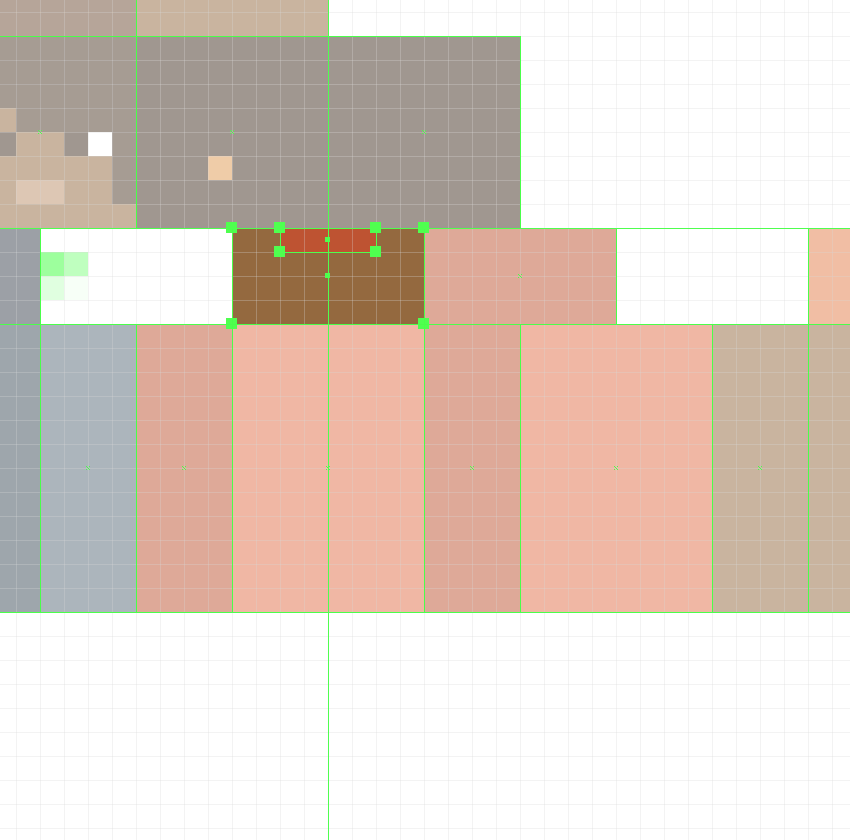
Start working on the top section of the torso by adding the back section
of the blouse’s neck using a 4 x 1 px rectangle,
which we will color using #BF522E and then center align to the underlying
shape’s top edge.

adding the blouse neck segment to the upper section of the torso

Step 2

Add the hair segments using two 2
x 4 px
rectangles (#4D3723), which we will position onto the sides as seen
in the reference image. Once you’re done, select and group (Control-G) all of the current section’s
composing shapes together before moving on to the next one.

adding the hair segments to the upper section of the torso

Step 3

Move down to the front section of the torso, and create the neck cutout
using a 4 x 2 px rectangle (#95693D)
vertically stacked on top of a smaller 2
x 1 px
one (#95693D), which we will group (Control-G) and then center align to the underlying shape’s top
edge.

adding the neck cutout to the front section of the torso

Step 4

Quickly draw the necklace using a couple of #E09A50 colored rectangles,
which we will group (Control-G) and
position onto the neck cutout as seen in the reference image.

adding the necklace to the neck cutout

Step 5

Add the hair segments using two 2
x 4 px
rectangles (#4D3723) vertically stacked on top of two smaller 1 x 2 px ones (#4D3723), which we will
individually group (Control-G) and
then position onto the sides of the neck cutout. Once you have the shapes in
place, select and group (Control-G) all
of them together before moving on to the next section.

adding the hair segments to the front section of the torso

Step 6

Move over to the back section of the torso, and then quickly add the
hair segments using three 1 px tall
rectangles which we will color using #4D3723 and then position as seen in the
reference image. Once you’re done, make sure you select and group (Control-G) all three of them together, doing the same for the entire section afterwards.

adding the hair segments to the back of the torso

Step 7

Finish off the current section by adding the belt using a 24 x 1 px rectangle, which we will color
using #37404D and then position at a distance of 1 px from the torso’s bottom edge.

adding the belt to the torso

7. How to Add
Details to the Character’s Arms

Now that we’ve
finished working to the torso, we can move on down to the next layer (that
would be the fourth one) and gradually add details to the arms, starting with
the right one.

Step 1

Create the outer side section of the blouse’s sleeve using a 4 x 8 px rectangle, which we will color
using #BF522E and then align to the underlying shape’s top edge, making sure to
select and group (Control-G) the two
together afterwards.

adding the outer side section to the right sleeve

Step 2

Draw the front section of the sleeve using a larger 4 x 6 px rectangle (#E37047) followed by two smaller ones (#E37047),
which we will group (Control-G) and then
position as seen in the reference image. Once you’re done, select and group all
of the current side’s composing shapes using the Control-G keyboard shortcut.

adding the front section of the right sleeve

Step 3

Add the inner side section of the sleeve using a 4 x 6 px rectangle, which we will color using #BF522E and then align
to the underlying shape’s top edge, making sure to select and group (Control-G) them together afterwards.

adding the inner side section of the right sleeve

Step 4

Create the back section of the sleeve using a copy (Control-C > Control-F) of the front, which we will vertically reflect
(right click > Transform > Reflect
> Vertical
) and then position onto the corresponding arm section, making
sure to delete the underlying shapes afterwards.

adding the back segment to the right sleeve

Step 5

Since we now have a finished version of the right arm, we can quickly
create the left one using a copy (Control-C)
of it, which we will paste (Control-F)
onto the fifth layer and then adjust by double-clicking on it to enter Isolation Mode and then swapping the
different sides as seen in the reference image. Once you’re
done, exit Isolation Mode by pressing
Escape, making sure to remove the shapes underneath before moving on to the next step.

adding the blouse sleeve to the left arm

Step 6

Add the hair segment to the top section of the left sleeve (the
shoulder) using a 1 x 4 px rectangle, which we will color using #6D4B31 and then position on its left edge, making
sure to select and group the two together afterwards using the Control-G keyboard shortcut.

adding the hair segment to the left shoulder

Step 7

Finish off the current body part by adding the hair segment to the front
of the sleeve using a 1 x 2 px rectangle
(#4D3723), which we will position as seen in the reference image. Once you’re
done, select and group all of the shapes together using the Control-G keyboard shortcut.

adding the hair segment to the front of the left sleeve

8. How to Add
Details to the Character’s Legs

Once we’ve
finished adding details to the character’s arms, we can move on to the third
layer, where we will focus on refining the legs, starting with the left one.

Step 1

Create the boot’s inner side section using a 4 x 5 px rectangle, which we will color using #37404D and then
bottom align to the underlying shape, making sure to select and group (Control-G) the two together afterwards.

adding the inner side section of the left boot

Step 2

Draw the front section of the boot using a couple of #37404D colored
rectangles, which we will group (Control-G)
and position as seen in the reference image.

adding the front section of the left boot

Step 3

Add the little corner of the blouse using a 2 x 1 px rectangle (#E37047) vertically stacked on top of a smaller
1 x 1 px one (#E37047), which we
will group (Control-G) and then
align to the underlying shape’s top-right corner. Once you’re done, select and
group (Control-G) all of the current
section’s composing shapes before moving on to the next one.

adding the front blouse segment to the left leg

Step 4

Add the outer side section of the boot using a 4 x 5 px rectangle (#37404D), which we will center align to the
larger shape’s bottom edge, making sure to group (Control-G) the two together afterwards.

adding the outer side section of the left boot

Step 5

Create the side segment of the blouse’s lower corner using a 4 x 2 px rectangle, which we will color
using #E37047 and then align to the top edge of the larger underlying shape.
Once you’re done, select and group (Control-G)
all of the current section’s composing shapes before moving on to the next one.

adding the blouse segment to the side of the left leg

Step 6

Add the back details to the leg using a copy (Control-C > Control-F) of the front one, which we will position
on the right and then adjust as seen in the reference image. Once you’re
done, select and group (Control-G)
all of the leg’s composing sections before moving on to the next step.

adding the details to the back section of the left boot

Step 7

Finish off the skin by adding the details to the right leg using a copy
(Control-C) of the one that we’ve
just finished working on, which we will paste (Control-F) onto the appropriate layer (that would be the second one) and then adjust by swapping out its sections as seen in the reference image.
Once you’re done, don’t forget to remove the underlying
shapes before hitting that save button.

finishing off the illustration

9. How to Export
the Skin

Okay, so we now
have a fully working skin, which means that all we need to do is export it so
that we can then bring it into Minecraft.

Step 1

Before you create the actual export, you’ll have to open the Layers panel and hide the guides
layer, otherwise your skin will end up having impurities.

example of hiding the guides layer

Step 2

As soon as the guides are hidden, you can easily export the final design
by going to File > Export > Save
for Web
(or by using the Alt-Shift-Control-S
keyboard shortcut), where we will want to set the File Format to PNG-24,
making sure to check the Transparency
option.

exporting the skin using the save for web option

10. How to Import
the Skin Into Minecraft

Now that we have our exported design, all we need to do is launch the game and upload this
pretty gal!

Step 1

Once the game has finished loading, click on the little hanger icon found
within the bottom-right section of the main window, right underneath your user
name and character preview.

using the hanger button to upload the skin

Step 2

A new window should pop up, giving you the option of choosing a new
skin.

choosing the new skin in minecraft

Step 3

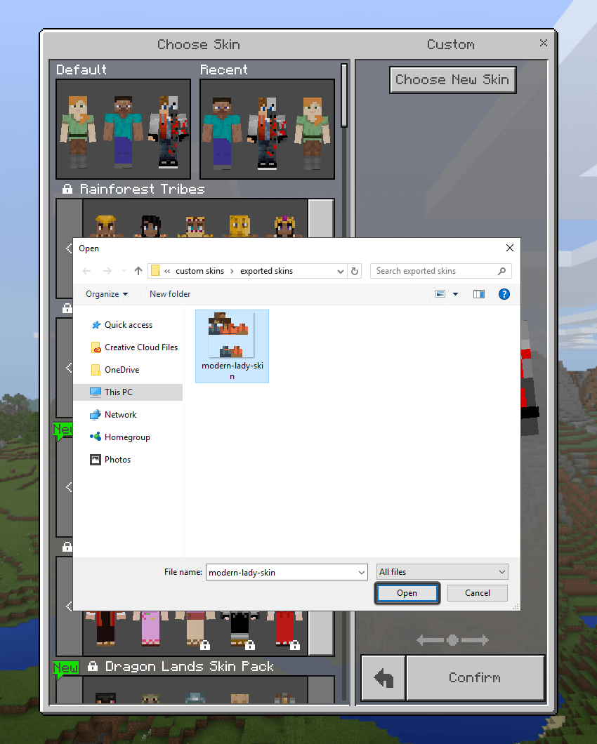
Navigate to the folder where you exported the skin and then simply
double click on it in order to upload it within the game.

navigating to the the saved skin

Step 4

The game will then ask you to choose the correct model type for your skin, which in our case is the one on the right with the thicker arms.

choosing the correct model type for the skin

Step 5

After that, all you need to do is click on the Confirm button, and then you can start playing with your custom
made skin that you put together.

in game skin example

It’s a Wrap!

There you have it, fellow Minecraft players, a nice and easy tutorial on how to create your very
own custom skin, using nothing more than a few rectangles.

As always, I hope
you had fun working on the project, and most importantly learned something new
and useful along the way.

If you have any questions, feel free to post them within the comments area and I’ll
get back to you as soon as I can!

finished project preview

How to Create an African Celebratory Pattern in Adobe Illustrator

Final product image
What You’ll Be Creating

In this tutorial, I will teach you how to create an African celebratory pattern in Adobe Illustrator. To bring this pattern to life, we’ll create different elements that represent African culture such as sacred African symbols, shapes, and silhouettes, and then we’ll combine all the elements to create a seamless pattern. Excited? Let’s get started then!

1. How to Set Up the Canvas

Create a new 600 px by 600 px document in Illustrator with the given settings:

Setting up the canvas

2. How to Create the Triangles

Step 1

We’ll start by forming the first element of our pattern: triangles. First, select the Polygon Tool, and then click once on the canvas and change the radius to 50 px and the Sides to 3.

Step 2

Next, change the fill color to teal #14aaa3.

Changing the color of the triangle

Step 3

Now that we have changed the color of the first triangle, we want to duplicate the triangle and rotate it. Activate the Selection Tool (V), and then select the shape and hold down Alt on the keyboard, and drag the shape while pressing Shift. Next, press Control-D seven times to create more triangles.

Duplicating the triangle once
Duplicating the triangle multiple times

Step 4

Now that we have our triangles, we want to group them and change the rotation. Activate the Selection Tool (V), select all the triangles, and press Control-G to group them. Next, select the grouped elements, Right-click, select Transform, and then Rotate. Change the angle to 180.

Changing the rotation

Step 5

Now, we want to center the shapesSelect the elements, and then press Shift-F7 to bring out the Align panel and click on Horizontal Align Center. Make sure to select Align to Artboard in the Align adjustment panel.

Aligning the shapes

Step 6

Next, we want to add another layer of triangles on top. Activate the Selection Tool (V), and then select the triangles, hold down Alt, and drag the shape slightly on top while pressing Shift. Fill it in yellow #edb71e.

Adding more triangles

3. How to Create the Circles and the African Symbol

Step 1

Create a new layer and name it medium circles. Then, activate the Ellipse Tool (L), fill it with red #e22227, and click on the canvas. Change the Width and Height to 20 px

Setting up the size of the circle

Step 2

Next, place the circle between the first two triangles. Activate the Selection Tool (V), select the circle, hold down Alt, and drag the shape down while pressing Shift as shown below.

Step 3

Now, we want to duplicate the circles between each triangle. Activate the Selection Tool (V), select the circles, and press Control-G to group them. Then, hold down Alt and drag the shapes into the spaces while pressing Shift as shown below.

Duplicating more circles to fill the space

Step 4

Before creating the African love symbol, we want to separate each part with thin rectangles. Activate the Rectangle Tool (M), fill it in red #e22227, and then click on the canvas and change the Width to 600 px and Height to 5.3333 px as shown below.

Changing the settings of the rectangles

Step 5

Next, activate the Selection Tool (V) and place the shape under the triangles. Then duplicate the shape by pressing Alt on the keyboard, and drag the shape as shown below.

Duplicating the rectangle

Step 6

Now we want to create the African love symbol. Create a new layer and name it Love symbol. Then, activate the Pen Tool (P) and start by drawing half of the shape as shown below.

Drawing the love symbol

Step 7

Then duplicate the shape by pressing Alt on the keyboard, and drag the shape as shown below.

Step 8

Now, we want to reflect the shape. Select the duplicated shape, Right-Click, and select Transform > Reflect.

Transforming and reflecting
End result

Step 9

Now that we have reflected the shape, we want to finish the symbol. Activate the Pen Tool (P), click on the bottom right anchor point, and draw the shape as shown below.

Drawing the right wing

Step 10

Next, select the Pen Tool (P), and click on the top left anchor point to finish the left wing as shown below. 

Finishing the left wing

Step 11

Now that we have finished drawing the symbol, we want to change the color. Fill it in a light yellow #fcde62. Next, activate the Selection Tool (V) and make the shape smaller, pressing Shift while resizing. Then, select the symbol and place it as shown below. 

Next, we want to duplicate the shape. Select the symbol and hold down Alt on the keyboard, and drag the shape while pressing Shift. Next, press Control-D until the space is filled.

Changing the color and duplicating the symbol

4. How to Create the Woman Silhouette

Step 1

Create a new layer and name it woman. Then, activate the Ellipse Tool (L) and fill it in cream #f4eabc, and click on the canvas. Change the Width and Height to 15 px

Drawing the silhouettes head

Step 2

Then, select the Pen Tool (P) and start drawing the body as shown below. Start from the circle to the left arm and keep moving. 

End result of shape

Step 3

Now that we have finished drawing the silhouette, activate the Selection Tool (V) and place the shape under the rectangle shape. Next, we want to duplicate the shape. Select the silhouette, hold down Alt on the keyboard, and drag the shape while pressing Shift. 

Duplicating the silhouette

Step 4

Next, we want to fill the space with more silhouettes. Press Control-D until the space is filled as shown below.

Filling the space with more silhouette

5. How to Create the Man Silhouette

Step 1

Before drawing the man silhouette, we want to break the designs with more lines and circles in between. First, drag one of the previous red rectangles, hold down Alt on the keyboard, and drag the shape while pressing Shift. Duplicate the shape twice, as shown below.

Adding more lines to break down the design

Step 2

Next, we want to fill the space between the two lines with small circles. Activate the Ellipse Tool (L), fill it in yellow #ecb71e, and click on the canvas. Change the Width and Height to 9 px

Settings for the circle

Step 3

Now, use the Selection Tool (V) to place the circle between the two shapes, and duplicate the circle once. Press Alt on the keyboard and drag the shape while pressing Shift. Duplicate the circle as shown below.

Duplicating the circle

Step 4

Next, we want to fill the space with more circles. Press Control-D until the space is filled as shown below.

Filling the space with more circles

Step 5

Now that we have broken down our pattern a little bit, we want to draw the man silhouette. Activate the Pen Tool (P) and draw the silhouette as shown below.

Drawing the man silhouette

Step 6

Next, we want to draw another shape between the arms and the trumpet. Activate the Pen Tool (P) and draw the shape as shown below.

Finshing the drawing

Step 7

Now that we’ve finished drawing the silhouette, we want to change the color and duplicate the silhouette to fill the space. Select the silhouette and fill it in cream #f4eabc. Then, select the shape between the arms and fill it in green #10755b. Next, select both shapes and press Control-G to group them. Then, press Alt on the keyboard, drag the shape while pressing Shift, and press Control-D until the space is filled as shown below.

Filling the space with the man silhouette

6. How to Create the Waves, Triangles, and Background

Step 1

First, we want to break down the pattern a little bit. Activate the Rectangle Tool (M), fill it with cream #f4eabc, and draw a thin rectangle under the silhouette as shown below.

Step 2

Now, we want to draw the waves. Choose the Pen Tool (P), fill it with blue #17aaa3, and then place each wave between the silhouettes as shown below.

Adding the waves

Step 3

Next, we want to duplicate the triangles and circles from the top to the bottom. Select the triangles and circles and press Control-G to group them. Then, press Alt on the keyboard and drag the shapes under the rectangle as shown below. Hold Shift while duplicating. Next, select the duplicated elements, Right-Click, Transform > Rotate.

Adding the final elements

Step 4

Now that we have finished drawing all objects, we want to add our background. Create a new layer and name it background. Place this layer under all layers. Then, activate the Rectangle Tool (M) and fill it in green #10755b. Next, drag the rectangle all over the canvas as shown below.

Adding the background

7. How to Make the Pattern Seamless

Step 1

Now, we want to readjust the design to be able to make it seamless. All elements except the lines have to be inside the artboard. Activate the Selection Tool (V), select all the objects that are hanging on the sides, and resize them as shown below.

Re-arranging all elements inside the artboard

Step 2

Now that we have adjusted everything, we want to make a clipping mask to remove any objects hanging around the artboard. Activate the Rectangle Tool (M), fill it with white #ffffff, and click on the canvas. Change the Width and Height to 600 px. Then, select all elements, including the background, and Right-click > Make Clipping Mask.

Making a Clipping mask

Step 3

Here is the fun part! We can now make it seamless. Select the artwork, and then go to Object > Pattern > Make. Change the Width and Height to 600 px. 

Making it seamless
Final result

Congratulations! Our African Celebratory Pattern Is Done!

Great job! We’ve finished creating our African celebratory pattern. I hope this tutorial brought you a joyful mood and helped you to discover some new tips and tricks which will be useful for your future artworks! Keep creating.

End result

How to Create a Game Graphic Style Text Effect in Adobe Illustrator

Final product image
What You’ll Be Creating

In this
tutorial, you will learn how to make a game graphic style in Adobe Illustrator. 

The graphic style we
will be creating is a part of Game
Graphic Style
.

If
you want to skip the tutorial and just use this style with nine more graphic
styles, you can purchase Game Graphic
Style
 from GraphicRiver.

All Game Graphic Styles

What You Will Need

The following font was used during this
tutorial:

Before you start creating this graphic style,
download and install the font.

1. How to Set Up a New Document

Step 1

Let’s start by creating a New Document of 600 x 600 px size
and RGB color mode.

Set up a New Document

Step 2

Now go to Edit > Preference >
General
. Check the Scale Stroke &
Effect
 option.
Hit OK to apply this setting.

Check Scale Stoke  Effect Option

2. How to Create a Graphic Style

Step 1

Let’s begin using the Type Tool! Pick the Type Tool (T) and select the Riffic font. Set the Font Size to 100 pt. Write “QUEST” with capital letters.

Write a Text

Step 2

Now we need to apply the first gradient color, so select the text and set the fill color to none. Next, go to the Appearance panel and click on Add New Fill.

Note: If you can’t see the Appearance panel, go to Window > Appearance.

Apply Add New Fill

Step 3

Select the new fill, go to Window > Gradient, and set the gradient with 3 color stops.

Follow these settings:

  • Type: Linear
  • Angle: 90o
  • First Gradient Color stop #d67638 and Location 0%
  • Second Gradient Color stop #e5af4b and Location 50%
  • Third Gradient Color stop #f3ea60 and Location 75%
Fill Gradient Using Gradient Panel

Step 4

Focus on the Appearance panel, and make sure the text and fill box are both selected. Add a second fill using that same Add New Fill button; after clicking on this button, a new fill box (layer) will be
created above the existing fill.

Now select the bottom fill box and click on Add New Effect (fx). Select Path > Offset Path.

Follow these settings:

  • Offset: 3
  • Joins: Meter
  • Meter Limit: 4

Hit OK to apply.

Offset Path

Step 5

Go to the Gradient panel (G) and set
the gradient with 2 color stops.

Follow these settings:

  • Type: Linear
  • Angle: 90o
  • First Gradient Color stop #ce5c39
    and Location 0%
  • Second Gradient Color stop #c96b2e
    and Location 100%

Tip: To remove any
unwanted color stop from the gradient panel, just pull it down.

Second Gradient with 2 Color Stops

Step 6

Now click on Add New Effect (fx) on the Appearance panel and select Distort and
Transform > Transform
.

Follow these settings:

  • Move Vertical: 1 pt
  • Check Scale Strokes & Effects
  • Check Transform Objects
  • Check Transform Patterns
  • Copies: 7

Hit OK to apply.

Transform Effect Using Appearance Panel

Step 7

We will change the color of this gradient, so go to the Gradient panel (G). Replace the gradient color with these settings:

  • Type: Linear

  • Angle: 90o
  • First Gradient Color stop #591714 and Location
    0%
  • Second Gradient Color stop #812e26 and Location
    100%
2 Color Stops Gradient

Step 8

Click on the upper fill box. Make sure the
text and upper fill box are both selected.

Now click on the Duplicate Selected Items button on the Appearance panel.

Using the Gradient panel, replace the gradient color with these settings:

  • Type: Linear
  • Angle: 90o
  • First Gradient Color stop #e6c04c and Location
    0%
  • Second Gradient Color stop #f2e95f and Location
    35%
  • Third Gradient Color stop #e8f4fc and Location
    100%
Duplicate Selected item Using Appearance Panel

Step 9

Now click on the Add New Effect (fx) button on the Appearance panel and select Path > Offset Path.

Follow these settings:

  • Offset: -4
  • Joins: Meter
  • Meter Limit: 4

Hit OK to apply.

Apply a New Offset Path

Step 10

Make sure the text and upper fill box are both selected. Click on Add New Effect (fx) and select Distort and Transform > Transform

Follow these settings:

  • Move Horizontal: -3 pt
  • Check Scale Strokes & Effects
  • Check Transform Objects
  • Check Transform Patterns

Hit OK to apply.

Again Transform Effect using Appearance Panel

Step 11

Now we will add a drop shadow behind the text. So select the text and click on Type on the Appearance panel.

Now click on the Add New Effect button and select Stylize > Drop Shadow.

Follow these settings:

  • Mode: Normal
  • Opacity: 35%
  • X offset: 0
  • Y offset: 8pt
  • Blur: 1 pt
  • Color: #221f1f

Hit OK to apply.

Apply a Drop Shadow

Congratulations! You Are Done

That’s it! You can use this style in your game projects. This graphic style we created is a part of Game Graphic Style. 

I hope you enjoyed this tutorial.

Final Image

How to Draw Vector Peaches Using Gradient Mesh in Adobe Illustrator

Final product image
What You’ll Be Creating

In this tutorial, you will have the opportunity to learn how to use the Gradient Mesh Tool to draw a pair of appetizing peaches.

If you’d like to skip this tutorial and just use these peaches in your work, you can go ahead and simply purchase Two Fresh Peaches from GraphicRiver!

Two Fresh Peaches
Two Fresh Peaches

1. How to Draw a Peach Using Mesh

Step 1

Let’s start off by drawing the top bun with Gradient Mesh.

Create an orange rectangle—the color is #FFAC38.

Next, grab the Mesh Tool (U). Click to create nodes, which in turn create a Mesh Grid.
When you have a thick enough mesh grid, grab the edges of the
rectangle and move them to make the shape rounder. It should resemble
the shape of a peach.

Once you’re done with the shaping, select the middle cluster of nodes (they are already colored differently in the screenshot) and color them with #FF7B46.

Next, select the nodes that are darker (they’re selected below) and proceed to change their color to #FF3A09.

Add some darker orange tones in the fourth step with #FF901C, and then darken it more with #FF6F1C and #FF6E20.

Always make sure to select the nodes that are selected in each screenshot below and apply the corresponding color to them!

draw peach with mesh

Step 2

Continue coloring the peach further. You will need to add more mesh nodes to make the image more complex.

You will need these colors:

  1. #FF8018
  2. #FF7035
  3. #FF7E26
  4. #FF9F3C
  5. #FFBA55
  6. #FFC776
gradient mesh tool

Step 3

Finish this part of the peach with these colors:

  1. #FF8732
  2. #FF9A5C
  3. #FF7F41
finish peach fruit with mesh

Step 4

Begin drawing the top of the peach.

  1. #FBDAA7
  2. #FEBB86
  3. #FF6B3F
  4. #FFA673
  5. #FF8753
  6. #FF4105
draw vector image

Step 5

Finish the peach.

  1. #FBDDAC
  2. #C82B00
  3. #FFCE9A
  4. #FF882D
  5. #FFBC85
vector mesh part in adobe illustrator

Step 6

Draw another part of the peach.

  1. #882505
  2. #611404
  3. #CB7103
  4. #5B1501
  5. #6A1A02
  6. #903804
peach stem mesh

Step 7

Draw two ellipses, filling the bigger ellipse with #D82B00 and the smaller one with #602E0C. Place the brown ellipse into the red one, and then make the big ellipse completely transparent.

create blend

Step 8

Go to Object > Blend > Blend Options, selecting Specified Steps and 30.

Next, select both ellipses and click Object > Blend > Make. Change the Transparency to Multiply.

blend options

Step 9

Add the stem and the shadow to the peach.

add mesh parts to vector peach

2. How to Add Texture

Step 1

For this step, download the attachment of this tutorial and drag texture.jpg into your file in Adobe Illustrator.

Go to Window > Image Trace, change the Mode to Black and White and Threshold to 144, and click Trace. Expand the result.

texture

Step 2

Create a copy of the expanded trace result, and then draw an outline of the mesh peach. Place the outline on top of the texture. Select both, right-click and Make Clipping Mask.

clipping mask

Step 3

Change the texture to Overlay and 20% Opacity.

change opacity

Step 4

Draw an outline of the top part of the peach and make a Clipping Mask with the copy of the original texture. Set it to Overlay with 20% Opacity.

clipping mask

Step 5

Place the textures onto the peach.

place texture onto peach

3. How to Draw the Leaf

Step 1

Draw a part of the leaf using the Pen Tool (P) with the shown stroke profile.

draw leaf

Step 2

Select the object and go to Object > Expand Appearance. Next, apply a Linear Gradient (#5D6D10 to #6B7A00) to it.

gradient

Step 3

Change it to Screen with 40% Opacity.

screen with 40 opacity

Step 4

Draw a mesh foundation for the leaf.

  1. #5D6D10
  2. #2F4304
  3. #415409
  4. #9CAA39
gradient mesh foundation

Step 5

Draw an outline of the leaf, place it on top of the mesh, and Apply Clipping Mask.

leaf outline

Step 6

Bend the leaf with Effect > Warp > Arc, a -37% Bend and -34% Horizontal Distortion.

Apply Object > Expand Appearance to the result.

warp leaf

Step 7

Draw a shadow by applying a Radial Gradient (from #8E6D51 to white) to an ellipse.

gradient

Step 8

Change the ellipse to Multiply with 86% Opacity.

opacity

Step 9

Add several shadows under the mesh peach.

add shadows

Step 10

Place the leaf with more shadows.

add leaf

Step 11

Add a second copy of the peach to the picture.

finish drawing of vector mesh peaches

Awesome Work, You’re Now Done!

Thank you for following along, and please
feel welcome to post your result in the comments. I’ll be looking
forward to seeing it!

In this tutorial, you learned how to
create a pair of peaches using the Mesh Tool.

I
hope you’ve enjoyed this tutorial and learned how to use some useful
tools for the future! Check out some of my other vector tutorials on my instructor profile.

You can purchase this item as well as other similar designs in my portfolio on GraphicRiver.

two peaches
Two Fresh Peaches

How to Warp Text in Adobe Illustrator

Final product image
What You’ll Be Creating

Want to warp some text? In this video from my course, 10 Essential Design Tips in Adobe Illustrator, you’ll learn all the ins and outs of distorting and warping text in Adobe Illustrator.

How to Warp Text in Adobe Illustrator

Prepare the Text for Warping

So we’re going to learn how to warp stuff. Let’s grab our Type Tool, left click anywhere on the artboard, and type some text. Let’s type “WARPED”. And we can go to the Character panel at the top, and we can pick a font—let’s go for Gotham Bold

Then I’m going to go to the alignment options and select Align Center so that it’s in the middle. Now let’s create a couple of copies by holding Alt-Shift and dragging. So your screen should look like this:

Plain text ready for warping

Create a Bulge Effect

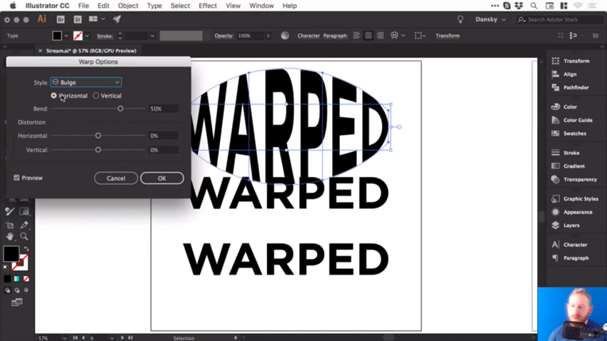
We’ll select the first piece of text, and go to Object > Envelope Distort > Make with Warp. We’ve got the Preview option checked, and we can choose the Style as well. There are lots of presets to choose from, so let’s go for Bulge, and see how that looks. 

Bulge effect

So at the moment, we are bulging this text horizontally, and we can adjust that Bend slider. So, of course, we can go up a few percent and you’ll see it starts to bulge outwards. Or we can go ever so slightly into the negatives and it will go inwards.

You could also bulge this vertically, so it’ll behave slightly differently. It really does depend what you’re going for.

Vertical bulge

Add Distortion

We could also distort this both horizontally and vertically, using the slider. So you could make one side appear larger by dragging the Horizontal Distortion slider to -100

Horizontal distortion

But let’s go for something more subtle. Choose the following values:

  • Horizontal Bend: -2%
  • Horizontal Distortion: -54%
  • Vertical Distortion: 25%

Then click OK, you can see that we’ve warped the text.

Bulge effect final

And if we click on it, we still have all of these options along the top, where you can change the preset and other values. 

Adjust the Bulge Effect

Now, at the moment, if I press Command-Y to go into outline mode, you can see that it’s still got a box and lines around it, and I can’t change the fill color or anything. 

Unexpanded text

So what I recommend is once you’ve done your warp, and you’re happy with your text, go to Object > Expand. Leave Object and Fill selected, click OK, and then we can switch into outline mode again, and you’ll be able to see your text. 

Expanded text

Now remember, when you expand anything in Illustrator, essentially what you see becomes the paths of the shape. So this is now made up of lots of different anchor points, and we can go in and adjust these if we want to fine tune that warp. 

Adjusting anchor points of warp text

But also, when we select it, it now has a fill color, and we can easily change it if we want to.

Create an Arc Effect

So let’s go and warp something else. 

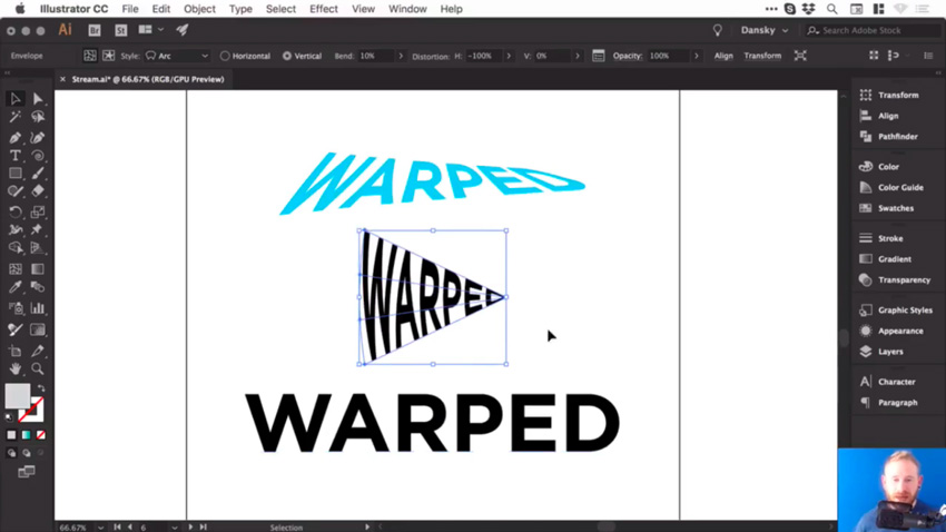
Click on the second piece of text and, as before, go to Object > Envelope Distort > Make with Warp. This time, for the Style, let’s choose Arc. So we’ll set the Distortion back to 0, and then we can bend this up or down, and of course, you can adjust the Bend to Vertical as well. 

Let’s try these settings:

  • Vertical Bend: -72%
  • Horizontal Distortion: -100%
  • Vertical Distortion: 0%

And it should look like this:  

Arc effect

Adjust the Arc Effect

Once you’re happy with your warp, and you’d like to start adding color to it, or possibly getting creative and adding some strokes or brushes, you can go to Object > Expand. Leave Object and Fill selected, click OK, and now we can get creative with this. 

Let’s add some brushes. We’ll start by swapping the fill and the stroke, so we now have an outline. And from the Brushes panel, let’s choose a pencil brush with an orange color. 

Arc with orange pencil brush

So those are a few ways to warp text in Illustrator, and now I’ll leave you to go and have a lot of fun experimenting with them.

Final results of warped text in lllustrator

Watch the Full Course

In the full course, 10 Essential Design Tips in Adobe Illustrator, you’ll learn about ten essential design tips to help you bring your creative ideas to life in Adobe Illustrator. You’ll master a variety of different techniques, helping you to boost your creativity and transfer your ideas to a digital canvas.

You can take this course straight away with a subscription to Envato Elements. For a single low monthly fee, you get access not only to this course, but also to our growing library of over 1,000 video courses and industry-leading eBooks on Envato Tuts+. 

Plus you now get unlimited downloads from the huge Envato Elements library of 490,000+ creative assets. Create with unique fonts, photos, graphics and templates, and deliver better projects faster.

How to Create a Crystal Formation Illustration in Adobe Illustrator

Final product image
What You’ll Be Creating

In today’s
tutorial, we’re going to take a close look at the process of creating a glass
dome enclosed crystal formation, using some of Adobe Illustrator’s most basic shapes
and tools.

So if that sounds interesting, grab a quick sip of that freshly poured
coffee and let’s get started!

Before we start, I wanted to take a couple of moments and point out that I’ll be using a custom line texture that I got from Envato Elements which proved to go really well with the rough shape of the crystals. The specific one I used is called “LineTexture07”, which can be found within the pack once you download and decompress the archive.

example of the custom texture used

1. How to Set Up a
New Project File

Assuming you already have Illustrator up
and running in the background, bring it up and let’s set up a New Document (File > New or Control-N)
which we will adjust as follows:

  • Number
    of Artboards:
    1
  • Width:
    800
    px
  • Height:
    600
    px
  • Units:
    Pixels

And from the Advanced tab:

  • Color
    Mode:
    RGB
  • Raster
    Effects:
    Screen (72ppi)
  • Preview Mode: Default
setting up a new document

2. How to Set Up the Layers

Once we’ve finished setting up our project
file, it would be a good idea to structure our document using a few layers, since this way we can maintain a steady workflow by focusing on one
section of the illustration at a time.

So bring up the Layers panel and create a total of five
layers, which we will rename as follows:

  • layer
    1:
    background
  • layer
    2:
    glass dome
  • layer
    3:
    crystal formation
  • layer
    4:
    texture
  • layer 5: overlay
setting up the layers

Quick tip: I’ve colored all of my layers using the same
green value, since it’s the easiest one to view when used to highlight your
selected shapes (whether they’re closed or open paths).

3. How to Create
the Background

Now that we’ve
finished layering our document, we can start working on the actual project by quickly creating the plain background.

Step 1

Using the Rectangle Tool (M),
create an 800 x 600 px rectangle
which we will color using #ffb75a and then position in the center of the
underlying Artboard using the Align
panel’s Horizontal and Vertical Align Center options.

creating the background

Step 2

Once you have the background in place, lock its layer from within the Layers panel and then move on up to the
second one.

locking the background layer

4. How to Create
the Glass Dome

Assuming you’ve already positioned yourself onto the next layer (that would be the second one),
let’s start working on the glass dome, which we will build one section at a
time.

Step 1

Create the top section of the wooden base using a 240 x 48 px ellipse, which we will color using #ffffff and then
center align to the underlying Artboard, positioning it at a distance of 152 px from its bottom edge.

creating and positioning the upper section of the wooden base

Step 2

Give the shape that we’ve just created an outline using the Stroke method, by creating a copy of it
(Control-C), which we will paste in
front (Control-F) and then adjust by
flipping its Fill with its Stroke (Shift-X) and then making sure to set its Weight to 2 px from
within the Stroke panel. Once you’re
done, select and group the two shapes together using the Control-G keyboard shortcut.

adding the outline to the upper section of the wooden base

Quick tip: the reason why we added an outline of the same color to the current shape is to align the lower body’s outer edges which we will be creating in the following steps.

Step 3

Create the base’s lower body using another 240 x 48 px ellipse (#ffffff), which we will position below the previous
shapes as seen in the reference image.

creating the main shape for the lower body of the wooden base

Step 4

Adjust the shape that we’ve just created by flipping its Fill with its Stroke (Shift-X) making
sure to set its Weight to 2 px. Then, select its top anchor point
using the Direct Selection Tool (A)
and immediately remove it by pressing Delete,
drawing a new path with the help of the Pen
Tool (P)
, using the reference image as your main guide.

adjusting the lower body of the wooden base

Step 5

Start working on the darker bottom section by creating a copy (Control-C > Control-F) of the
resulting shape, which we will adjust by flipping its Fill with its Stroke (Shift-X), making sure to set its color
to #3a302e.

creating the main shape for the lower section of the wooden base

Step 6

Continue adjusting the shape by selecting its top anchor points using
the Direct Selection Tool (A), and
then removing them by pressing Delete.

adjusting the darker section of the wooden base

Step 7

Create a copy (Control-C >
Control-F
) of the resulting shape which we will position 8 px below it, and then unite the
two paths into a single larger shape by selecting them and then pressing the Control-J (join) keyboard shortcut
twice. Once you’re done, don’t forget to position the shape underneath the
white outline (right click > Arrange
> Send to Back
) before moving on to the next step.

positioning the darker section underneath the lower body of the wooden base

Step 8

Add the bottom ring to the base using a copy (Control-C > Control-F) of the lower body’s outline, which we
will adjust by selecting and removing its top anchor points, positioning the
resulting shape at a distance of 8 px from
its bottom edge.

adding the bottom ring to the wooden base

Step 9

Next, let’s take a couple of moments and add the little texture lines
using a couple of 2 px thick Strokes with a Round Cap. The way I usually start drawing them is by choosing a corner and then getting a feel of the flow. As soon as I get at least two lines down, I then try to inverse the direction and then gradually make my way to the opposite side of the shape that I need to fill. Once I’m pleased with the result, I always making sure to select and group (Control-G) all of them together before moving on to the next step.

adding the texture lines to the wooden base

Step 10

Mask the texture lines that we’ve just created by using a copy (Control-C) of the lower body’s outline
which we will paste in front (Control-F), and then with both the copy and the lines selected, simply right click > Make Clipping Mask.

masking the texture lines

Step 11

Add the ring insertion to the upper section of the base using a 224 x 40 px ellipse with a 2 px thick Stroke, which we will color using #ffbe57. Once you’re done, select
and group all of the base’s composing shapes together using the Control-G keyboard shortcut.

adding the ring insertion to the upper section of the wooden base

Step 12

Start working on the actual dome by creating a 224 x 320 px rectangle with a 2
px
thick Stroke (#ffffff), which
we will position on the upper half of the base and then adjust by setting
the Radius of its top corners to 112 px from within the Transform panel’s Rectangle Properties.

creating the main shape for the glass dome

Step 13

Since we want the bottom sections of the glass dome to be distinguishable
from the base, we will create a copy (Control-C
> Control-F
) of the insertion ring, which we will then adjust by
removing its top anchor point. Then, using the Pen Tool (P), we will need to extend the resulting path so that it
goes outside of the base’s surface, making sure to mask it afterwards (right click > Make Clipping Mask)
using a copy (Control-C > Control-F)
of it.

adding the lower side sections of the glass dome

Step 14

Finish off the current section by adding the subtle detail lines using a
couple of 2 px thick Strokes (#ffffff) with a Round Cap. Take your time, and once
you’re done, make sure you select and group (Control-G) all of the glass section’s composing shapes together,
doing the same for the entire dome afterwards.

adding the detail lines to the glass dome

5. How to Create the Crystal Formations

Now that we’ve finished working on
the dome, we can lock its layer and then move on to the next one (that would be
the third one), where we will gradually create the crystal formations.

Step 1

With the help of the Pen Tool (P), draw the main shape for the center crystal using #7b7bef as your Fill color, following the reference
image as your main guide. Since this part of the illustration is based on looser shapes, you don’t have to create an exact copy, so feel free to get
creative and create something new and unique.

drawing the main shape for the center crystal

Step 2

Take a couple of moments and shade the resulting shape by drawing the different
sections seen in the reference image, using #9c9cff for the lighter shape, #6363d3
for the darker shapes, and #5252c1 for the darkest one. Once you’re done, select
and group all of them together using the Control-G
keyboard shortcut.

adding the shades to the central crystal

Step 3

Outline the crystal using a couple of 2 px thick Strokes (#ffffff)
with a Round Join, making sure to
select and group (Control-G) them
together afterwards. Once you’re done, select and group (Control-G) all of the shapes that
we have so far and group those as well.

adding the outlines to the center crystal

Step 4

Following the same process, add the remaining crystals using the
reference image as your main guide. Take your time, and once you’re done, make
sure you select and group all of them together using the Control-G keyboard shortcut before moving on to the next step.

adding the remaining crystals

Step 5

Using a 2 px thick Stroke (#ffffff), quickly draw the
organic path that goes around the crystal formations, making sure to position
it underneath afterwards by right
clicking > Arrange > Send to Back
. Since we’re pretty much done
working on this part of the illustration, we can select and group (Control-G) all the shapes before moving
on to the next section.

adding the organic line to the back of the crystals

6. How to Add Texture to the Crystals

At this point,
we’re going to start adding the finishing touches to our little illustration,
and we’ll start with the texture.

Step 1

Using the Direct Selection Tool
(A)
, select all of the crystals’ main shapes and then copy (Control-C) and paste (Control-F) them onto the next layer (that
would be the fourth one), making sure to lock the previous one.

creating a copy of the crystals for the texture

Step 2

Since we’ll want to use the copies as a Clipping Mask for the texture, we’ll have to make them behave as a
single larger shape by turning them into a Compound
Shape
using the Pathfinder
panel’s hidden option.

turning the crystals copy into a compound shape

Step 3

Next, we need to grab a copy (Control-C)
of the custom texture and paste (Control-F)
it onto the current layer, making sure to position it underneath the Compound Shape once we’ve set its color
to white (#ffffff) and adjusted its size.

positioning the texture onto the crystals

Step 4

With the texture in place, we can now select both it and the Compound Shape and then simply right click > Make Clipping Mask in
order to hide the sections going outside of the crystals’ surface. Once you’re
done, we can lock the current layer and then move on to the last one.

masking the texture

7. How to Add the
Overlay to the Crystals

We are now down to
the last part of the process, where we will see how easy it is to add some
polish to the crystals’ colors using Blending
Modes
. This part is kind of optional, but I really hope you try and play with it, since sometimes you can get some interesting color variations using a couple of simple steps.

Step 1

Start by pasting (Control-F)
another copy of the crystals from the Clipboard
onto the current layer, which we will then adjust by setting the color to black
(#000000).

creating the copy for the color overlay

Step 2

Open up the Transparency panel,
and set the resulting shape’s Blending
Mode
to Overlay, which will
immediately shift the colors from purple to an interesting blue.

adjusting the blending mode

Step 3

Adjust the Opacity level by
lowering it until the effect isn’t all that powerful (in my case 40%), and that’s pretty much it!

finishing off the illustration

Great Job!

There you have it—a nice and easy tutorial that should shine a light on the process behind
these sorts of illustrations.

As always, I hope you had fun working on the project, and if you have any
questions, feel free to post them within the comments section and I’ll get back
to you as soon as I can!

finished project preview

How to Create an Illustration of a Starling on a Branch in Adobe Illustrator

Final product image
What You’ll Be Creating

Spring is here, and we are all about it! It’s the most wonderful time of the year, when the trees and flowers are blooming, the birds are chirping, and joy is in the air. And that is what we will create today—an apple blossom branch and a starling.

Before browsing PhotoDune, I didn’t know that starlings are in all different colors, because on my side of the Earth they are just black. It’s interesting to browse a few pages and see what a big diversity there is for birds with the same name.

As this tutorial is for beginners, you don’t need to be a super artist to follow it, because we will use basic shapes, some warp effects here and there, and your illustration is ready!

Let’s go!

1. How to Create the Starling

Step 1

Create a new document (File > New) with 850 px Width and 850 px Height.

Let’s start with the head. Delete the stroke color and set the following fill color you see in the image below. Next, take the Ellipse Tool (L) and create a dark grey ellipse.

Now, we will apply the Inflate effect to this ellipse. Go to Effect > Warp > Inflate. Enter the options you see below. Expand this shape (Object > Expand Appearance).

To start the eye, first create a small, light grey oval (use the Ellipse Tool (L)) and rotate it slightly to the left. After that, add a black circle and one more tiny white circle to highlight the eye. To get a perfect circle, use the Ellipse Tool while holding the Shift button.

how to create the head and eye

Step 2

To create the body, draw a dark grey ellipse using the Ellipse Tool (L). Modify it by going to Effect > Warp > Arc. In the image below, you can see the options you need to enter. Expand the shape (Object > Expand Appearance).

how to create the body

Attach the body to the head.

attaching the body to the head

Step 3

For the beak, create a yellow ellipse. While keeping it selected, go to Effect > Warp > Arc and enter the options you see below. Expand the shape.

While keeping the expanded shape selected, create a new copy in front (Control-C, Control-F). Don’t take off the selection yet, and hit the Delete Anchor Point Tool (-) and delete the three marked anchor points by clicking on them. Now you should have the two parts of the beak: a light yellow shape on top and a dark yellow one on the bottom.

Stretch the lighter top part to the right a little bit. The beak is ready!

how to create the beak

Give it to the starling.

placing the beak

Step 4

On to the wing. Using the same fill color as the starling has for the head and body, create an ellipse. While keeping it selected, go to Effect > Warp > Arc and enter the options you see below. Expand the shape.

Next, we will give the wing some shading. Create a copy behind (Control-C, Control-B) and shift it diagonally to the bottom-right corner. Make the new copy a bit darker.

Keep the same fill color and draw a tiny ellipse, because we want to add a few feathers to the wing. Using the Direct Selection Tool (A), select its top and bottom anchor points and move them down just a little bit using the same tool. That’s another way to warp an ellipse. 

Next, make few copies of this shape and put them under the actual wing shape. The whole wing is now completed. Group it.

how to create the wing

Place the wing in its place.

placing the wing

Step 5

In this step, we will create the tail. Start with an ellipse, and then go to Effect > Warp > Arc and enter the options you see below. Next, we’ll apply another effect to the same ellipse: Effect > Warp > Inflate. As the printscreen option on my computer allows me to show you just one options window, that’s why you can see the Arc options below. Now, as you need options for the Inflate effect, scroll down to see them.

As we want to make the tail more interesting, create a narrow horizontal ellipse. Using the Direct Selection Tool (A), select its top and bottom anchor points and move them down just a little bit. Make a few more copies of this narrow ellipse and place it as shown below. That’s the completed tail, so group it.

how to create the tail

The Inflate options window:

Inflate options window

Give the tail to the starling.

placing the tail

Step 6

Now we’ll create the leg. Draw an ellipse. Hit the Direct Selection Tool (A), select its top and bottom anchor points, and move them following the direction shown by the arrow in the image below. Notice how the handles of the anchor points changed their positions.

Add one more copy, so now you have two bird’s toes.

Add a third copy of the toe, pointing in the opposite direction.

Finally, add a narrow rectangle attached to the toes, which will be the leg.

how to create the leg

Step 7

Place the leg behind the bird’s body. Add a tiny ellipse with the same fill color as the body. This ellipse has to be placed where the leg begins.

Create another copy of the leg, putting it close to the first one, and don’t forget about the tiny ellipse.

placing the leg and creating another one

Step 8

Remember how we created the “feathers” on the bird’s wing and tail? Create another copy of this warped ellipse, and be sure it has the same fill color as the starling’s body (use the Eyedropper Tool (I) to take the same fill color as the body). As we will use this shape a lot, it’s better to keep one extra copy on the side for later use. I’ll just call this shape the feather. So put three feathers on the bird’s head, to make him fuzzier.

Then, make a new copy of the feather which should be a lighter color (the same fill color as the feather on the tail), and place some copies on the starling’s head and wing.

Finally, make a new darker copy of the feather (the same fill color as the feather on the wing), and place some copies of it on the starling’s tummy.

adding feathers

2. How to Create the Apple Blossom

Step 1

Start to create the petal with a white ellipse, and then go to Effect > Warp > Fisheye and enter the options you see below. The black stroke you see below is just to help you see it better, so you don’t need it in your final result.

Take the feather, make sure it’s narrow and pink, and then put few of them on the petal.

Select the whole petal and group it (right-click > Group).

how to create the petal

Step 2

Don’t take off the selection of the petal, but hit the Rotate Tool (R). After that, holding down the Alt key, click under the petal, where you want the axis of rotation to be. A new dialogue window will pop up. Enter Rotate Angle 72 degrees, and press Copy. To repeat your last movement, hit Control-D three times, and you’ll notice that now you have a flower with five petals.

You still need the middle part for the flower, so place a yellow circle in the middle. To make this yellow middle part more natural, let’s distort it. While keeping it selected, go to Effect > Distort and Transform > Roughen… In the new dialogue window, enter Options Size and Detail at a value that’s not too high—just try to move the slider and find the result you like. Don’t forget to check Absolute in the Options section and Smooth in the Points section. Once you like how it looks, press OK.

how to create the white flower

Step 3

To make the flower even more natural, delete the fill color and set the fill color. Using the Arc Tool, draw a few curves on the middle part of the flower. We are creating the stamens. Then make another copy of this middle part of the flower, put it in front of everything (Control-X, Control-F), change its fill color, and make even more tiny copies. Place those as shown below. Now our flower looks like apple tree blossom!

how to create the stamens

Create a copy of your first flower, and change its color to get two different flowers. Remember that in the final result, the white petals won’t have the black stroke.

two flowers

Step 4

Let’s draw a new flower that is half open. For this, we need a special shape for the petal. Start with a pink ellipse, and then deform it (Effect > Warp > Arc), and enter the options you see below. Don’t take off the selection, and apply a new effect: Effect > Warp > Fisheye. The options for this second effect can be found below.

how to create the petal

Fisheye Options window:

Fisheye Options window

Step 5

Remember the first flower we created today, the white one? Make a copy of one petal from this flower and change its fill color to pink. Shrink this new petal down a little. Create another copy of this petal behind (Control-C, Control-B), making this copy darker and wider.

Next, you need to take the first petal of the half-open flower, which we created previously. Place the two of them as shown below.

Create two more copies of the first petal and place them behind all the petals as in the image below.

how to create the half open flower

Step 6

In the same way as we draw the stamens for the first white flower, draw them for this half-open flower.

continue creating the half open flower

Step 7

Let’s draw the place where all the petals sit. Add a tiny green ellipse, select its top anchor point by using the Direct Selection Tool (A), and move this point down.

Take the feather, make it long and narrow, and use it as the stalk.

finishing creating the half open flower

Step 8

Now we want to create the bud. Take the first petal from our previously created half-open flower. Add two more pink petals behind. Then, add one darker petal behind everything. Note how the petal used for the bud is not shrunk down.

Finish off the bud as we did for the half-open flower.

how to create the bud

Step 9

Create one more bud by using the fill colors shown below.

how to create another bud

Step 10

So here are all the flowers and buds we created so far. Group each flower separately for your convenience.

all flowers together

3. How to Create the Leaves

Step 1

Start creating the leaf from a green ellipse. Apply a warp effect for it: Effect > Warp > Fisheye. Then expand the shape.

Keep it selected, hit the Reflect Tool (O), and then press Enter. In the new dialogue window, check Axis Horizontal, Angle 0 degrees, and press Copy. You’ll get a copy of the previous shape. Move this copy down using the Down Arrow key. In the image below, you can see how the two shapes should overlap, but actually you don’t need the black stroke.

how to create the leaf shape

Step 2

Now we want to make the leaf more natural. Unite these two shapes you created for the leaf: while keeping them selected, press the Unite button on the Pathfinder panel (Window > Pathfinder).

Now that you have one shape, let’s distort it: go to Effect > Distort and Transform > Roughen… Depending on your leaf size, enter Options Size around 2 px, check Absolute, Detail around 20/in, for the points check Smooth, and finally press OK.

Take the feather, make it dark green, and apply it as the leaf veins.

finishing creating the leaf

Step 3

In this step, I’m sure you already know how to warp the leaf. Just make sure you grouped the whole leaf (right-click > Group).

warping the leaf

It’s nice to have about three different leaves for variety. You should keep one untouched and two warped.

Group each leaf separately for your convenience.

all leaves together

4. How to Create the Branch

Step 1

Take the Rounded Rectangle Tool and draw a long brown rectangle.

Now, double-click on the Warp Tool (Shift-R) and enter the options you can see in the second image below. Following the arrows in the first image, stretch the rounded rectangle to have the branch.

how to create the branch

The dialogue window for the Warp Tool Options is shown here.

Warp Tool Options window

Step 2

First, place the leaves on the branch, and then add the buds and half-open flowers.

Finally, add the rest of the flowers.

placing blossom and leaves on the branch

Step 3

Put the starling on the branch.

placing the starling on the branch

5. How to Create the Background 

Step 1

Grab the Rectangle Tool (M) and click on your artboard. In the new dialogue window, enter 850 px Width and Height, and then press OK. Change its fill color to a pastel blue.

how to create the background

Step 2

Take the Ellipse Tool (L) and, while holding the Shift key, create an even circle in the middle. 

how to create the background

Step 3

Put the square and your circle behind the starling and the branch.

placing the branch with starling on the background

Step 4

Create few ellipses as clouds. The black stroke, which you actually don’t need, shows you how the ellipses should overlap each other. Notice how that branch and the clouds overlap the big circle, and the starling doesn’t.

how to create the clouds

Step 5

After you’ve placed everything how you like, select the big circle in the middle and create a new copy of it in front (Control-C, Control-F). Then cut the copy off (Control-X) and place it in front of everything (Control-F). This copy in front of everything is marked by the black stroke.

You can also add a black stroke color for this circle so you can see what is inside a bit better.

Now—be careful—select everything except for the light blue square (our background). You should select the starling, the branch, the clouds, the big blue circle in the middle, and the top copy with the black stroke. After that, go to Object > Clipping Mask > Make (Control-7).

You should end up with a similar result to the image below.

how to make the Clipping Mask

Conclusion

Amazing job! I’m happy that you went to the end with me, and I hope you learned something new in this tutorial. I think that this is a really nice spring-themed illustration, and I hope you like your final result. See you next time!

final