Create Two Colorful Children’s Book Illustrations in Illustrator

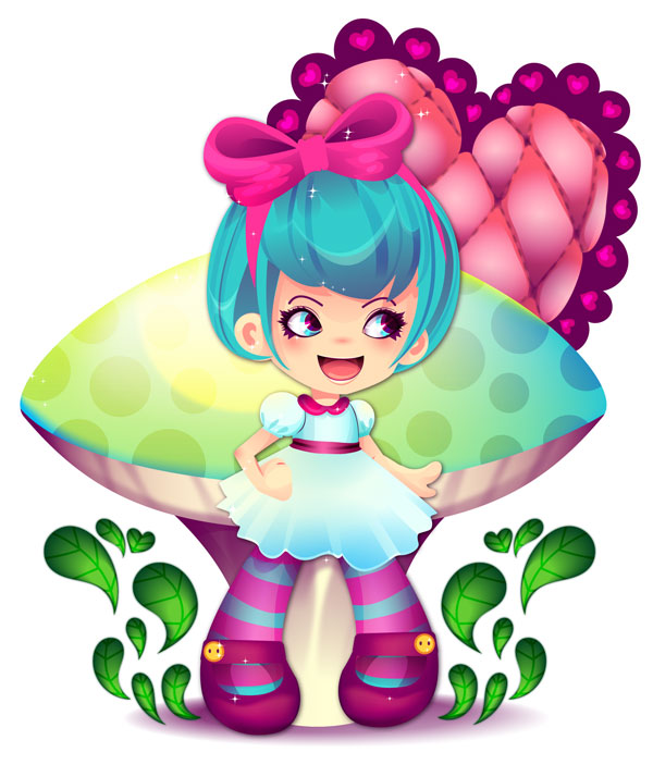
Final product image
What You’ll Be Creating

Doodle up a cute design for a kids’ book and render it with Gradient Meshes, Blends, little sparkles, and various Blending Modes. Layered shapes pump this design and its counterpart up from being as simplistic as the initial sketch. 

Once you’re done with this tutorial, check out its counterpart by Grace Fussell on designing the layout of a children’s book in Adobe InDesign.

If you prefer to use some ready-made illustrations, you can find thousands of cute vectors on Envato Elements. It’s also a good place to go if you’re looking for inspiration for your own designs.

cute vectors on Envato Elements
Cute vector illustrations on Envato Elements

1. Start With a Sketch

Step 1

Let’s start with a sketch. Using the default brush with the Paintbrush Tool (B), start drawing a cute, child-like character. This design is inspired by Alice in Wonderland in theme, is super cartoony, and remains quick and loose, even while drawing layers of more refined line work. 

Step 2

Group (Control-G) together your brush lines, reduce the Opacity in the Transparency panel to 40%, and lock the design in the Layers panel. 

Layer your refined sketches in this manner as you figure out your composition. I didn’t want to overwhelm the character, so I’ve kept the design simple with a giant mushroom and heart in the background. I also didn’t get too detailed in the sketch since the rendering of the character will take quite a bit of time in itself.

2. Build the Face

Step 1

With all of the line art Grouped together, opacity reduced, and locked in the Layers panel, it’s time to start on the various shapes involved in the character’s head. 

Using the Ellipse Tool (L), draw a circle over the top half of the head. Trace the jawline drawn previously with the Pen Tool (P) and either Unite the two shapes in the Pathfinder panel or combine them with the Shape Builder Tool (Shift-M). 

For the ears, draw two rounded D-like shapes. For the neck, you can use the Rectangle Tool (M) and taper the bottom with the Direct Selection Tool (A).

Step 2

The hair is rounded and helmet-like. The idea is to keep the character child-like, which means “has a large, adorable head”. Draw the hair in sections: bangs, sides, and back. 

I drew the hair bow in five sections. Each puffy side is like a sideways heart. The center is supposed to be knot-like, so consider adding some bumps to the top and bottom. I found it easiest to draw it out with the Pencil Tool (N). The band is created with two curving triangles placed beneath the rest of the bow in the Layers panel. I’ve added strokes to each object so you can see how they’ve been United more easily.

Step 3

Let’s break down the steps in creating large, adorable eyes.

  1. The eyebrow is a simple stroke, drawn with the Pen Tool, set at 2–3pt weight, and rounded cap in the Stroke panel. For the eye itself, I drew an ellipse with the Ellipse Tool, used the Convert Anchor Point Tool (Shift-C) to bring the ellipse’s left anchor to a point, and manipulated the shape and position of the anchor points with the Direct Selection Tool for a more pleasing eye shape.
  2. For the iris of the eye, draw a circle with the Ellipse Tool and place it where you’d like your character to look. I’ve gone for the right side of the picture plane.
  3. Use the Shape Builder Tool to select both shapes (the iris and white of the eye) and Select the non-intersecting portion of the iris. Deselect and Delete the extra shape.
  4. Thicken up the eye by drawing shapes with the Pen Tool and Pencil Tool. Add eyelashes to the right corner of the eye. I like to keep the lashes large, chunky, and limited to the right half of the eye.
  5. I hid the iris in this and the last step in order to focus on the lashline. Select all lash shapes and Unite them in the Pathfinder panel.
  6. Unhide the iris and make sure it is above the white of the eye but below the lashes in the Layers panel. I chose for all of these shapes to be filled with a flat color and the stroke color to be set to null. Repeat on the other side and Group together all of the eye components.

Step 4

The mouth is fairly simple. The main shape is a half circle turned up at the corners. The outline, which is a stroked line, was thinned out at the mouth’s corners with the Width Tool (Shift-W)

For the tongue, I used an overlapping circle with non-intersecting components deleted from it using the Shape Builder Tool (see the previous step) with a Linear Gradient applied going from a bright coral color to a light red-orange. I changed the gradient’s angle to 90° so the darker color is at the top of the tongue and lighter color at the bottom.

3. Render the Face

Step 1

Let’s start with the character’s little rosy cheeks. I drew a bean-like shape on either side of her face. This allows the Radial Gradient we’ll apply to exist comfortably within the boundaries of the shape without interacting with the edges. The gradient goes from a light rose color at the center to the character’s skintone at 0% Opacity. Place both gradient shapes beneath the eyes.

Step 2

For the eyes, I applied a Linear Gradient to the whites of the eyes. It goes from purple (since I’m using purple in place of black or brown for this design) to white to purple again. Adjust the gradient in the Gradient panel so purple is pushed to the corners of the eyes. 

To add some depth in the eye, draw a thin strip-like shape that overlaps the eyelashes and the rest of the eyeball. The gradient will go from purple at 100% Opacity to purple at 0% Opacity

Additional details break down as follows:

  1. I’ve layered three circles on top of each other, each smaller than the last. Their order is blue, yellow, and purple (this will be the iris). I deleted them from the white of the eye in the same fashion as the iris was built in Section 2, Step 3.
  2. Apply another gradient to the iris with a darker color in the right corner of the eye. In this case, it’s light blue to dark blue. The darker color should be in the corner where the eyes are directed. If your character is looking straight ahead, change the angle so the darker color is at the top of the iris.
  3. Finally, the highlight was drawn with the Pen Tool and is bright white. Think of it as a curved triangle that points to the center of the pupil.

Step 3

Instead of adding a bunch of colorful shapes into the eyes, I opted for a few shadows and highlights. The shadows are purple set to Multiply in the Transparency panel. The highlights are light yellow set to Overlay. Three highlights and three shadows were added below. Doing so immediately creates more depth and color in the character’s cute little eyes.

Step 4

For the nose, I’ve used the same gradient from the bean-like cheek shape. I used the Rounded Rectangle Tool to draw a small shape above the mouth. Adjust the Radial Gradient using the Gradient Tool (G) to keep the radius of the gradient within the rounded rectangle without touching its edges. The same gradient color is used for the shadows under the hair and in the ears. Both of these concentrate the darker color of the gradient at the top of the shape.

Step 5

Finally, let’s add some depth to the mouth. The same gradient from the eye was used for shadows in the mouth. All shadows have been set to Multiply and layered on top of each other. My aim was to draw a shape in either corner, at the top of the mouth, at the top of the tongue, and overlapping the tongue. The highlight on the upper lip is light yellow set to Overlay in the Transparency panel.

4. Render the Hair

Step 1

You have some choices to make with the hair: color, shadows, highlights, and whether to include lines or not. Regardless of what colors you choose for the base of the hair, use the same shadow color used throughout this design (in this case purple) set either to Multiply or Hard Light at various levels of transparency. I drew shapes, most of them like elongated crescents, sectioning off hair, as well as a large, scalloped shape defining the curve of the character’s bangs. For the highlights, I used light yellow again set to overlay.

Step 2

Initially, I drew stroked lines throughout the hair. if I was keeping outlines on the character’s clothing, body, and in the background, the lines in the hair would have worked. Since I decided to nix it completely, they had to go too. 

Additionally, I changed the hair color from orange to teal. Doing so didn’t effect the shadow or highlight colors since they work quite well on both. I definitely suggest using shadow colors that work for a variety of base colors (purples, browns, or blues) in order to make changing color palettes easy.

5. Draw the Body

Step 1

Since I already have the sketch below my design layer, I don’t have to bother drawing out the entire body of my character below the clothing. 

  • To start, the bodice of the shirt is a rectangle with a dip in the center for the neck. 
  • The sleeves are two circles with a thin strip on one edge for the sleeve’s band. You’ll need two of these.
  • The arms and hands are simple shapes. I typically draw a shape for the bicep and another for the forearm and Unite them in Pathfinder once I’ve connected them together (at the elbow). 
  • Note how large the hands are. Much like the head, they’re oversized, while the arms are thin like the neck. Group the limbs below the shirt pieces.

Step 2

The skirt was a simple, scalloped half circle, and I traced it with the Pen Tool. I find it too simple to be represented below. We’ll work on it further when the clothes are rendered.

  1. The legs are oversized, like the hands and head. They’re also very simple shapes that curve inward and don’t have joints (knee and ankle). One-third of this design’s leg is the foot.
  2. I decided to draw cute Mary Jane shoes. To start, I outlined the foot. 
  3. Then I cut a hole out of the shoe using the Rounded Rectangle Tool. Select both shapes after overlapping and hit Minus Front in the Pathfinder panel.
  4. The strap is another slightly Rounded Rectangle with the button drawn on as two EllipsesGroup together the shoe pieces. Copy (Control-C)Paste (Control-V), and Reflect over a Vertical Axis for the other leg.

6. Render the Clothes

Step 1

We’re going to use Clipping Masks for the clothes. I find that when you’re layering a lot of gradients, transparent shapes, and shapes with different blend modes on top of each other, a mask will cut down your time in creating your design.

  1. The clothes are a light blue, so we’ll use a darker blue, purple, or teal for its shadows. I used the Pencil Tool to layer two or three transparent shapes (reduce each shape’s Opacity to 30% or so in the Transparency panel). Once you’re satisfied with your shadow shapes’ placement, Group them together.
  2. Copy and Paste the main shirt shape and Align it to the original shirt.
  3. Select the new shirt shape and the shadow group.
  4. Make a Clipping Mask (Control-7) and you’ll find your shadow shapes cut off at the shirt shape’s boundaries.
  5. Move the shadow shapes below any collar, ribbons, or sleeves you’ve drawn in the Layers panel so the shadows are above the base shirt shape.

Step 2

Next, render the sleeves.

  1. Make sure the sleeves are below any collars or ribbons on the dress, but above the shirt pieces.
  2. Draw shadow shapes that accentuate the inner edges of the sleeve where it meets the bodice (or shirt) of the dress. 
  3. I’ve also drawn shapes that show the puckering caused by puffy sleeves having been gathered around an armband. These flower-like shapes are at the bottom of the sleeve.
  4. Layer both highlights (on the upper left) and shadows (lower right) and Make a Clipping Mask to keep the rendered components within the sleeve’s boundaries.

Step 3

I neglected to show the creation of the collar. Much like the skirt, doing so would drag this design process out when we can instead focus on rendering technique. There are a variety of collar styles you can give your character. Researching children’s dress fashion will help you in choosing what fits your design theme best.

  • To start, I’ve drawn a shadow shape that accentuates the underside of the collar. This is purple at 30% Opacity and set to Hard Light.
  • The highlights here are light yellow set to Overlay. Since it’s on pink, they show up as being a brighter pink.
  • Continue layering shadow and highlight shapes as much as you see for your design.
  • Make a Clipping Mask when finished. If you find you want to change shapes in any way or create additional shapes, you can place them beneath the mask path in the clipping mask group and it will be instantly masked with the other components.

Step 4

Below you’ll see the skirt components broken down into sections, starting with the bottom.

  1. This is the base skirt shape. It’s a series of scallops and edges and based entirely on the initial sketch I did in Section 1.
  2. This is the first shadow group. Each shadow shape defines a pleat in the skirt. They go from blue at 100% to 0%, and the gradient’s angle places the opaque color at the bottom edge of the skirt. The top shape is a Linear Gradient in an ellipse, giving some color and shadow to where the skirt meets the bodice.
  3. The highlight on the skirt is a large, wiggly shape with light yellow at 100% going to 0% and focused in the upper left corner of the shape.
  4. Finally, additional shadow shapes were created in two pieces with the same gradient from Part 2Just like the other parts of the dress, Make a Clipping Mask and keep your shadow and highlight shapes tidy.

Step 5

There aren’t a lot of details added to the dress’s ribbon on the character’s arms. For the ribbon, I applied a Linear Gradient to it and drew a thin strip in the middle of it, also with a gradient added. The ribbon’s gradient goes from dark pink to light pink and back to dark pink again. And the strip on top of it is purple at 100% Opacity to 0% to 100% again.

The hands and arms have a few shadows, each the same shadow gradients and colors (rose or peach) from the face, added to the main arm shape, to the elbow, to the underside of the arm, and to define the features of the hand. If your hands are more detailed, then feel free to push your rendering further than what I have done here.

Step 6

The legs start with stripes drawn along their length and a shadow shape (again the purple at 100% or purple at 0% Opacity) drawn for the shadow cast by the shoe onto the sock. I Copied and Pasted the leg three times and applied a Linear Gradient to each. 

For the highlight shape, it has yellow or white in the center, and the other two have purple as the shadow color. The highlight shape is set to Screen, and the shadows are set to Normal. Layer them on top of the sock, Group together, Paste the base sock shape again, and Make a Clipping Mask.

Step 7

For the shoe, I decided to layer a series of shoe shapes as follows:

  • The base shoe shape. This is a bright purple.
  • I applied a gradient mesh to this shape using the Gradient Mesh Tool (U). In order to keep it easy, I simply added highlights along the toeline of the shoe, shadow colors to the bottom edge, and another highlight where the center of the shoe’s band would be. I used the Direct Selection Tool to manipulate the shape of each gradient within the mesh so it follows the shape of the shoe itself.
  • A simple shadow gradient going from purple at 100% to 0%, set to Normal, and reduced in overall Opacity to 55%.
  • The highlight shape is just like the highlight on the leg: yellow at 0% to 100% to 0%. This one has been set to Overlay, however.
  • Align all of them together. Create a Clipping Mask in order to cut out the center of the shoe.

7. Create the Background

Step 1

Now that the character’s components are all taken care of, let’s work on the background. Using the sketch from Section 1, Step 2, we’re going to work on the mushroom. It’s large and takes up most of the space behind the character.

  • Draw three pieces: top, underside, and stem. The top is dome-like. Paired with the underside of the mushroom, the top of the mushroom is like an elongated half circle. Using the Shape Builder Tool in conjunction with either the Pen Tool or the Ellipse Tool (if you want to have a rounder, more precise shape) makes creating this feature easy. Use the Rectangle Tool (M) to draw the stem and curve it inward by manipulating the anchor point handles with the Direct Selection Tool.
  • Layer gradient shadow shapes, in the same fashion as you did on the character in previous sections. Start with the top and sides of the stem.
  • Consider additional design features to make the mushroom’s stem fluted (like a vase) before Making a Clipping Mask. Make sure the mask group is above the stem and beneath the rest of the mushroom.
  • Work up designs (similarly fluted) on the underside of the mushroom. Mask it and let’s move on to the top of the fungus.

Step 2

The top is fairly simple.

  1. The polka dots are transparent white circles that have been scattered around the mushroom and masked along with the other features of the mushroom.
  2. Three gradient shapes overlapping the mushroom (in green, teal, and blue) were layered on top of each other.
  3. I added a Gaussian Blur Effect in the Appearance panel to the designs on the stem in order to soften the lines up.

Step 3

The next background element is the quilted heart that appears in the upper right corner. I drew the initial heart with the Pencil Tool.

  • To start working out the quilted look, I changed the fill color to null and the stroke to purple and drew cross-hatched lines over the heart. I curved them towards the center of the heart. Optionally, you can also use the Pen Tool for more precise lines.
  • For the corners of where each line met, I used the Pen Tool, with a Radial Gradient as the fill color, to create curved, diamond-like shapes in each line intersection. 
  • Group together your lines and the curved diamonds. 
  • With the overall shape and design figured out, I redrew the heart with the Pencil Tool, indenting at every line so the heart will later look like quilted material rather than just looking flat with a design printed on it.

Step 4

This step breaks down all of the layers involved in the quilted heart design, starting with what’s on top. Before we begin, however, Copy and Paste the puffy heart shape and the line group (without the little diamonds), Align this new group with the first heart, and hit Divide in the Pathfinder panel. Copy and Paste this divided group for the first four sections below. Or you can just doodle rectangles in each section (which I did for the first three sections below).

  1. I applied a Linear Gradient that concentrates the color toward the bottom of the heart to the divided group. Adjust each shape’s gradient angle with the Gradient Tool
  2. These shapes have Radial Gradients applied to them. The color goes from light peach at 100% Opacity to 0% Opacity.
  3. This layer was added to soften things up. The Radial Gradients are larger and go from the heart’s base color at 100% Opacity to the purple being used for shadows at 0% Opacity.
  4. This layer is an altered version of the curved diamonds. I toned down the Radial Gradient in each and applied a linear gradient going from the heart’s base color at 0% Opacity to purple at 100% Opacity. Reduce its overall opacity in the Transparency panel to 60-70%.
  5. The line group was changed to dashed lines (7 pt dash, 7 pt gap) in the Stroke panel and a Gaussian Blur Effect of 3.9 pixels was applied in the Appearance panel.
  6. Place all five of the layers above on to the base heart, Copy and Paste the heart, and Make a Clipping Mask with the new heart and the first five layers.

Step 5

For the heart’s backing, I drew scallops around the heart and added a series of hearts layered on each other in each scallop. Group the backing together and place it behind the heart group.

Step 6

The final part of the background is the splashing leaves on either side of the character.

  1. Draw several short curving teardrop and heart shapes in a dark green. 
  2. Draw smaller, bright green shapes inside each one. Note how longer shapes will not work with the next few steps.
  3. Select one of the dark green shapes and its light green counterpart and apply a smooth blend with the Blend Tool (W). Instead of figuring out the steps, I chose Smooth Color in the Blend Tools Options.
  4. Repeat on the other shapes.

Step 7

  • For the leaves’ veins, draw stroked lines on each.
  • Group them together and set the Blend Mode to Overlay in the Transparency panel. 
  • Copy and Paste the base shapes and Make a Clipping Mask. Copy, Paste, and Reflect over a Vertical Axis for the other side.

Now that we’ve finished the components of the first illustration, let’s work on the second.

8. Create the Tea Set

Step 1

Much like the first section of this tutorial, start with a sketch. In this case, draw out a teapot and stacked teacups. The teapot has seven sections: the heart, lid, lid rim, body, handle, spout, and base. The teacups have three: opening, cup, and handle. Trace your teapot design and one of the cups from your sketch. 

Step 2

For the other two teacups, Copy and Paste the first and stack them into each other.

  1. The goal is to separate intersecting shapes and add them to the shape below. In this case, the portion of the top cup that intersects the bottom should be selected with the Shape Builder ToolDeselect the top cup, and add the intersecting portion (note the number 1 below) into the cup below.
  2. You’ll be left with a cup that nestles perfectly into the one below it.
  3. Paste the third cup and rotate or reflect as needed.
  4. Repeat the technique from the first part of this step in order to make the top cup nestle into the middle one. Note where the number 4 was placed in the image below.
  5. Finalize your color choices for your illustration.

9. Rendering the Teapot

Step 1

Like the shoes from Section 6, I used the Gradient Mesh Tool to render the teapot. 

  1. Start with your base pot shape. I’ve isolated it from the rest of the design so we can focus on it without distraction.
  2. On the left side, I’ve used light cream and white for the highlight. On the bottom and right side, I’ve placed a light peach within the mesh. Instead of bothering too much with the shape of the mesh, I simply clicked away at mesh points along the right side and bottom in order to fill in the peach color and create an even gradient.
  3. For additional highlight, I drew shapes on the left side of the pot, with the Pencil Tool, that contained Radial Gradients going from white at the center at 100% to 0% Opacity.
  4. For the cast shadow on the left side, I drew a wiggly shape that mimics the overlapping teacup stack. This gradient goes from purple at 100% to 0% Opacity.

Step 2

The following shows the breakdown of the spout’s layers.

  1. Radial Gradient concentrated on the bottom left.
  2. Linear Gradient with color concentrated at the bottom of the spout shape.
  3. Radial Gradient with the color concentrated at the opening of the spout.
  4. Another Gradient Mesh. Much like the teapot, I placed purple on the right edge and under the curve (on the left) of the spout. For the highlight, I followed an arbitrary line from the spout’s curve down to the bottom.
  5. The spout base shape.
  6. Align and Group together the spout shapes. Paste an additional spout shape over top this group and Make a Clipping Mask if your gradient shadows or highlights were drawn overlapping the spout rather than being Copied and Pasted components.

Step 3

The teapot’s handle is pretty similar to the spout. 

  1. Gradient shadow layer, with a Radial Gradient in the curve of the handle.
  2. The gradient mesh with the same colors (purple, teal, and light blue) as the spout.
  3. The base of the handle.

Step 4

For the base of the teapot, it’s the same layering process as the other pieces: shadow gradients with both linear and radial gradients and a light yellow or white highlight. The highlight shape (top middle) is a Radial Gradient going from light yellow at 100% to 0% Opacity.

The Gradient Mesh below is similar to the other mesh pieces of this tutorial where three colors are used (yellow, yellow-orange, and purple) and placed at the edges, curves, and indents. The purple was placed along the top edge. The yellow-orange was placed below that for a smooth transition to yellow and in the right corner. The rest of the mesh is yellow (I set it as the base color, much like teal being used in the spout and handle).

Step 5

I’ve skipped the lid of the teapot since it is the same process as the main teapot. I also skipped the gold rim since it’s just a Linear Gradient going from purple to yellow and back to purple again. Let’s focus on this cute little heart.

  1. The highlight is a blend, just like the leaf pieces from Section 7, Step 6. In this case, the small shape is light yellow at 100% Opacity, and the bottom is the same yellow at 0% Opacity. I chose Smooth Blend in the Blend Tool’s Options.
  2. The shadow is a Radial Gradient. The same purple is used throughout this tutorial.
  3. Finally, the Gradient Mesh is terribly simple as it’s just a few placements of purple in the right corner, along the edges of the heart. 

Step 6

The cups are similar to the other teapot pieces in that they’re just a handful of layered gradients.

  • A purple Radial Gradient concentrated at the bottom right of the cup.
  • A new shape created with the Pencil Tool and a Radial Gradient going from light blue at 100% Opacity to 0% Opacity.
  • A second version of the previous, but with a darker blue.
  • The cup pieces itself. I United the handle piece into the rest of the cup in order to minimize the amount of anchor points within the vector.
  • Finally, the Gradient Mesh. It’s the same bright blue from the cup with dark blue along the edges and around the handle. Place all of them together and Make a Clipping Mask with the top cup shape Copied and Pasted for the Mask Path.
  • The other cups are the same process with different colors.

Step 7

For the steam rising from the teapot and top cup, draw wispy shapes with the Pencil ToolGroup them together, and apply a Linear Gradient going from purple at 100% to 0% Opacity. Select the group and apply a Gaussian Blur Effect in the Appearance panel with a Radius of 8.7 pixels.

Put It All Together!

At long last, put everything together and you have completed two fairy-tale inspired children’s illustrations using the Blend Tool, the Gradient Mesh Tool, assorted layered gradient shapes, and your own doodles and sketches.

Now that you’re done here, why don’t you check out Grace Fussell’s tutorial on designing the layout of a children’s book in Adobe InDesign.

How to Create a Furry Cheshire Cat Inspired Text Effect in Adobe Illustrator

Final product image
What You’ll Be Creating

Follow
this tutorial and learn how to create a Cheshire Cat inspired text
effect in Adobe Illustrator. You will learn a new way to create the
appearance of fur and also use a Pattern brush to add extra fur for a
more detailed look. And this tutorial would not be complete without a
cheesy cat grin. Let’s start!

If
you are looking for more text effects or cartoon characters, be sure
to check out GraphicRiver and you’ll surely find what you are looking
for there. 

Tutorial
Assets

To
complete the tutorial, you will need the following assets:

1. How
to Open a New Document

Launch
Illustrator
and
open a blank document. Type a name for your file, set the
dimensions, and then set
Pixels
as
Units
and
RGB
as
Color
Mode

Next,
go to
Edit
> Preferences > General
and
set the
Keyboard
Increment
to
1
px
and
while there, go to
Units
to
make sure they are set as in the following image. I usually work with
these settings, and they will help you throughout the drawing process. 

how to open new illustrator document

2. How
to Create and Distort the Text

Step
1

Grab
the Type Tool (T) and write “MEOW” on your artboard using the
Jungle Fever Font, size of 160 pt. Choose Expand Appearance from the
Object menu to get the individual letters and Ungroup
(Shift-Control-G)
if necessary. 

how to write the Meow text

Step
2

Focus
on the letter “M”. Use the Delete Anchor Point Tool (-) to delete
some of the points at the top to obtain a straight edge (1). Now,
take the Pen Tool (P) and draw a shape like the one below to simulate the Cheshire Cat’s tufts of fur (2). Continue with the shape of the ears
and send them to the back (3). 

how to distort the letter M

Step
3

Focus
on the letter “W”. Use the Add Anchor Point Tool (+) to add an
extra point at the top of the left leg and distort the shape to
simulate another tuft of fur (1). 

Switch
to the Pen Tool (P) and draw the shape of the tail (2). After that,
select the letter along with the tail and press Unite in the
Pathfinder panel to merge them into a single shape (3). 

how to distort the letter W

Step
4

Rotate
and move the letter “E” closer to the letter “M” (1). Next,
delete the existing letter “O” and draw an egg-like shape instead
(2). Scale up the letter “W” 
 a little, rotate it, and move it over
the letter “O” (3). At this point, the text is ready.

how to arrange the text

3. How
to Create the Stripes on the Text

Step
1

Use
the Pen Tool (P) to draw a few paths over the letter “M” and drag
some of them over the letter “E” as well to create a continuous
look (the green paths). Use Width Profile 1 to stroke these paths
and choose different Stroke Weights of 14 pt, 12 pt, and even 10 pt

how to draw stripes on letter M

Step
2

Focus
on the letter “E”. First, make copies of the three green paths
that go over both letters because you will need the duplicates later.
After that, draw more paths to cover the free areas (the blue paths).
Use Width Profile 1 again and choose different Stroke Weights of
12 pt and 18 pt

how to draw stripes on letter E

Step
3

Now,
focus on the letter “O” and draw four paths with a 10, 12, and
14 pt Stroke (1). Next, draw a long path that goes over the letter
“W” as well, and leave some free space in the bottom left corner for
the cheesy Cheshire Cat grin (2).

Continue
to draw more wavy paths over the letter “W”, and don’t forget to
duplicate the green one for later (3). 

how to draw stripes on letter O and W

Step
4

Let’s
go back to the letter “M”. Select all the paths and choose Expand
Appearance
from the Object menu to turn them from strokes into fills.
Do not release and go to Object > Compound Path > Make
(Control-8)
(1). Make a copy in front of the resulting compound path
for later use.

Copy
and
Paste
in Front (Control-F)

the letter “M”; then select this copy along with the striped
compound path and press Minus Front in the Pathfinder panel (2). If
you get a group of shapes as a result, also go to Object >
Compound Path > Make (Control-8)
. Fill the newly obtained compound
path with gray for the moment (3). 

how to create the pink fur compound path for letter M

Step
5

Select
the original pink letter and then Copy and
Paste
in Front (Control-F)

again. While this copy stays selected, also select the copy of the
striped compound path made in the previous step and press Intersect
in the Pathfinder panel (1). If you get a group of shapes as the
result, go to Object > Compound Path > Make (Control-8). You
will obtain a new striped compound path (2). 

how to create the pink striped fur compound path for letter M

Step
6

Focus
on the letter “E” and select all the paths that go over it (1).
Choose Expand Appearance from the Object menu to turn them into fills
and then go to Object > Compound Path > Make (Control-8). Make
a copy in front of the resulting striped compound path.

Select
the pink letter and then Copy and
Paste
in Front (Control-F)
.
Keep this copy selected along with the striped compound path and
press Minus Front on the Pathfinder panel. Also go to Object >
Compound Path > Make (Control-8)
and fill the resulting shape with
gray (2).

Make
another copy in front of the pink letter. While this copy stays
selected, also select the copy of the striped compound path made
earlier and press Intersect on the Pathfinder panel. If you get a
group of shapes as the result, go to Object > Compound Path >
Make (Control-8)
. You will obtain a new striped compound path (3). 

how to create the fur compound paths for letter E

Step
7

Follow
the technique explained above and apply it for the letters “O”
and “W” as well to get the compound paths that you need. 

how to create all fur compound paths

4. How
to Create the Furry Look

Step
1

Focus
on the letter “O”. Select the gray compound path obtained earlier
and change the fill color to a darker shade. Next, go to Effect >
Sketch > Reticulation
and apply the settings shown (1). Choose
Expand Appearance from the Object menu to expand the effect, and then
go to Object > Image Trace > Make. Do not release, and choose
High Fidelity Photo as the Preset and Expand from the Control panel. 

Use the Direct Selection Tool (A) to select only the white square
around the letter and delete it (2). As a result, you will have a
complex group of tiny gray shapes (3). 

how to apply Reticulation effect and Trace for letter O

Step
2

Fill
the group of tiny shapes with the linear gradient shown at a -60
degrees Angle
(1). Next, go to Effect > Distort & Transform >
Pucker & Bloat
and apply a -140% Pucker effect to get the furry
look. Drag the Pucker & Bloat effect applied under Contents in
the Appearance panel for a better result (2).

While
the group of shapes is still selected, go to the Appearance panel and
double click on Contents to see the attributes. Select the existing
Fill attribute and then go to Effect > Stylize > Drop Shadow.
Apply the settings shown and hit OK (3). This will add more depth to
the fur. 

how to create the pink fur on letter O

Step
3

Now,
select the striped compound path and replace the fill color (1).

Make
a copy in front of this shape, fill it with gray, and apply the
Reticulation effect using the same settings (2).

Choose
Expand Appearance from the Object menu to expand the effect and then
go to Object > Image Trace > Make. Select High Fidelity Photo
as the Preset and Expand from the Control panel just like before, and
then delete the white square. You will get a new group of tiny random
gray shapes (3). 

how to apply Reticulation effect and Trace for stripes letter O

Step
4

Fill
the newly obtained group of tiny shapes with the linear gradient
shown at a -45 degrees Angle (1). Apply a -140% Pucker effect again, and after that, drag the effect under Contents in the Appearance panel
(2).

While
the group is still selected, open the Contents to see the attributes
and apply a Drop Shadow effect using the same settings in order to
add more depth (3). 

how to create the purple striped fur on letter O

Step
5

If
you take a closer look, you will be able to see the shapes that are
behind the fur, and they are too sharp. Let’s fix that.

Select
the pink letter that was in the back all along and, while the existing
Fill attribute stays selected in the Appearance panel, go to Effect >
Path > Offset Path
and apply an Offset of -1 px to make the shape
slightly smaller. Next, go to Effect > Stylize > Inner Glow and
apply the settings shown; then go to Effect > Blur > Gaussian
Blur
and apply a Radius of 2 px (1).

Now,
select the purple striped compound path behind the purple fur and
apply the same effects to obtain smooth, blurry edges (2). You can see
the end result in the image below (3). 

how to create smooth blurry edges for letter O

Step
6

Now,
focus on the letter “E” and apply the same technique. First,
create the pink fur, starting from the gray compound path and the
Reticulation effect (1). Next, replace the blue fill color of the
striped compound path with purple and make a copy in front (2). To
this copy, apply the Reticulation effect and then create the purple
fur as explained earlier (3). At the end, don’t forget to create the
smooth, blurry edges for the original pink letter and the purple
stripes that are in the back (4).

Repeat
the same things for the letter “W”. 

how to create fur on letter E O and W

Step
7

For
the letter “M”, after you create the fur on the actual letter (1), let’s work on the shapes above. Select the fur tufts shape and apply
the Offset Path, Inner Glow and Gaussian Blur effects using the same
settings as for the purple striped compound paths earlier in the
tutorial (2). Make a copy in front of this shape, remove all existing
appearances, and apply the
Reticulation
effect followed by Image Trace and the Pucker & Bloat effect to create the
fur (3). 

how to create fur on tufts shape for letter M

Step
8

Repeat
the same technique and create the pink fur on the ears. 

how to create fur on ear shapes for letter M

Step
9

At
this point, the Cheshire Cat inspired text effect should look like the following image. 

finished pink and purple fur for Meow text

5. How
to Add Extra Fur Around the Text

Step
1

Select
the original pink letter “M” and then Copy and Paste in Back
(Control-B)
to make a copy of it. Remove all existing appearances
(1). Go to File > Scripts > Round Any Corner and apply a Radius
of 10 in order to get the rounded corners. This script works better
than the Round Corners effect. 
You
can find more information about the Round Any Corner Script and how to
install and use it in the 
20
Free and Useful Adobe Illustrator Scripts
 tutorial.

Give
it a 1 pt light pink Stroke and use the Grass Pattern Brush that you
can find in the Brush Libraries Menu > Borders >
Borders_Novelty
. Open the Stroke Options window from the Appearance
panel, drag the Scale slider to 20%, and set the Colorization Method
to Tints and Shades. This will make the grass smaller, like fur, and it will take the color of the stroke, which in this case is pink. If the tips
of the brush don’t go outwards, also check the Flip Across option
(2). 

how to add extra fur around letter M

Step
2

While
this copy of the letter is still selected, add a New Stroke at the
top of the Appearance panel and use the Grass Pattern Brush again.
This time, set the color to a darker pink (1). Open the Stroke Options
window, drag the Scale slider to 40%, and set the Colorization Method
to Tints and Shades. You can see the result in the image below (2). 

how to add more fur around letter M

Step
3

Now,
select the fur tufts shape and make a copy in back. Remove the
existing appearances and then apply the Round Any Corner Script. To
this shape, apply the two Stroke attributes using the Grass Pattern
Brush
and the same settings (1).

Repeat
the same thing for the ear shapes (2).

You
can even save this “Edge Fur Graphic Style” in the Graphic Styles
panel and apply it more easily to the other letters. 

how to add extra fur around tufts and ear shapes

Step
4

Apply
the same technique for the letters “E”, “O”, and “W”, and
add extra fur around the letters. 

how to add extra fur around letters E O and W

6. How
to Add Shadow to the Furry Text

Step
1

Let’s
create a complex compound path. Focus on the letter “O”, select
the original pink shape, and then Copy and Paste in Place
(Shift-Control-V)
. Remove all existing appearances and give it any
fill color (1). Hide this shape for the moment.

Select
the purple fur group and Copy and Paste in Place (Shift-Control-V) to
make a copy of it. Double click on Contents in the Appearance panel
to see the attributes and delete the Drop Shadow effect. Now, go to
Object > Expand Appearance in order to expand the Pucker &
Bloat
effect. Do not release the group and press Unite in the
Pathfinder panel (2); then go to Object > Compound Path > Make
(Control-8)
. Fill the resulting striped fur compound path with blue
for the moment (3). 

how to create a striped fur compound path for letter O

Step
2

Next,
select the pink fur group and Copy and Paste in Place
(Shift-Control-V)
to make a copy of it. Delete the Drop Shadow effect
in the Appearance panel and then go to Object > Expand Appearance
to expand the Pucker & Bloat effect (1). Press Unite in the
Pathfinder panel followed by Object > Compound Path > Make
(Control-8)
and you will obtain the green complex compound path (2).
Hide it for now. 

how to create a complex fur compound path for letter O

Step
3

Next,
select the copy of the letter “O” stroked with the Grass Pattern
Brush
and then Copy and Paste in Place (Shift-Control-V) to make a
copy of it (1). Go to Object > Expand Appearance to expand the
brushes (2); then press Unite in the Pathfinder panel followed by
Object > Compound Path > Make (Control-8). Fill the resulting
compound path with gray for the moment (3). 

how to create the edge fur compound path for letter O

Step
4

Unhide
the pink, blue, green, and gray compound paths that you have obtained
in the previous three steps (1) and keep them selected. Press Unite
in the Pathfinder panel, and then go to Object > Compound Path >
Make (Control-8)
. We’ll use this newly obtained shape to create the
shadow (2). 

how to create the shadow shape for letter O

Step
5

Follow
the steps explained above and create the other shapes that you need
(1). Move all four shapes into a New Layer under the text effect and
fill them with purple. Go to Effect > Stylize > Drop Shadow and
apply the settings shown (2).

how to create shadow for Meow text

Step
6

Select
the four shapes from the previous step, and then Copy and Paste in
Back (Control-B)
to make copies of them. While they are still
selected, go to Object > Compound Path > Make (Control-8) to
merge them into a single compound path (1). Remove the Drop Shadow
effect and replace it with the Outer Glow effect (2). 

how to add more shadow around Meow text

Step
7

Take
the Pen Tool (P) and draw a path where the letter “M” touches “E” and where “O” touches “W”. Send the first path
behind the letter “M” but in front of the letter “E”; and
send the second path behind the letter “W” but in front of “O”
(1).

Give
them both a 3 pt black Stroke and use Width Profile 1 in the
Stroke panel. Next, apply a 3 px Gaussian Blur and reduce the Opacity
to 50% (2). 

how to add shadow between Meow letters

7. How
to Create the Cheesy Cheshire Cat Grin

Step
1

Use
the Pen Tool (P) to draw the shape of the smile on the letter “O”.
Give it a white fill and then go to Effect > Stylize > Outer
Glow
and apply the settings shown. Also, add a 2 pt Outside Stroke
and use the linear gradient shown. 

how to draw the cheesy cat smile shape on letter O

Step
2

With
the smile shape still selected, add a New Fill at the bottom of the
Appearance panel and use black as the color. While this Fill
attribute stays selected, go to Effect > Distort & Transform >
Transform
and apply a -3 px Vertical Move. Set the Blending Mode to
Overlay and you will get a thin shadow at the top of the smile (1).

With
the smile shape still selected, add another black Fill attribute at
the bottom of the Appearance panel and then apply a 3 px Vertical
Move
. Set the Blending Mode to Overlay and you will get a thin shadow
at the bottom of the smile (2). 

how to add shadow around cheesy cat smile

Step
3

Use
the Pen Tool (P) of the Line Segment Tool () to draw a bunch of
short paths to define the teeth (1). Give all of them a 2 pt light
gray Stroke and use the Tapered Blend Art Brush. Add a New Stroke at
the top of the Appearance panel and use the same brush, but choose a
darker shade of gray and reduce the Stroke Weight at 0.2 pt (2).
I’ve
shown how to create and save this useful blend brush in the How to Create a Candy Monster Character 
tutorial
(section 10).

Select
the smile shape and then Copy and Paste in Place (Shift-Control-V) to
make a copy of it. Set it to stroke-none and fill-none. While this
copy stays selected, also select the lines and go to Object >
Clipping Mask > Make (Control-7)
(3). 

how to define the teeth on cheesy cat smile

Step
4

Use
the Pen Tool (P) to draw a few short paths following the edge around
the mouth and apply the two Stroke attributes using the Grass Pattern
Brush
and the same settings as for the extra fur around the edges of
the letters earlier in the tutorial (1).

While
all the paths stay selected, go to Object > Expand Appearance in
order to expand the brushes, and then Group (Control-G) them and apply
the Drop Shadow effect (2). 

how to add extra fur around cheesy cat smile

Step
5

Select
the smile shape, go to Object > Path > Offset Path, and apply an
Offset
of 2 px. Now, select the bigger shape that you have obtained
and bring it in front of everything by going to Object > Arrange >
Bring to Front (Shift-Control-])
. Set this shape to stroke-none and
fill-none (1).

Now,
select the small groups of fur around the mouth along with the copy
of the smile and go to Object > Clipping Mask > Make (Control-7)
(2). At this point, the cheesy grin is ready. 

how to mask extra fur around cheesy cat smile

Congratulations!
You’re Done

Here
is the final image of the Cheshire Cat inspired text effect. This was
challenging and fun to create. I hope you enjoyed it and that you
learned new techniques. Don’t forget to share an image with us if you
decide to recreate it. 

Cheshire Cat inspired text effect final image

How to Create an Alice in Wonderland Tea Party Scene in Adobe Illustrator

Final product image
What You’ll Be Creating

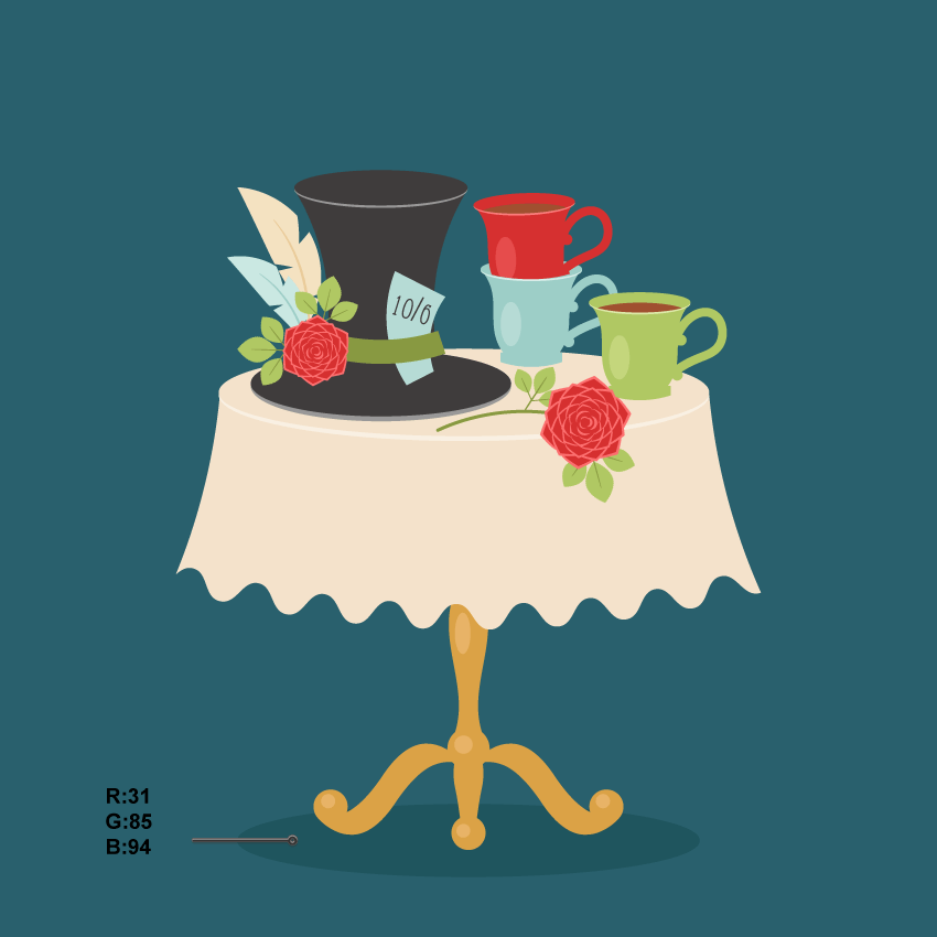
In this tutorial you will learn how to create an Alice in Wonderland themed tea party scene. Many of you may have heard of the little girl falling down a rabbit hole into a world full of adventures. There was a tea party—an odd, bizarre, ridiculous, and eccentric tea party. For me, it was the most memorable scene. That’s why I want to show you how to create such an illustration.

As always, we will use basic shapes and warp effects. At the end, you will have an adorable illustration and a bunch (I hope!) of new tricks you’ve learned during the process of creating it.

If you would like to get yourself in the necessary mood, why don’t you browse GraphicRiver and see how other artists imagine this quirky world of Alice in Wonderland.

Whenever you’re ready, let’s go!

1. How to Create the Hat 

Step 1

After opening Adobe Illustrator, create a new document with 850 x 850 px Width and Height

We’ll begin by illustrating the hat. Using the Ellipse Tool (L), create a dark grey oval. In the image below, you can see what fill color you need. Create a copy of this oval behind the original one (Control-C, Control-B), stretch it down a little, and change its color to a lighter grey.

After that, using the Rectangle Tool (M), add a rectangle under the two ovals. Be sure this rectangle stays in the back (Control-X, Control-B). To change the shape of this rectangle, go to Effect > Warp > Bulge. In the new dialogue window, enter the options you see in the image below. Expand this shape (Object > Expand Appearance).

how to create the top hat

Step 2

Now make a copy of the two ellipses from the top of the hat (Control-C, Control-V), make them larger, and attach them to the bottom part.

To add a ribbon, create a green rectangle and deform it: go to Effect > Warp > Arc and enter the following options. Always remember to expand after deforming a shape (Object > Expand Appearance).

continue creating the top hat

Step 3

Let’s add a feather decoration for the hat. Create an ellipse using the Ellipse Tool (L). Take the Convert Anchor Point Tool (Shift-C) and click on the top and bottom anchor points to make them sharp.

For the stem of the feather, we will use a very thin vertical ellipse. Using the Direct Selection Tool (A), select the right and left anchor points of this ellipse and move them down by pressing the Down Arrow key on your keyboard.

Next, keep the deformed ellipse selected and go to Object > Path > Add Anchor Points. Add three anchor points in a few places as shown in the image below (marked by blue circles). Now, using the Direct Selection Tool (A), select the middle anchor point of each triplet and move it to the middle of the feather. To get a sharp angle in the anchor points, take the Convert Anchor Point Tool (Shift-C) and click on each anchor point.

how to create the feather

Step 4

To deform the feather, go to Effect > Warp > Arc and enter the options shown below. Expand the shape.

Make a smaller copy of the feather, and change its color to blue.

Finally, place two feathers on the hat. Be sure they are placed behind the ribbon.

how to create the another feather and place it on the hat

Step 5

For the tag, create a light blue rectangle and deform it with the warp option, as shown below.

Go to Type > Font, and choose your favorite font. Click on the Type Tool (T) and then type the necessary numbers. Place the text on the tag and slightly rotate the text to the right. Group it together (right-click > Group).

how to create the tag

Place the tag on the hat but behind the ribbon.

how to place the tag

Step 6

Let’s decorate the hat with a rose. Create a red ellipse and deform it by using the warp effect: go to Effect > Warp > Fish and enter the options you see below. Always remember to expand.

Using the Convert Anchor Point Tool (Shift-C), make the top anchor point sharp. After that, make a copy behind (Control-C, Control-B), shift it slightly upward, and its change color to the light red. Select these two shapes and group them (right-click > Group). This will be a petal for our rose.

how to create the petal of the rose

Step 7

Now, while keeping the petal selected, hit the Rotate Tool (R). After that, keep the Alt button pressed, click below the petal, where the rotation axes will be placed, and hit Enter. Enter 45 degrees in the new dialogue window and press Copy. Thus, you will have another petal of the flower. To finish the first layer of petals, press Control-D four more times. Group them together.

Now, create a copy of this layer in front (Control-C, Control-F), make it smaller, and rotate it a little as shown in the image below. You now have a second layer of petals. Similarly, make the third, fourth, and fifth layers, which should be slightly smaller and rotated.

In the middle of the rose, we will add the middle petals made from circles. So create a circle (it doesn’t have to be perfect). In this case, it will be a darker circle in front and a lighter one behind it, which should be slightly visible. Group these two circles together to make the middle petal. Make a few copies of this middle petal and place them as shown in the image. Finally, put the middle petals on the rest of the petals you created before.

For your convenience, group the whole rose together.

how to create the rose

Step 8

We’ll create the leaf now. Start with the Ellipse Tool (L) and set a green fill color for it. While keeping the ellipse selected, take the Convert Anchor Point Tool (Shift-C) and click on the top and bottom anchor points to make them sharp.

To roughen the edges of the leaf, select the shape and go to Effect > Distort & Transform > Zig Zag. In the Zig Zag options window, adjust the Size and Ridges per segment to achieve a similar roughness to the image below. Your numbers could be different than mine, because it really depends on the size of your leaf.

how to create the leaf

Step 9

For the stalk, create a very thin, vertical oval. Place the stalk over the leaf you created in the previous step, as shown below. Now make a smaller copy of the stalk and the leaf, rotate them to the left, and attach them to the main stalk. Make another copy of the stalk and the leaf and place this copy on the right side of the main stalk.

how to create more leaves

Step 10

Place the leaves behind the rose, as shown in the image below. Make a copy of the whole little branch, and place it on the other side of the rose. The rose is ready to decorate the hat.

how to place the leaves

Place it in front of the ribbon and feathers.

final illustration of the hat

2. How to Create the Cups

Step 1

To create the cup, we will start with a green rectangle. Modify this rectangle with the warp effect: go to Effect > Warp > Fish and enter the options you see below. Add a small, light green oval in front of the shape for the highlight.

how to create the cup

Step 2

Add a little rectangle on the bottom and deform it with the warp effect (Effect > Warp > Arc Lower).

Next, add a green oval on top of the cup. In the image below, this oval has a black stroke color only for better visibility; however, in the final image, no stroke color will remain. Create a copy of this oval behind (Control-C, Control-B), make it lighter, and slightly stretch it down.

Now we will add some tea to our cup. Create a large brown oval in front which will overlap the green oval in the area marked by the red lines in the image below. Then, make a copy of the green oval in front (Control-C, Control-F), and while keeping this copy selected, select the brown ellipse as well (you need to press the Shift button to select more than one shape). Then hit the Intersect button in the Pathfinder panel. You will end up with a brown shape, which is the tea.

how to create the tea

Step 3

For the handle, create a green oval with no fill color, just green stroke color (press Shift-X to change the fill color to stroke color). On the Stroke panel, make the stroke Weight very thick. While keeping the oval selected, go to Effect > Warp > Arc and enter the options you see in the image below. Expand this shape.

Attach the handle to the cup.

Finally, add two green circles in the places where the handle is attached to the cup (use the Ellipse Tool (L) while holding down the Shift key).

how to create the handle of the tea cup

Step 4

Create two more copies of the cup and change their colors, except the color of the tea.

how to create another colors cups

Step 5

Let’s put the red cup on top of the blue one. First place the red cup in front of the blue as shown below.

Then select the top blue ellipse from the blue cup and make another copy over it (Control-C, Control-F). I marked this new copy with a black stroke for better visibility. You can also make this new copy with a black stroke, so you can see what is inside better.

With the help of the Direct Selection Tool (A), move the anchor points inside the top part of the red cup. Also, be sure that the bottom part of the deformed oval remains in the same position as before. Select the red cup and the deformed ellipse with the black stroke. Then go to Object > Clipping Mask > Make (Control-7). Now the red cup is inside the blue one.

how to place one cup inside another

3. How to Create the Flower to Decorate the Table

Make a copy of the rose and leaves, which we created before for the hat decoration. Note that there is only one pair of leaves. Now we will add a stalk: delete the fill color, set a green stroke color, and check Round Cap on the Stroke panel. Using the Arc Tool, draw an arc.

Next, take the Direct Selection Tool (A) and move the handles of the arc to achieve the result you like. You may want to add more leaves to the stem.

how to create the rose

4. How to Create the Table

Step 1

First, create a beige rectangle by using the Rectangle Tool (M). On top of this rectangle, add an oval with the same fill color. For convenience, both shapes are marked here with a black stroke color.

Now, select the rectangle and deform it: go to Effect > Warp > Bulge. Try to play around with the options in order to have a smooth transition from the oval to the new shape. Depending on the size of your oval and rectangle, these options might be a little different from the ones shown below. Remember to expand this shape (Object > Expand Appearance).

how to create the tablecloth

Step 2

Use the Line Segment Tool () to draw a line over the deformed shape. To make the line straight, hold the Shift key while drawing it.

Now we will modify this line; go to Effect > Distort & Transform > Zig Zag. In the Zig Zag options window, adjust the Size and Ridges per segment to achieve a similar curve as in the image below. Don’t forget to select Smooth Points. For your convenience, select Preview while adjusting these options.

Next, while keeping this wavy line selected, go to Effect > Warp > Arc. In the new window, adjust the options from the image below. Finally, don’t forget to Expand Appearance (Object > Expand Appearance).

continue creating the tablecloth

Here’s the Arc options window:

warp options window

Step 3

While keeping the Zig Zag curve selected, also select the deformed rectangle and press the Divide button in the Pathfinder panel. Since you now have two objects grouped, ungroup them: right-click on your mouse and hit Ungroup.

Now you can simply delete the bottom part to create the tablecloth shape.

After that, create another copy of the top oval behind (Control-C, Control-B), make it lighter, and slightly stretch it down.

finishing creating the tablecloth

Step 4

For the table leg, create a light brown rectangle and place it behind the tablecloth (Control-X, Control-B). To modify this rectangle, we’ll use the Fish effect: go to Effect > Warp > Fish and enter the options shown.

Finally, add a light brown ellipse and one more tiny circle as shown below.

how to create the leg of the table

Step 5

Add another ellipse below and deform it with the Fish effect again. Make a copy of the circle from the previous step and attach it below the new oval. Note how the new circle is slightly smaller.

continue creating the leg of the table

Step 6

Now create a horizontally aligned ellipse and apply the Flag effect: go to Effect > Warp > Flag. Use the options shown below, and remember to expand the final shape.

continue creating the leg of the table

Step 7

Attach the new shape to the bottom part of the table’s leg. Add a brown circle with a light circle to the end of this shape, as you can see below. This is the left side part of the table’s leg.

Now, while keeping this left side part selected, take the Reflect Tool (O) and, while holding down the Alt key, click on the middle part of the leg. In the new dialogue window, select Vertical, Angle 90 degrees and press Copy. You should now have the right part of the table leg. The table is ready for a tea party!

finishing creating the leg of the table

5. How to Create the Background

Step 1

Arrange the details on top of the table as shown below. You can place the details in a way that you like.

placing all the objects on the table

Step 2

Create a dark blue square 850 px Width and Height, by using the Rectangle Tool (M). First, take the tool, and then click on your artboard and enter the necessary options. Align the background to the artboard. To do this, open the Align panel (Window > Align). Set Align To: Align to Artboard (open the fly-out menu and go to Show Options if you don’t see the Align To:), make sure that your background is selected, and click the Horizontal Align Center and Vertical Align Center buttons.

how to create the background

Step 3

Place the image in front of the background. However, it will be easier to put the background behind all the objects (Control-X, Control-B).

placing all the objects on the background

Step 4

To add some dimensions to the scene, create a darker ellipse at the bottom of the square, behind the table.

adding dimension

Awesome Work, You’re Done!

And we are finished! Well done! I hope you enjoyed learning some of the processes and shortcuts while creating this image in Adobe Illustrator. As always, feel free to share your project and ask questions in the comments section below. As you can see, you can use basic shapes to create amazing images in Adobe Illustrator. See you next time!

final

Create Beautiful Page Layouts and a Striking Cover for a Children’s Fiction Book

Final product image
What You’ll Be Creating

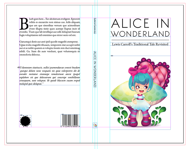
In this tutorial I’ll show you how to create a striking cover as well as creative page layouts for a children’s book (in this case a modernized version of ‘Alice in Wonderland’!). Using Adobe InDesign, we’ll explore how thinking outside of the box with typography and images can make classically typeset pages more exciting. This tutorial looks at techniques you can use for layout and design—lessons you can apply when putting together your own print book or eBook.

Many thanks to Mary Winkler for contributing her fantastic illustrations for the layouts. You can learn how to create your own Alice in Wonderland illustrations from her tutorial posted earlier in the week.

1. Set Up the Layout of the Cover 

Step 1

Open InDesign and select File > New Document. In the New Document window, set the Intent to Print and set the No. of Pages to 1. Deselect Facing Pages. Under Page Size, select Custom… from the drop-down menu to open the Custom Page Size window. Under name, type ‘Alice in Wonderland_Cover’ and set Width to 277 mm and Height to 216 mm

This allows for an interior page size of 135 mm by 216 mm, which is an industry standard for paperback books. In my version of InDesign, Millimetre units are automatically translated into Picas, but throughout this tutorial I will list all units in Millimetres. Click Add, and then OK

Set the top, right and left margins to 20 mm and the bottom margin to 25 mm. Set the Bleed on all sides to 3 mm. Click OK.

Step 2

Drag a vertical guideline from the left-hand ruler (go to View > Show Rulers, if not already visible) to 135 mm. Drag a second guideline to the centre point, at 138.5 mm. Drag a third guideline to 142 mm. This sets up the outer edges and centre point of a 7 mm width spine.

Step 3

From the left-hand ruler, drag a guideline to 115 mm (the page width of 135 mm minus the 20 mm margin width) to set up the margins of the back cover. Repeat for the front cover by dragging a guideline to 162 mm.

The basic proportions of your cover are now set up—you can begin to add content.

2. Design the Front Cover 

Step 1

Use the Rectangle Frame Tool (F) to create a frame 95 mm in width. The height can vary depending on the image you choose to place. Sit the frame against the bottom margin and File > Place. Select your chosen image (ideally an EPS image with a transparent background if using a vector illustration) and Open.

With the image frame selected, click the Fill Frame Proportionally option from the top control panel.

Step 2

Select the Type Tool (T) and create a frame 95 mm Width and 30 mm Height. Type ‘ALICE IN (paragraph break) WONDERLAND’ and select Align Center from the top control panel.

Now you can select a couple of fonts to give your cover a dynamic look. In this example, I went for a classic-looking Serif font, EB Garamond, and a contrasting modernist Sans Serif font, BonvenoCF. This combination will work really well for this modernised take on Alice in Wonderland.

Return to the text frame you’ve created and highlight the text. Set the Font to BonvenoCF Light. Highlight just ‘ALICE IN’ alone and set the Font Size to 55 pt, Leading to 66 pt, and Tracking to 30. Highlight ‘WONDERLAND’, and set the Font Size to 33 pt, Leading to 39 pt, and Tracking to 30.

Step 3

Go to Window > Stroke to open the Stroke panel. Select the Line Tool () and hold Shift to drag a horizontal line 90 mm in Width. In the Stroke panel, set the Weight to 0.35 mm, and maintain the line as Solid. Place the line centered beneath the heading.

Step 4

Create a second text frame 95 mm in Width using the Type Tool (T). Insert a sub-heading, in this case, ‘Lewis Carroll’s Traditional Tale Revisited’, Align Center, and set the Font to EB Garamond Regular. Set the Font Size to 16 pt.

Your simple and striking front cover is done! Now for the back cover of the book.

3. Design the Back Cover 

Using the Type Tool (T), create a text frame 95 mm in Width and rest the top of the frame against the top margin on the back cover. The frame should sit centrally on the back cover.

You can insert your book’s blurb here, or go to Type > Fill with Placeholder Text for now. 

Extend the frame down to just over half of the back cover and split the text into two paragraphs. Highlight all the text and select Justify with Last Line Aligned Left from the top control panel. Set the Font Size to 12 pt and Leading to 14.4 pt. Go to Window > Type & Tables > Story to open the Story panel. With your cursor sitting amongst the text, check Optical Margin Alignment.

Highlight the first paragraph and set the Drop Cap Number of Lines in the top control panel to 4. Set the Font to Regular.

Highlight the bottom paragraph and set the Font to Italic and the Drop Cap Number of Lines to 2. This is a great place to insert a quote, review, or author biography.

You can also insert a logo, website, and/or barcode at the bottom of the back cover if relevant.

4. Format the Spine

Step 1

Use the Type Tool (T) to create a new text frame 3 mm in Height, 25 mm in Width. Insert ‘Author Name’. Set the Font as EB Garamond SC (or use the All Caps option in the Character control panel to imitate this) and the Font Size to 11 pt. Select the frame, Control-click (Mac) or right-click (PC) and Transform > Rotate 90 degrees Clockwise. Rest the top of the frame against the top margin, centered down the spine.

Step 2

Edit > Copy > Paste this text frame and extend the Width to 57 mm and the Height to 3.5 mm. Edit the text to read the book’s title (e.g. ‘ALICE IN WONDERLAND’) and set the Font to Bonveno CF Light. Adjust the Tracking to 30. Position this text frame about halfway down the center of the spine.

You can also insert a logo or small illustration at the bottom of the spine against the lower margin—this can add a special touch to the overall cover.

Well done—your book cover is done! Now for the inside pages.

5. Set Up the Layout of the Interior Pages

Step 1

Go to File > New Document. In the New Document window, set the Intent to Print and set the No. of Pages to 3. Keep Facing Pages selected. Under Page Size, select Custom… from the drop-down menu to open the Custom Page Size window. Under name, type ‘Alice in Wonderland_Pages’ and set Width to 135 mm and Height to 216 mm. Click Add, and then OK

Set the top and inside margins to 20 mm, outside margin to 15 mm, and the bottom margin to 25 mm. Set the Bleed to 3 mm, but leave the Inside value at 0 mm. Click OK.

Step 2

We can create two Masters—one for the opening page of a chapter or section, and a second for the main pages.

Ensure the Pages panel is open by going to Window > Pages. You will see that an A-Master consisting of two pages combined as a spread has been automatically added in InDesign. In this book, all our chapters will start on a right-hand page, so click on the left-hand page of the A-Master and drag it to the trash icon at the bottom right-hand corner of the Pages panel.

Double-click the A-Master page to bring it up on screen. Drag a vertical guideline from the left-hand ruler to 69 mm and drag a second to 73 mm to mark out the edges of two columns for text.

Select the Type Tool (T) from the tools control panel and drag to create a small text frame 5 mm in Width and 4 mm in Height. Position this centrally between the column guidelines (at around Y position 201 mm) and go to Type > Insert Special Character > Markers > Current Page Number. Set the text to Align Center, Font to EB Garamond SC, and Font Size to 9 pt.

Step 3

Go to the Pages Menu > New Master… to create a new two-page B-Master spread. 

You can copy the guidelines and page number text frame and duplicate them in the relevant positions on this second spread.

You can also add some page headers at the top of each page to give your book a unified and professional look. Create a text frame using the Type Tool about 3.5 mm in Height and 100 mm in Width. Position this centrally above the top margin on the right-hand page of the B-Master. Type the book title in uppercase letters and set the text to Align Center, Font to Bonveno CF Light, Font Size to 7 pt, and Tracking to 30.

Use the Line Tool () and hold Shift to create a line about 37 mm in length. Keep the line thin (I went for 0.088 mm) and position this just below the header text to give it a nice frame.

Edit > Copy > Paste the header text frame and line, and manoeuvre them into the matching position on the left-hand page of the B-Master.

You can apply this Master to Pages 2 and 3 here, plus any other pages that are not opening chapter pages in your book.

6. Create a Dynamic Opening Chapter Page

Step 1

Apply the A-Master to Page 1 by clicking and dragging the A-Master page icon to the Page 1 icon. Double-click Page 1 to bring it up on screen.

Select the Type Tool (T) and drag to create a text frame 47 mm in Width and 5 mm in Height. Position this frame at the top of the left-hand column, with the top of the frame resting against the top margin. 

Type the Chapter Number or Section Title and set the Font to Bonveno CF Light, Size to 15 pt, and Tracking to 30. Select All Caps from the top control panel.

Use the Line Tool () to create a line slightly shorter than the text frame, around 46 mm. Set the Weight to around 0.3 mm and position it centered, just beneath the text frame.

Step 2

We can apply a dramatic Drop Cap to the first letter of the chapter text to create interest. To do this, however, we need to extend the Height of the text frame beyond the limits of the column margins. This may involve a bit of trial and error, but it’s a great typographical effect to use.

Use the Type Tool (T) to create a text frame 47 mm in Width and 196 mm in Height. You may need to zoom out a little to see its full Height. Position this frame within the right-hand column space, resting the bottom of the frame on the bottom margin. 

You can insert the text for your chapter and set the Font to EB Garamond Regular. For now, it will be more manageable to just work with the first five or so lines (or the first complete sentence) of your chapter. We can add the rest later. 

Select Justify with Last Line Aligned Left. Set the Font Size to 12 pt and Leading to 15 pt. Now highlight the first letter of the text and go to Drop Cap Number of Lines in the top Control Panel. Set the value to 9. Your first letter has been blown up to the width of the right-hand column.

Step 3

To make the typography really special on this page, you can play around with the sizing, tracking, and leading of lines to give a dynamic look to the type, and pull out the first line of the chapter for a dramatic effect. This can work really well for children’s books in particular, where text may be less lengthy and the size of type generally needs to be larger.

In this example, I highlighted ‘here was a’ and increased the Font Size to 34 pt and the Leading to 43 pt. I pulled out the next short group of words and increased the Font Size to 44 pt. Continue through the text, experimenting with size (you may encounter your own challenges with any long or hyphenated words). This will start to push down the text to the bottom of the page, and you can play around with the position of the frame until you are happy.

Awesome—it’s looking good!

7. Design a Spread With Creative Typography

Step 1

Bring up Pages 2 and 3 on screen by scrolling down. Create two text frames using the Type Tool (T) and adjust the size of these to fit within the two columns on Page 2. You can insert the remaining text of your chapter into the first frame. Click the small white box at the bottom right of the frame and click into the second frame to link the frames and flow the text into the second frame.

Set the text to Justify with Last Line Aligned Left. Set the Font to EB Garamond Regular, Font Size to 12 pt, and Leading to 15 pt

Highlight the first letter of the first paragraph of text and set the Drop Cap Number of Lines value to 4. You may need to adjust the height of the text frames a little to allow the last line of text to sit perfectly on the bottom margin. Ensure Optical Margin Alignment is not checked to allow the first paragraph to ‘tuck’ into the column.

Step 2

The second page of your chapter looks classic and traditional. We can contrast this against a quirky opposite page. 

We can achieve this by using Illustrator to create a vector shape that we can fill with text. Pairing this with a relevant image makes an exciting combination. 

Use the Rectangle Frame Tool (F) to create a small frame and position this in the bottom right of the page. File > Place and select an image (preferably in black and white or grayscale, with a white or transparent background, to maintain the illusion of an old-fashioned novel); click Open. Use Fill Frame Proportionally to resize the image.

Step 3

Open Illustrator and File > New… to create a new document. Now you have to exercise some imagination. What shape would work well with your chosen image? Can you make it wide enough to accommodate enough text? 

In this example, I created a simple ‘steam’ shape using the Arc Tool and gave it a Fill (you don’t need to give it a Stroke). Select the shape and go to Edit > Copy.

Step 4

Return to InDesign and go to Edit > Paste. The Illustrator shape is dropped into your InDesign Document. You can set the Fill to None by going to the top control panel. 

Step 5

Using the Selection Tool (V, Escape), adjust the size of the shape to fit nicely onto Page 3. You can hold Shift to maintain the proportions of the shape. Select the Type Tool (T) and hover the cursor over the top of the shape. The cursor will change to a type cursor; click once and the shape is turned into a text frame.

Link the second text frame on Page 2 to the shape on Page 3 by clicking the lower right-hand white box in the second column and clicking again in the shape. The text will flow into the shape. 

You may need to make some adjustments to the shape’s dimensions once the text has been included. Do your best to make sure there are no large gaps between lines of text and that there are no straggler words.

Step 6

That’s the first three pages of your chapter done—it’s looking great!

You can repeat the principles in Steps 1-5 above to create more beautiful interior layouts for your book. The results will be dependent on your content, your images, and your imagination. Here’s another example to get your creative juices flowing.

In this example, I created a spiral shape in Illustrator using the Spiral Tool and, as before, copied and pasted the shape into InDesign and used the Type on a Path Tool (Shift-T) to flow the text onto the spiral. 

It’s a great way of visualising Alice’s descent down the rabbit hole!

8. Prepare Your Book for Print or Digital

The aim of this tutorial has been to show you some ways of creating dynamic and quirky layouts for a children’s book. You can use the ideas presented here to create your own beautiful cover and layouts. 

Once you have put together your whole book, you may want to export this as an Interactive PDF for sharing online (go to File > Export and select Adobe PDF (Interactive) from the Format drop-down menu; and check Spreads from the subsequent menu). 

Alternatively, you can create a print book by going to File > Export > and selecting Adobe PDF (Print) from the drop-down menu. Select Press Quality from the Adobe PDF Preset drop-down menu, and check All Printer’s Marks from the Marks and Bleeds menu.

Awesome Work, You’re Now Done!

I hope you have found this tutorial useful and has inspired you to have a go at creating your own children’s book.

How to Create an Alice in Wonderland Themed Stencil in Adobe Illustrator

In this tutorial we’ll make a fun and very simple stencil that we can use on a variety of surfaces, including t-shirts, walls, and canvas bags. The possibilities only end with your imagination. Inspired by Alice in Wonderland, I’ll create a mouse in a teacup design in Adobe Illustrator and prepare it ready to be used as a stencil.


1. Prepare Your Document

Step 1

Let’s start our project by bringing in our artwork. I’ll be working in pure white for the majority of this project, so I’ll work from the darker picture. I’m sharing a clean sketch version in this project as well as a darker version just in case you have a preference and wish to recreate the stencil yourself.

Twinkle_Twinkle_01

Step 2

I’ve started with a sketch of what I’d like the finished vector project to look like with a regular mechanical pencil. I’ve adjusted the contrast of the JPEG to give us a cleaner line quality in Photoshop, and now we can begin to work. 

I’m working in Adobe Illustrator at a size of 8.5 x 11 in to ensure that whoever uses the stencil has the right size when the vector is printed.

When I’m ready to start my layers, I’ll label my first layer “Sketch” and lock the layer to make sure that I don’t accidentally move or delete the sketch.

Twinkle_Twinkle_02

2. Trace the White Areas of the Stencil

Step 1

Next, we’ll start by creating a new layer and calling it “White” to distinguish it from any others that we might create. Now that we have this new layer, we can start to trace our character. 

Try to imagine your image being cut out and the need for negative space as well as positive space. To create a little more interest, the project will be done in two colors rather than just one. I’ve decided to make a white mouse, but again, this project can be later done in any color the artist chooses.

If you feel that, by the time you’re finished with this tutorial, you’re ready to tackle something a little more complicated, I’d suggest trying out Adam Cairns’s Create a Five Color T-Shirt Design Ready for Print in Adobe Illustrator.

Twinkle_Twinkle_03

Step 2

In this step, we’re adding the eye. I may change this later depending on how the other pieces come together, but for now, I’m cutting out an area for the eye. This can be done by making the eye shape with the Pen Tool (P) and then clicking on the head, holding down the Shift and Alt keys while selecting the eye shape above it. You’ll find the Pathfinder panel most likely on your top right side, but if you can’t find it, click Windows > Pathfinder and press the Minus Front icon.

Twinkle_Twinkle_04

Step 3

By this point we can clearly see that our mouse is taking shape, but with the color that we’re using, it might be harder to see all of your hard work paying off. 

While I’m working, I like to make a separate layer that I’ll place a black rectangle in, the exact size of my Artboard. When I want to take a quick look at my progress, I can make the black rectangle unhidden.

Twinkle_Twinkle_05

Step 4

The next area to tackle will be our beloved dormouse’s teacup. Since we have a large area to cover, I started out by outlining the largest piece. Now, before you freak out and say to yourself, “How will I ever cut out my handle?”, fear not, because this is only the start.

Twinkle_Twinkle_06

Step 5

Draw the space between the handle and cup, and select the cup body. While holding down the Shift and Alt keys, select the shape and click Minus Front in your Pathfinder panel. This will immediately take out that troublesome piece and allow us to see our cup handle more clearly.

Twinkle_Twinkle_07

Step 6

While we’re making our cup, we need to be aware of parts that could become problem areas for the person who is cutting these pieces out. Even though we’re trying to create something cool and creative, we don’t want this project to become someone else’s headache.

Twinkle_Twinkle_08

Step 7

By this stage, we have our cup almost completed, but if we really want something unique, we’ll have to put a little more elbow grease into our project.

Twinkle_Twinkle_09

Step 8

We’ll start to trace our spoon and saucer at this point, making negative spaces as we go. If we make the areas too thin, the stencil may break and ruin the project.

Twinkle_Twinkle_10

Step 9

Next, we will add the tea drip to our spoon. We’ll revisit this area later, but it’s nice to lay out the main pieces first.

Twinkle_Twinkle_11

Step 10

We’re now ready to give our cup a stripe to decorate its surface. The easiest way to do this is to lay a Stroke line over the surface with whatever color we would like and thicken the Stroke Weight to 16 pt.

Twinkle_Twinkle_12

Step 11

Our Stroke line is now ready to become a Fill. To do this, select the Stroke, and go to Object > Expand and untick the Fill box. Press OK and you’ll now have a Fill that will help you cut away some of the unneeded cup areas.

Twinkle_Twinkle_13

Step 12

With our colored Fill line ready, select your white cup pieces along with your new Fill line and click Trim in your Pathfinder tab. This will take out the area that we need to cut away.

Twinkle_Twinkle_14

Step 13

By this time, we will have a nice line that can later become decorative as we create with our other color.

Twinkle_Twinkle_15

Step 14

While making our lettering, we can be as messy as we want. We can clean these letters up with a very easy trick. Create a line across the area you’d like to cut away. Select your word and then the new path, and click Trim. When we’re done, we’ll have a set of whimsical words fit for a dormouse.

Twinkle_Twinkle_16

3. Trace the Pink Areas of the Stencil

Step 1

With our “White” layer pretty much complete, we can start on our next layer. I’ve chosen to go with pink, so our new layer will be called “Pink”.

Twinkle_Twinkle_17

Step 2

I’ve gone with a bubblegum pink that will pop nicely against the white, but again these are only temporary colors. They are merely there to help me understand how the stencil will be cut and laid out together.

Twinkle_Twinkle_18

Step 3

I can go ahead at this point and follow the sketch to create the ears and the other decorated parts for the dormouse and cup. I’m now working from my “Pink” layer, so there’s no fear of mixing parts that should stay separate.

Twinkle_Twinkle_19

Step 4

Following the sketch, we can continue to add our pink areas which include our tail and paws.

Twinkle_Twinkle_20

Step 5

As you can see, I’ve added the bow and have followed the sketch as closely as possible.

Twinkle_Twinkle_21

Step 6

Now that I have my liquid drop ready, I can cut some of the area around the reflective area so that we won’t have any issues later. I’ve locked my “Pink” layer and unlocked my “White” layer so that I can work on the reflective piece. Select this only and add a Stroke line in any color other than the white or pink. You’ll need to see what you’re making. Change the Stroke Weight to 2 pt.

Twinkle_Twinkle_22

Step 7

Once you have your line, we will now make this a Fill by selecting and going to Object > Expand and unticking the Fill box. Press OK and you’ll now have a Fill ready to exclude. Again, we will click Minus Front in our Pathfinder tab to clean up the space around the reflection.

Twinkle_Twinkle_23

Step 8

While working on the stencil, I’ve decided to take out the eye shape on the white layer, and I’m now making one on the “Pink” layer. The reason I’m doing this is so that when we make the eye, you’ll have a richer overall color for it. 

Also, when the head is cut out in our stencil, you’ll automatically lose the eye. This will take care of that problem, allowing us to cut out a reflection shape from our newly made eye. To cut this, we’ll be using our Minus Front option in the Pathfinder panel again.

Twinkle_Twinkle_24

Step 9

In this shot, you can see that we’ve erased the eye that we had previously cut. I made a quick patch over the eye and selected it and the head shape together. I’ll go back to my Pathfinder and click the Unite icon to make one piece.

Twinkle_Twinkle_25

4. Create the Registration Shapes and Prepare the Images

Step 1

Our next step is very important. We’ll add registration shapes for our partner to follow so that when they match up the pieces, there won’t be any complications. I’ve chosen to go with a star, which I’ve put on both the “White” layer and the “Pink” layer. I’ve added these stars in two places as well. We have them placed in the upper right corner and the lower left corner for easy alignment.

Twinkle_Twinkle_26

Step 2

Both of our pieces are now ready to go—well, almost. We have our two layers ready, but to make this printer ready, we have one more step. Any guesses as to what we should do next?

Twinkle_Twinkle_27

Step 3

To make sure that our collaborative partner can go on to the next phase without too much difficulty, we should color both layers black. You may not be able to see the eyes or the stripe in our teacup, but they are definitely still there. This ensures that no matter what type of printer they end up using, they will have clean lines that are easy to see. Depending on how they would like to receive the stencil, we can now save each layer individually or give the file to them as it is now.

If you have any interest in making more Alice in Wonderland inspired artwork, I’d suggest hopping over to Sharon Milne’s Creating a Mysterious Cheshire Cat in Adobe Illustrator.

Twinkle_Twinkle_28

Congrats! Phase 1 Is Complete!

I hope you’ve found our dormouse fun and simple to complete. Why not try creating a stencil from it and printing it onto a wall, bag, anything!

Twinkle_Twinkle_Final

27 Amazingly Detailed Adobe Illustrator Tutorials

Recently on our Facebook page, we were asked in response to a vector tutorial being posted:

Ain’t that too detailed for Illustrator?

Aint that too detailed for Illustrator
Names & avatars blurred for privacy

In response to one of our readers… here’s an article especially for you and other vector fans. Here are 27 tutorials from our archives, with amazingly detailed end results, that you wouldn’t believe were created in Adobe Illustrator.

27 Amazingly Detailed Adobe Illustrator Tutorials

Let’s start with the original tutorial which our reader questioned…

If you’re looking for more detailed Gradient Mesh tutorials, Vladimir Galantsev has plenty available over on his profile. Here are some of my favourite detailed gradient mesh tutorials by him and other talented artists on Envato Tuts+.

Amazingly Detailed Gradient Mesh Tutorials

Amazingly Detailed Illustration Tutorials

Did you know Illustrator can do more than detailed gradient meshes? Well what about these detailed illustrations! 

Amazingly Detailed Illustrator Text Effect Tutorials

What happens if illustration isn’t your thing… well we’ve got plenty detailed text effect tutorials in Adobe Illustrator!

Show Us Your Detailed Vector!

Let’s open the floor… do you create detailed vector art? We’d love to see it, so please upload it to the comments and show other vector fans what you can create with some vector points.

Stay tuned to Envato Tuts+, for more detailed vector art tutorials… as well as other amazing content for Adobe Photoshop, InDesign, Affinity Designer, and much, much more!

50 Stylish Wedding Invitation Templates

Love is in the air! And in this collection of premium design assets, we present you with 50 stunning wedding invitation templates.

Loaded with incredible designs from GraphicRiver and Envato Elements, this collection features a plethora of gorgeous invitations we’re sure you’ll love.

Download these templates today to embark on your romantic journey or enlist the help of a design professional from Envato Studio for custom invitation design.

50 Fabulous Wedding Invitation Templates

Start the first day of the rest of your life in style. Download one of these premium wedding invitation templates to celebrate your love with the world. They’re crafted with exquisite designs and luxurious elements, so say “I do” to these fabulous wedding templates today. Enjoy!

Wedding Invitation Set

To kick off this collection, we’ll start with this lovely wedding invitation set. This set includes several unique templates for your wedding invitations, RSVP cards, and so much more. Celebrate your special day in style with this minimal design featuring unique cursive lettering.

Wedding Invitation Set

Black and White Wedding Invitation

Dazzle your guests with this stunning wedding invitation design. This template features an elegant black and white color scheme with gold elements to complement your overall palette. Print ready and easy to use, this design can be downloaded today!

Black and White Wedding Invitation

Watercolor Wedding Invitations 8 Cards

This beautiful invitation package features a handmade watercolor wash that is sure to impress your guests! Also included in this package are eight Photoshop files with multiple card designs and so much more!

Watercolor Wedding Invitations 8 cards

Elegant Wedding Invitation

Match your invitation design to the bride’s dress details with this elegant invitation. This template features a lovely dark and light version with a professional clean design that is sure to make your invitations memorable.

Elegant Wedding Invitation

Love Letter Wedding Invitation

Send a love letter to all your party guests with this stunning invitation package. This download includes several print-ready designs with lovely script details. Easily adjust and customize the designs for more creative options.

Love Letter Wedding Invitation

Wreath Wedding Invitations

Customize your invitations to match your wedding’s style. Perfect for that elegant look, this suite includes one invitation and matching RSVP card. Complement your wedding details by featuring this beautiful gold wreath set.

Wreath Wedding Invitations

Floral Wedding Invitation Suite

Kick off your wonderful wedding experience with this floral invitation suite. Apart from the initial documentation file, you’ll also receive four separate Photoshop files with double-sided invitations and additional wedding cards.

Floral Wedding Invitation Suite

Elegant Vintage Wedding Invitation

Need an invitation with a unique vintage theme? Then look no further! Here we have a gorgeous template that features a pristine vintage design with rustic elements and both front and back layout options.

Elegant Vintage Wedding Invitation

Floral Wedding Invitation Template

One unique way to make your invitations shine is to match them to your current floral arrangement. Use this template to feature your favorite flowers with a modern typographic design. Included in this set are two Photoshop files that are well organized with color-coded groups.

Floral Wedding Invitation Template

The Vintage Wedding Card

Stamp your face on a cute invitation design and let your loved ones know you’re ready to take the leap! This lovely template features a professional clean design that is print ready and super easy to use. Simply drag and drop your photos into the allotted Smart Objects to customize this design easily.

The Vintage Wedding Card

Summer Wedding Invitation Card

Are you having a wedding in the summer? Then perhaps you’ll love this gorgeous floral wedding invitation card. Designed with vintage floral elements and elegant text, this pack includes two high resolution invitation cards. Share the love today!

Summer Wedding Invitation Card

Rustic Wedding Invitation & RSVP

Enjoy this rustic invitation design for your special day. This elegant template features a minimalist design with vintage rustic elements to highlight your wedding arrangements. Download this file to get three unique color combinations and links to free fonts.

Rustic Wedding Invitation  RSVP

Save The Date Chalkboard Postcard – Volume 3

You can achieve the look of custom chalkboard lettering against a dusty blackboard with this unique design. This template features two additional color alternatives with a front and back design for a nice vintage look.

Save The Date Chalkboard Postcard - Volume 3

Vintage Wedding Invitation Template

Many invitation templates on GraphicRiver come with elegant color alternatives. Check out this vintage wedding invitation, for instance. This template features three unique color combinations along with a clean front and back design perfect for your romantic celebration.

Vintage Wedding Invitation Template

The Wedding Invitation

Want a wedding invitation with bold, vibrant colors? Then check out this lovely minimalist design. This template features four unique color combinations that we’re sure you’ll love. Download free fonts included with this package to take advantage of this stunning design.

The Wedding Invitation

Elegant Wedding Invitation

There’s no need for a fussy design when you can celebrate your love with an elegant wedding invitation. This template features four fully layered Photoshop files, with two color options, and so much more!

Elegant Wedding Invitation

Watercolor Invitation Template – 4 Colors

Or how about a nice watercolor design for your wedding invitation? This template features a special design with handmade watercolor textures that are sure to complement your special day. Download this template to get access to four color combinations and so much more!

Watercolor Invitation Template - 4 Colors

Bokeh Wedding Invitation Template

If you love the look of sparkly bokeh photography, then we’re sure you’ll enjoy this stunning wedding invitation. This template features a gorgeous sparkly design with elegant text and a simplistic layout. 

Bokeh Wedding Invitation Template

Lace Wedding Invitation

Put your love on display with this beautiful wedding invitation template. This design features a print-ready layout that is super easy to use. Simply place your photos into the appropriate Smart Objects to enjoy this design quickly and easily.

Lace Wedding Invitation

Modern Wedding Invitation Template

Love geometric shapes and warm, vibrant colors? Then this template might be the one for you! Included in this package are all the materials you need to kick off your wedding in style. Enjoy a complete collection featuring modern designs for wedding invitations, RSVP cards, and more!

Modern Wedding Invitation Template

Save the Date Invitation Card

Many lovely couples utilize talented photographers for stunning engagement photos. So take advantage of your special photo shoot by showcasing your photos on your save the date cards. Created in Photoshop with well organized layers, this template is ready to download and enjoy today!

Save the Date Invitation Card

Green Foliage Wedding Invitation

Save the date with a remarkable design that is classic and effortless. This wedding invitation features a sublime design with exquisite watercolor foliage. Adjust the text elements with the names of you and your love to enjoy this invitation now!

Green Foliage Wedding Invitation

Fresh Royal Wedding Invitation Package

Get royal with this stunning wedding invitation package. Included in this package are ten premium Photoshop files with templates for the invitations, RSVP cards, and so much more. Download this set to create a nice, cohesive look for all your wedding materials.

Fresh Royal Wedding Invitation Package

Save The Date Postcard – Volume 5

This super cute wedding invitation is perfect for an adorable retro couple. Show off his manly stache and her favorite lip shade with this cute design. This template features two layered Photoshop files, front and back designs, and plenty of room for guest information.

Save The Date Postcard - Volume 5

Save The Date Postcard – Volume 1

Save the date in style with this customized wedding invitation. This template features two layered PSD files that are super easy to edit. Simply drag and drop your favorite photo into the template and change the details for a personalized design.

Save The Date Postcard - Volume 1

Wedding Invitation Package – I Heart You

Show how much you love each other with this adorable wedding invitation package. This package includes 11 Photoshop files with templates for your save the date invites, RSVP forms, and thank you cards. Download this set today to get 11 great designs in one professional package!

Wedding Invitation Package - I Heart You

Wedding Invitation Typography Template

Take advantage of cool typographic design with this unique wedding invitation template. This design features a grungy mix of letters for all your pertinent information. Download this package to get an easy-to-use file with fully editable layers and more.

Wedding Invitation Typography Template

Simple Elegant Wedding Invitation

Wedding planning is already stressful, so do yourself a favor and go with a simple and elegant invitation design. This template features five gorgeous color variations with simplistic details and well-organized layers. Download it today to plug in your wedding details in no time at all!

Simple Elegant Wedding Invitation

Watercolor Leaves Wedding Invitation Suite

Match your invites to your garden surroundings. We hope you’re inspired to take a calming stroll amongst the flowers after using this lovely invitation set. Included in this download are several Photoshop files with front and back wedding card designs for fast printing!

Watercolor Leaves Wedding Invitation Suite

Floral Rustic Wedding Invitation

With a mix of fresh flowers and vintage design, this template features two unique light and dark versions to match your overall theme. Download this package today to get access to fully editable files and print-ready templates.

Floral Rustic Wedding Invitation

DIY Birdy Wedding Invitation & RSVP

Are you a bird lover at heart? Incorporate your passion into your wedding with this unique wedding invitation set. This template features a simplistic, elegant design with double-sided cards in a print-ready format. Download it today to make the most of this lovely design.

DIY Birdy Wedding Invitation  RSVP

Beige Wedding Invitation

For a classic wedding invite design, check out this gorgeous collection below. This package features easily editable Photoshop files for invites, info cards, and so much more. Customize it easily with your wedding details to get started today!

Beige Wedding Invitation

DIY Black & White Wedding Invitation PSD Template

Stand out from the crowd and download a template today that won’t be expected. This creative design features a unique black and white style with charming design details. You’ll receive a documentation file with nine additional files to cover your wedding arrangements.

DIY Black  White Wedding Invitation PSD Template

Black Wedding Set – Invitation

White typography against a solid black background always makes for stunning design. And you can utilize this design for print-ready invitations that are super easy to use. Purchase this package today to get access to several black and white designs featuring that classic vintage look.

Black Wedding Set - Invitation

DIY Peonies Wedding Invitation PSD Template

Do it yourself with this fabulous wedding invitation set! This package includes an elegant design with incredible peony flowers and room for photos. Customize your cards easily with dreamy engagement photography and all your wedding details.

DIY Peonies Wedding Invitation PSD Template

Dark Watercolor Wedding Templates

Save the date with this divine wedding invitation package. Featuring a gorgeous wash of watercolor as the base, this design also includes eight Photoshop files that are easy to use. Download the free fonts included with these templates to take full advantage of these designs.

Dark Watercolor Wedding Templates

DIY Vintage Wedding Invitation PSD Template

The beauty of DIY design is that you can still create beautiful invitations that won’t break the bank. And this vintage template is certainly no different. Included in this package are several files for your invites and cards in a print-ready format you can also print at home.

DIY Vintage Wedding Invitation PSD Template

Art Deco Wedding Invitation

Match your vintage wedding theme with this authentic invitation design. Included in this package are four Photoshop and Illustrator files with 100% vector elements. Show off your style and your incredible taste with this overall charming invitation set.

Art Deco Wedding Invitation

Grey Wedding Invitation Set

Those special little details really set a normal invitation apart from an extraordinary one. And this watercolor invite set features lovely floral details with files available in Adobe Photoshop. Get it printed on a special card stock with raised ink for an awesome experience.

Grey Wedding Invitation Set

Minimalist Wedding Invitation

Minimalist design can be just as fabulous as ornate ones. And with this adorable invitation set, you’ll be able to enjoy a simple design with a loving couple on the back cover. This package also includes elegant font types with vintage design elements for added style.

Minimalist Wedding Invitation

Autumn Wedding Invitation Set

As the colors on the leaves start to change, autumn becomes a beautiful time of the year to have a wedding. And with this invitation set, you get access to a nice fall design with several invitation cards that are easily editable. Celebrate your favorite season with the wedding of a lifetime!

Autumn Wedding Invitation Set

Embroidery Wedding Invitation

Go for a traditional aesthetic with this sweet embroidery invitation package. This download includes several important items like invites, RSVP cards, and more to complete your special day. Get access to front and back designs with bleed lines and more.

Embroidery Wedding Invitation

24 Vintage Wedding Invitations

It’s always good to have options in your life. And with this wedding invitation package, you get access to 24 vintage invitations featuring a fabulous brocade design. With print-ready files and six color variations, these mature wedding designs will make your plans complete.

24 Vintage Wedding Invitations

Marble Wedding Invitation

Marble floors exude class and sophistication. And you can incorporate that expensive look into your designs with these marble wedding invitations. Complete with print-ready files that are also fully editable, this template lets you enjoy that marvelously chic look without breaking the bank.

Marble Wedding Invitation

Painted Wedding Invitation Set

Unite your love of flowers and vibrant watercolors with this stunning invitation set. Included in this package are several save the date designs with a bonus set of eight watercolor elements. Choose a premium card stock to truly highlight your awesome designs.

Painted Wedding Invitation Set

Modern Classic Wedding Invitations

Showcase your classic wedding theme with this gorgeous modern design. This template features print-ready, fully editable files, with only free fonts used. Download this package today for a smart and simple wedding solution.

Modern Classic Wedding Invitations

Floral Wedding Invitation

This fun floral invitation is made with 100% vector elements. This means you can easily customize the flowers and leaves by scaling them to the size you desire. Make additional changes to the text or colors for a nice personalized touch.

Floral Wedding Invitation

Elegant Wreath Wedding Invitation

Or surprise your guests with these extraordinary invites featuring beautiful script text. This template includes a classy watercolor wreath design that your guests are sure to love. Choose from two color palettes, green and gold, to make your wedding unique and memorable.

Elegant Wreath Wedding Invitation

Spring Wedding Invitation Card

If your wedding is during that special time of the year when the flowers are at full bloom, then you’ll definitely want this spring invitation set to match your theme. Included in this package is a lovely watercolor design with flirty elements and gorgeous cursive fonts.

Spring Wedding Invitation Card

DIY Typography Wedding Invite PSD Template

To finish this awesome collection, we’ll feature this amazing typographic design. Included in this package are six separate Photoshop files with a multitude of color variations to fit any theme. Download today to customize this design quickly and easily.

DIY Typography Wedding Invite PSD Template

Conclusion

This list is jam-packed with exciting resources for the avid designer
familiar with Adobe Photoshop and Illustrator. If you need additional
help modifying these templates, enlist the skills of a talented
professional by choosing one of the amazing designers from Envato Studio.

And with hundreds of gorgeous wedding invitation templates available, chances are we’ve missed a few to add to your personal collection. Be sure to browse Envato Market and Envato Elements for more resources, and let us know your favorites in the comments below!

How to Create Five On-Trend ASE Color Palettes in Adobe Software

Final product image
What You’ll Be Creating

With Vogue declaring 2018 to be ‘The Year of Optimism’, bold and beautiful colors are firmly back on the fashion world’s radar. Graphic design and illustration are following suit as well, with muted tones making way for cheerful, color-box brights that won’t fail to raise a smile.

To up your color game for the year ahead, here we’ll look at how to create five on-trend color palettes in Adobe software. You can then save these as reusable ASE (Adobe Swatch Exchange) files which you can come back to for future projects. 

You can find more color inspiration for your designs on Envato Elements, where you can find a huge range of on-trend print and graphic templates.

What You’ll Need to Create Your Color Palettes

You can create a color palette in any design software, but here we’ll look specifically at how to create palettes in Adobe InDesign, Illustrator, and Photoshop. You’ll need access to at least one of these programs to follow the steps detailed below.

You can save each palette as an ASE (Adobe Swatch Exchange) file in the Adobe program you are most comfortable with using. You can then open this ASE file in other Adobe programs, so it’s easy to open and apply a palette to a vector illustration in Illustrator, for example, as well as to typography in InDesign.  

Skip to Section 2, below, to find instructions for creating palettes in InDesign, Illustrator, and Photoshop.

Read on to discover the five color palettes that are going to make a statement in design in 2018.

1. Five On-Trend Palettes to Create and Use for 2018

These five palettes reflect upcoming color trends for the year ahead. Each palette has been created with a range of complementary swatches, which you can use together to create a cohesive look that’s bang up-to-date. 

Follow the instructions in Section 2, below, to save the palettes in your software of choice. 

Palette 1: Botanic Pastels

botanic pastels

The most subtle palette of the five, this is a calming palette inspired by nature. Juicy orange and lime contrast with deeper teal and powder blue for a pretty, fresh palette that would look beautiful on stationery and packaging designs. 

  • C=9 M=6 Y=7 K=0
  • C=0 M=57 Y=73 K=0
  • C=28 M=0 Y=9 K=0
  • C=0 M=23 Y=23 K=0
  • C=83 M=25 Y=50 K=9
  • C=29 M=19 Y=75 K=4
  • C=13 M=7 Y=83 K=0

Palette 2: Eighties Neon

eighties neon

This is a brash, in-your-face palette that takes inspiration from the neons and bright tones favored during the 1980s. Use these colors on illustrations and websites to make your designs look retro in the right way.

  • C=6 M=0 Y=88 K=0
  • C=74 M=8 Y=17 K=0
  • C=1 M=99 Y=100 K=0
  • C=88 M=91 Y=0 K=0
  • C=12 M=84 Y=0 K=0
  • C=10 M=8 Y=13 K=0

Palette 3: New Mid-Century

new mid century

Designers’ love affair with all things mid-century modern isn’t going away this year, but 2018’s take on Fifties colors is richer and moodier than before. Contrast deep blacks and blues with pure greens and pinks for a high-contrast palette which would give an elegant edge to posters and flyers. 

  • C=0 M=82 Y=92 K=0
  • C=87 M=71 Y=19 K=4
  • C=0 M=55 Y=19 K=0
  • C=67 M=0 Y=83 K=0
  • C=0 M=0 Y=3 K=0
  • C=2 M=9 Y=81 K=0
  • C=91 M=79 Y=62 K=97

Palette 4: Crayola Brights

crayola brights

This palette is in tune with the general shift towards optimistic, punchy color in 2018. Contrasts between cool and warm swatches create a bit of clash, making it an attention-grabbing palette choice which would suit editorial work in particular. 

  • C=0 M=92 Y=92 K=0
  • C=62 M=0 Y=19 K=0
  • C=4 M=33 Y=0 K=0
  • C=2 M=9 Y=94 K=0
  • C=55 M=93 Y=0 K=0

Palette 5: Child’s Play

childs play palette

Looking to give your illustrative style an update this year? This palette uses rich, vintage-inspired colors which feel optimistic, friendly, and a little childlike. They’d make a great pairing for naive-style illustration or retro-inspired typography. 

  • C=0 M=22 Y=81 K=0
  • C=23 M=0 Y=6 K=0
  • C=76 M=49 Y=0 K=0
  • C=81 M=8 Y=79 K=0
  • C=4 M=20 Y=6 K=0
  • C=5 M=80 Y=82 K=0
  • C=78 M=57 Y=46 K=42

2. How to Create a Palette in Adobe InDesign

Step 1

Open up Adobe InDesign, and go to File > New > Document, and create a document at any size.

Expand the Swatches panel (Window > Color > Swatches) and choose New Color Swatch from the panel’s drop-down menu (accessible at the top-right corner).

new color swatch

Step 2

For print-friendly versions of your swatch, set the Color Type to Process and Color Mode to CMYK*.

Type in the percentage levels for Cyan (C), Magenta (M), Yellow (Y), and Black (K), before clicking Add and then OK.

new color swatch

Repeat the process for the rest of the swatches in the palette, to build up a full range of colors in the Swatches panel. 

swatch options

*If you want to use your swatches for digital work only, first set the CMYK levels of your swatch before switching the Color Mode to RGB. The values will automatically convert to RGB equivalents.

Step 3

To save your palette as an ASE file, you first need to delete all the default color swatches loaded in the Swatches panel. Highlight these, and Right-Click > Delete Swatch. 

delete swatch

Step 4

Highlight all your new swatches, and choose Save Swatches from the panel’s menu. 

save swatches

Give your palette a memorable name, and hit Save

save palette

Your ASE palette’s now ready to open in either a new InDesign document, or in Photoshop or Illustrator!

Step 5

To open a palette in InDesign, choose Load Swatches from the Swatches panel’s menu. 

load swatches

Navigate to your saved ASE file, and click Open

navigate to ASE file

The swatches will appear in the Swatches panel and are ready to use. 

swatches panel

3. How to Create a Palette in Adobe Illustrator

Step 1

Open Illustrator and go to File > New. Create a new document at any size.

Expand the Swatches panel (Window > Swatches), and choose New Swatch from the panel’s drop-down menu. 

new swatch

Step 2

Set the Color Type to Process and Color Mode to CMYK*.

Adjust the levels of Cyan (C), Magenta (M), Yellow (Y), and Black (K), before clicking OK.

Repeat the process to create a palette of new swatches.

new swatch

* If you want to use your swatches for digital work only, first set the CMYK levels of your swatch before switching the Color Mode to RGB. The values will automatically convert to RGB equivalents.

Step 3

To save your color palette, highlight the swatches in the Swatches panel, and choose Save Swatch Library as ASE from the panel’s main menu. 

save swatch library

Give your palette a suitable name and click Save.

save swatches

Step 4

To open an ASE palette in Illustrator, go to Open Swatch Library from the Swatches panel’s menu and choose Other Library. 

open swatch library

Navigate to your ASE file, click Open, and the palette will load into a new panel, ready for you to apply to your designs. 

palette opened

4. How to Create a Palette in Adobe Photoshop

Step 1

Open up Photoshop.

Click on one of the Color Picker squares at the bottom of the Tools panel, which is docked to the left side of the workspace. 

Set the CMYK values for your swatch, before clicking Add to Swatches. 

color picker

In the Color Swatch Name window that opens, either keep the default numbered name or choose a more memorable one. Click OK

color swatch name

Repeat the process to create a full range of new swatches. 

Step 2

Once you’ve created all your swatches, use Option-Click to select and delete the default swatches in the Swatches panel, leaving just your new swatches. 

Then choose Save Swatches for Exchange from the panel’s main menu. 

save swatches for exchange

Give your swatch a suitable name, and click Save

save swatches

Step 3

To open an ASE palette in Photoshop, choose Load Swatches from the Swatches panel’s menu. 

load swatches

After clicking Open, your palette will load into the Swatches panel. 

swatches loaded

Conclusion

Color palettes are a quick and simple way to give your designs an instant update. The general message for this year? Aim for bright, bold color that makes an optimistic statement. Above all, have fun with color!

You can find more color inspiration for your designs on Envato Elements, where you can find a huge range of on-trend print and graphic templates.

You can also flex your color muscles with these color-filled tutorials:

New Course: 10 Essential Design Tips in Adobe Illustrator

Are you ready to learn some useful new skills and techniques in Adobe Illustrator? If so, check out our new course, 10 Essential Design Tips in Adobe Illustrator.

What You’ll Learn

In this course, designer Daniel White will share ten essential design tips to help you bring your creative ideas to life in Adobe Illustrator. The ten tips will cover a variety of different techniques, helping you to boost your creativity and transfer your ideas to a digital canvas.

Creating 3D objects in Adobe Illustrator

Here are some free lessons from this course, as a preview of what you can expect:

Drawing a Heart

In this video, you’ll learn a couple of different ways to create a heart shape. This exercise will help you practice manipulating objects and paths.

Warping Text

Want to get creative with type? In this tip, you’ll learn how to distort and warp text.

Stitching Effect

In this video, you’ll learn how to create a realistic stitching effect.

Take the Course

You can take our new course straight away with a subscription to Envato Elements. For a single low monthly fee, you get access not only to this course, but also to our growing library of over 1,000 video courses and industry-leading eBooks on Envato Tuts+. 

Plus you now get unlimited downloads from the huge Envato Elements library of 440,000+ creative assets. Create with unique fonts, photos, graphics and templates, and deliver better projects faster.

How to Draw Heart-Shaped Daisies in Adobe Illustrator

Final product image
What You’ll Be Creating

In this tutorial, you will learn how to use the Mesh Tool and Warp Effects in Adobe Illustrator to create a beautiful pair of heart-shaped daisies!

If you want to skip the tutorial and just use these flowers in your work, you can purchase the Two Daisies with Heart Shaped Middles from GraphicRiver!

 Two Daisies with Heart Shaped Middles
Two Daisies with Heart Shaped Middles

1. How to Create a Gradient Mesh Background With Transparent Hearts

Step 1

Let’s learn how to use the Mesh Tool while creating this background!

First, draw a rectangle, filling it with the color #53A1FF. Grab the Mesh Tool (U) and create a Mesh Grid like the one in the screenshot below by clicking where the nodes are supposed to be.

Next, select the six bottom nodes as
indicated in the second step of the image, and color them with #FFFFFF.

Continue in a similar fashion, first coloring the top middle row of nodes, now with #A8D9FF, and then three more nodes on the top with #89C6F7.

mesh sky

Step 2

Using the Pen Tool (P), draw a white-filled heart. Create two smaller copies of it.

white hearts

Step 3

Next, change the Opacity of the biggest heart to 50%, of the middle heart to 70%, and of the smallest one to 30%.

different opacity

Step 4

Place them onto the blue background like this:

add to sky

Step 5

You can also add clouds. Find out how to create those in this tutorial!

clouds

2. How to Draw the Daisy

Step 1

Now that our background is all done, let’s move on to the harder part of the tutorial: drawing the daisy with Mesh!

Draw the first petal out of an ellipse, which you need to add Mesh nodes to and shape as shown in the screenshot below.

Use the Mesh Tool (U) and follow the steps below, coloring the selected nodes.

You will need these colors:

  1. #FDFEF9
  2. #F6F0E4
  3. #E8DDD0
  4. #B59F89
mesh petal

Step 2

To make the second petal, create a copy of the first one and proceed to Effect > Warp > Squeeze, using a 34% Bend with 1% Horizontal and 3% Vertical Distortion.

After you apply this effect, use Object > Expand Appearance. Then manually resize the petal to make it a bit smaller.

We will be making a lot of different petals, so I recommend that you keep track of the numbers assigned to them! You will be needing those in the future.

warp petal

Step 3

Return to Mesh for the creation of the third petal. Follow the steps below.

  1. #FDFEF9
  2. #F4EDE4
  3. #CBBBA9
gradient mesh petal

Step 4

Draw the fourth petal with mesh.

  1. #FDFEF9
  2. #F2EBE0
  3. #CFC1B1
mesh

Step 5

To create the fifth petal, grab a copy of the one we made in Step 2.

Go to Effect > Warp > Arc, using the following settings:

  • Bend: 14%
  • Horizontal: 3%
  • Vertical: 19%

Don’t forget to apply Object > Expand Appearance.

warp

Step 6

To get the sixth petal, simply stretch a copy of number 5.

copy petal

Step 7

Draw this one with Mesh.

  1. #FDFEF9
  2. #ECE3D9
  3. #F4EFE7
  4. #CFC1B1
gradient mesh

Step 8

For petal number 8, flatten a copy of the seventh petal, and then move to Effect > Warp > Arc, applying these settings:

  • Bend: 8%
  • Horizontal: 14%
  • Vertical: 11%

Object > Expand Appearance.

warp mesh

Step 9

For this one, also grab a copy of 7, this time using Effect > Warp > Squeeze.

  • Bend: 35%
  • Horizontal: -4%
  • Vertical: -14%

Don’t forget to apply Object > Expand Appearance.

squeeze petal

Step 10

For the tenth petal, return to a copy of the first petal we made and apply Squeeze.

  • Bend: 47%
  • Horizontal: -3%
  • Vertical: 9%

Expand Appearance of the object.

warp petal

Step 11

Make this one with Mesh.

  1. #E9DFD4
  2. #DACFC1
  3. #FDFCFB
gradient mesh

Step 12

  1. #F4EDE4
  2. #E5DCD0
  3. #EBE3D7
daisy flower petal

Step 13

Draw the final petal.

  1. #F3ECE3
  2. #FEFDFD
  3. #E1D7CB
  4. #EAE1D6
mesh tool

Step 14

Using the numbers as reference, assemble the daisy.

assemble daisy

3. How to Finish the Daisy

Step 1

The one element we are missing is the middle of the sunflower. As it
is very difficult to draw such a complex thing from scratch, I’d like to
turn to Image Trace.

In the sidebar of this tutorial, you will find the Download Attachment button. Press it and, when the zip file downloads, unzip the archive. One of the files, full_daisy.jpg, is a photo (taken by me) that we will be using in this step.

For the next couple steps, you will be needing Adobe Photoshop. If you don’t have this software, feel free to skip ahead to Step 4.

First, open the .jpg file in Adobe Photoshop. Zoom in on the daisy in the middle and crop out the middle of it; next, isolate it in white as shown on the right.

If you encounter difficulties while isolating the middle, use daisy_cropped.jpg for the next step.

photoshop daisy

Step 2

Go to Filter > Liquify and there, select the first tool on the toolbar. With this, shape the daisy middle into a heart.

shape heart

Step 3

It should turn out like this; however, this process is quite difficult and requires great attention to detail. Because of that, you can instead use the file I have made (daisy_heart.jpg) for the next step if you find it necessary.

daisy heart

Step 4

Open the file you made in Photoshop (or daisy_heart.jpg) in Adobe Illustrator.

Tweak the color a little bit with Edit > Edit Colors > Adjust Colors to make it brighter.

recolor

Step 5

Go into Window > Image Trace and in that panel, input the settings you can see below:

  • Mode: Color
  • Palette: Full Tone
  • Colors: 100
  • Paths: 50%
  • Corners: 50%
  • Noise: 5 px

Click Trace.

trace

Step 6

Take the resulting vector and use Effect > Distort & Transform > Free Distort to lay it in perspective. Expand Appearance of the object.

free distort

Step 7

Using the Pen Tool (P), draw an outline for the heart. Next, apply a Radial Gradient  (#D2A451#FFFFFF) to the Stroke.

stroke

Step 8

Change the Transparency Mode of the heart to Multiply and its Opacity to 60%.

multiply

Step 9

Place the outline on top of the heart.

outline

Step 10

Draw two hearts. Fill the smaller one with #92621E and the bigger one with #E8DCC8.

two hearts

Step 11

Place the brown heart on top of the white heart and make the white heart completely transparent.

transparent heart

Step 12

Go to Object > Blend > Blend Options, select Specified Steps, and input 30.

Then, select both hearts and apply Object > Blend > Make.

blend

Step 13

Set the heart to Multiply with 30% Opacity.

multiply

Step 14

Place it behind the heart.

behind the heart

Step 15

Place the middle on top of the daisy petals.

add to daisy

Step 16

Draw the stem for the flowers with Mesh.

  1. #94A040
  2. #597418
  3. #FFFFFF
stem

Step 17

Warp the stem with Arc.

  • Bend: 14%
  • Horizontal: 2%
  • Vertical: 0%

Expand Appearance of the object.

bend stem

Step 18

Attach stems to the two daisies.

attach stems

Step 19

Place the daisies onto the background.

place daisies

Awesome Work, You’re Done!

Thank you for following along, and please
feel welcome to post your result in the comments. I’ll be looking
forward to seeing it!

In this tutorial, you learned how to
create beautiful photo-realistic daisies using the Mesh Tool.

I
hope you’ve enjoyed this tutorial and learned how to use some useful
tools for the future! Check out some of my other vector tutorials on my instructor profile.

You can purchase these flowers as well as other similar designs in my portfolio on GraphicRiver.

 Two Daisies with Heart Shaped Middles
Two Daisies with Heart Shaped Middles